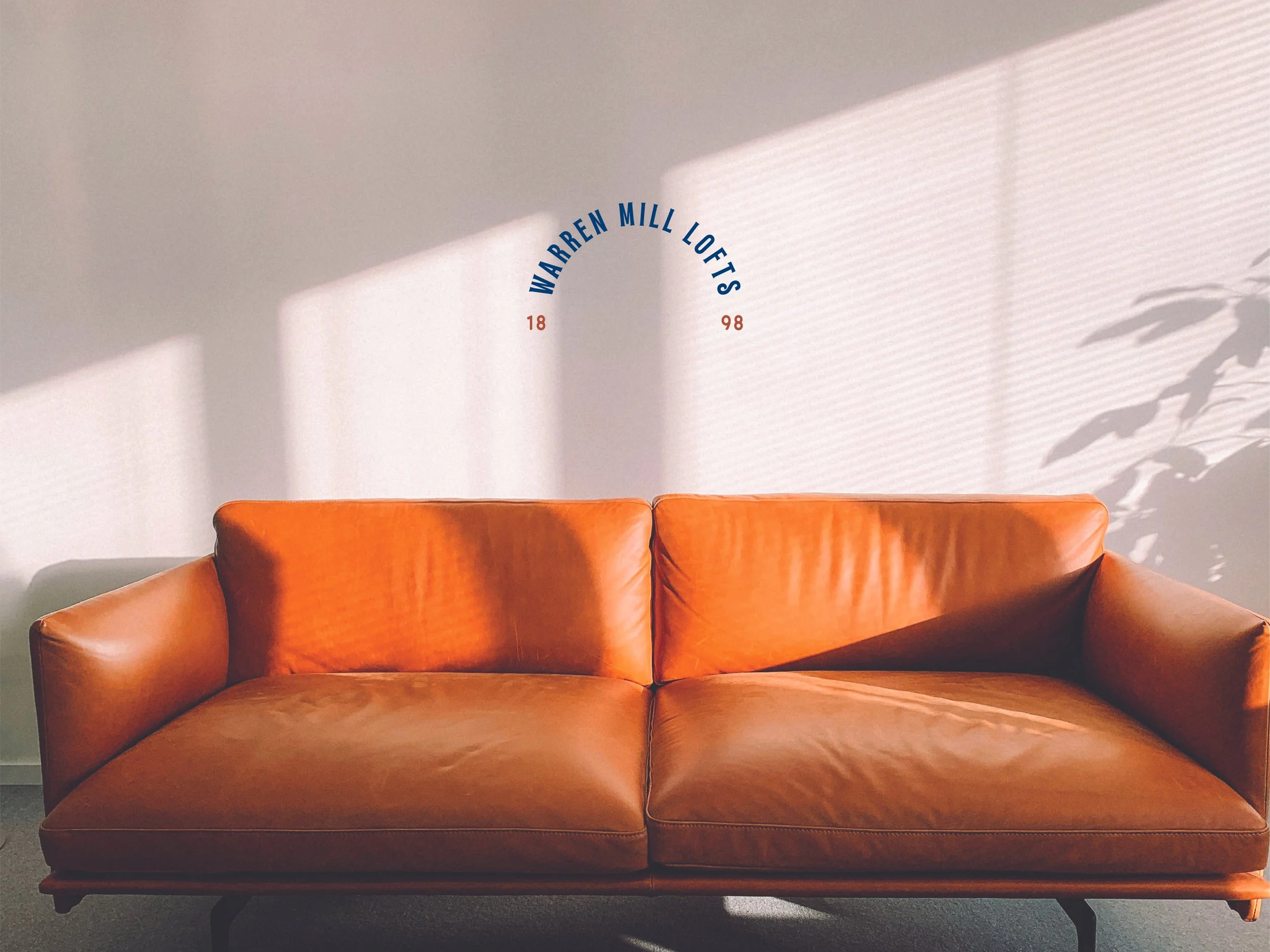
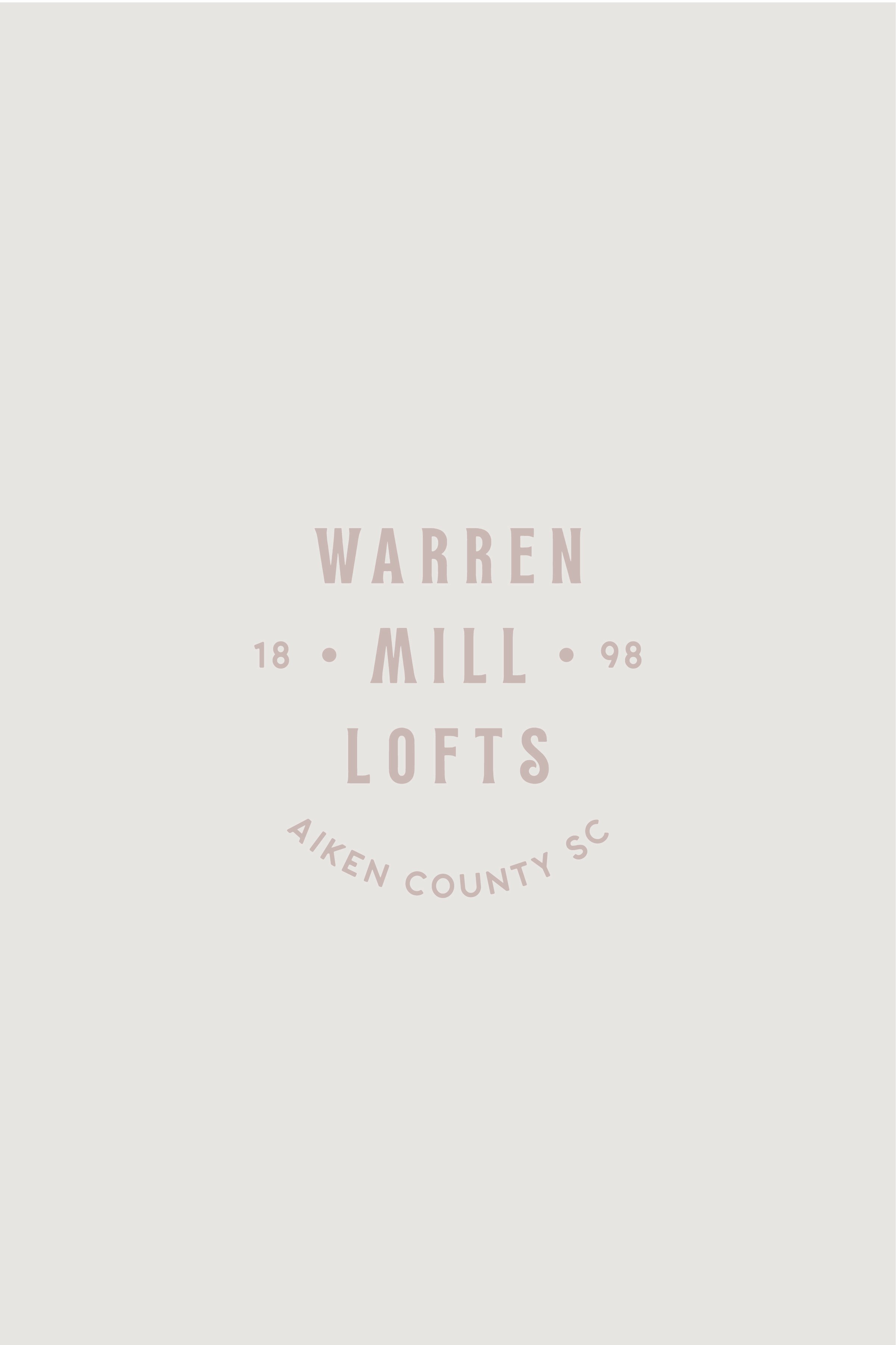
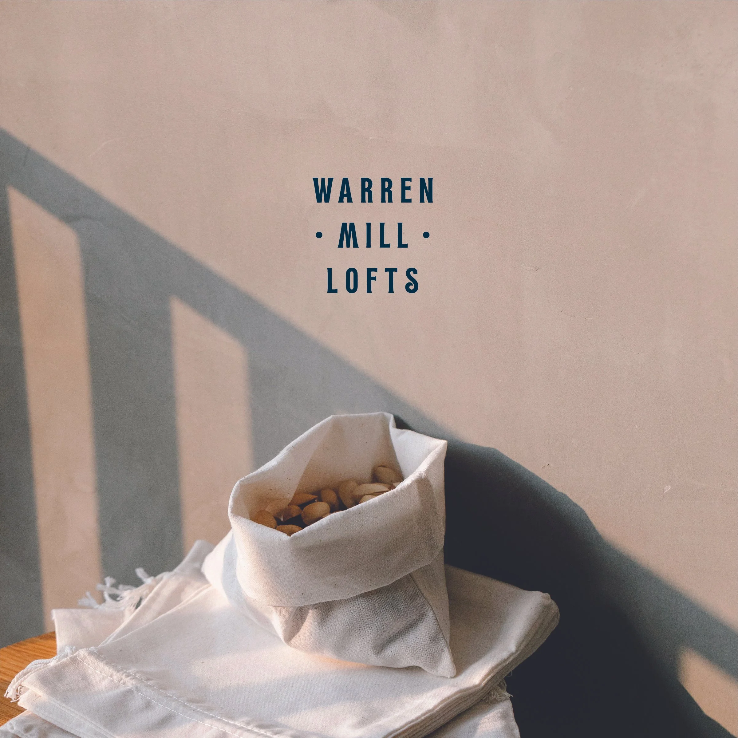
Warren Mill Lofts
residential apartments / restored cotton mill, aiken, SC
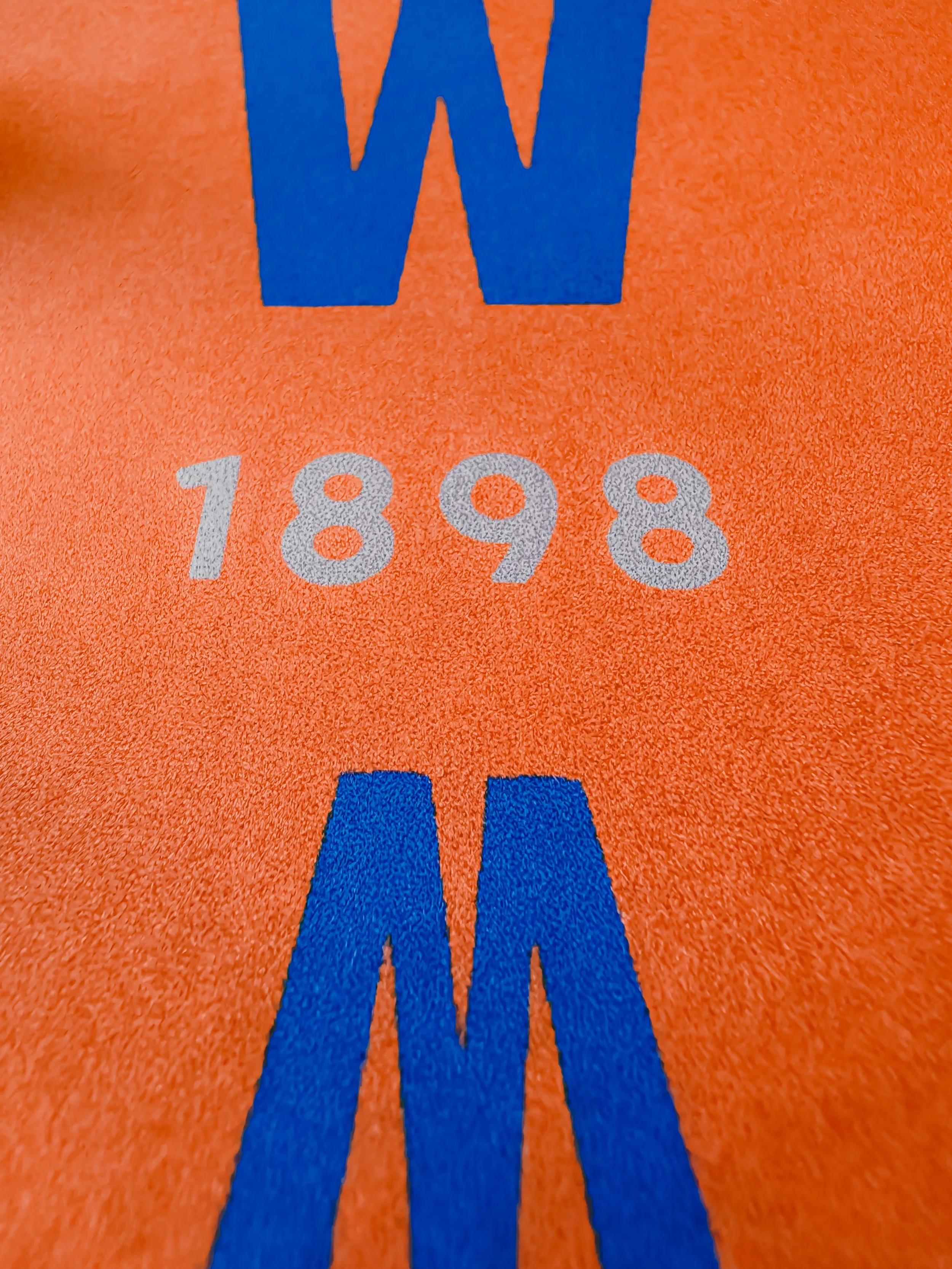
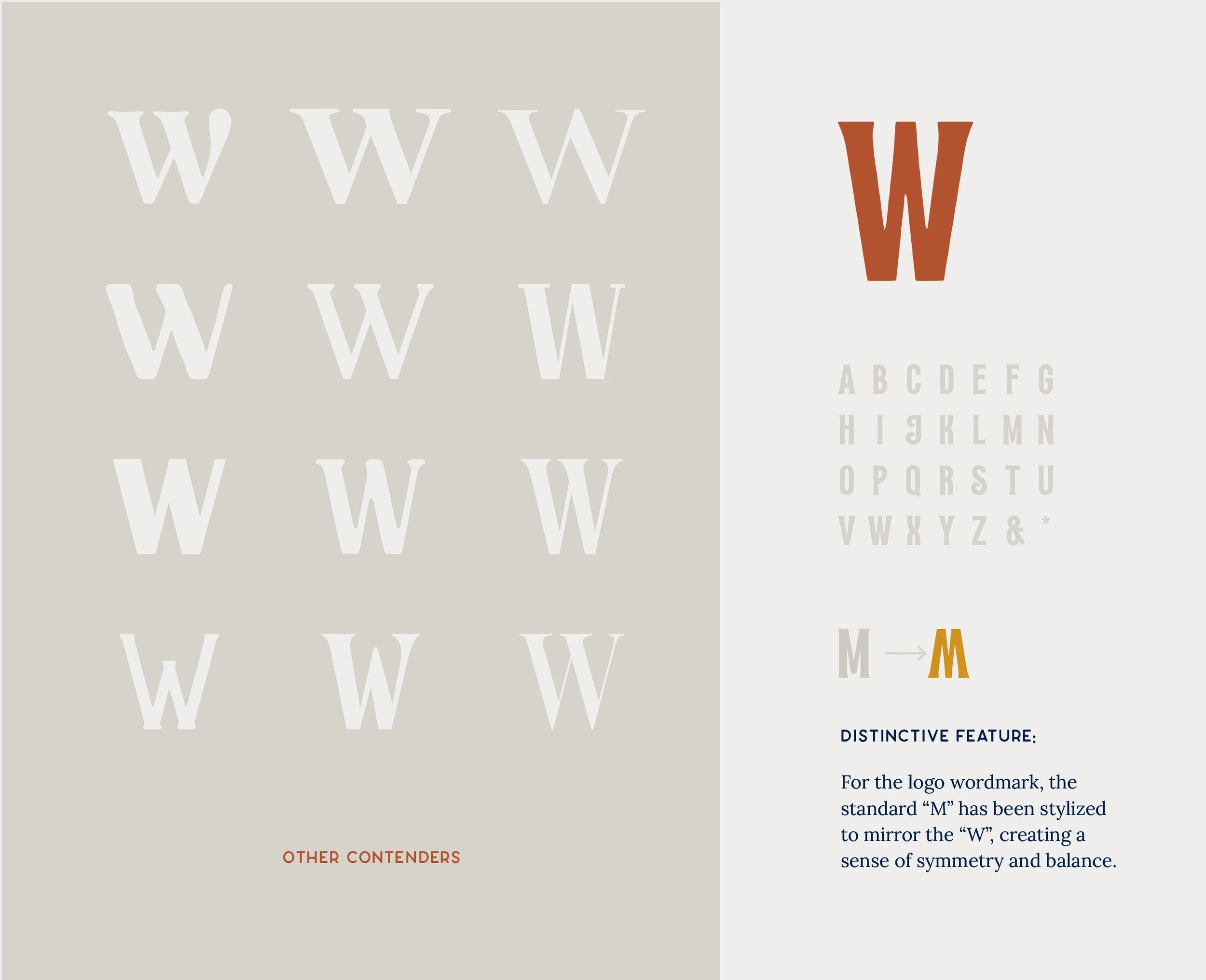
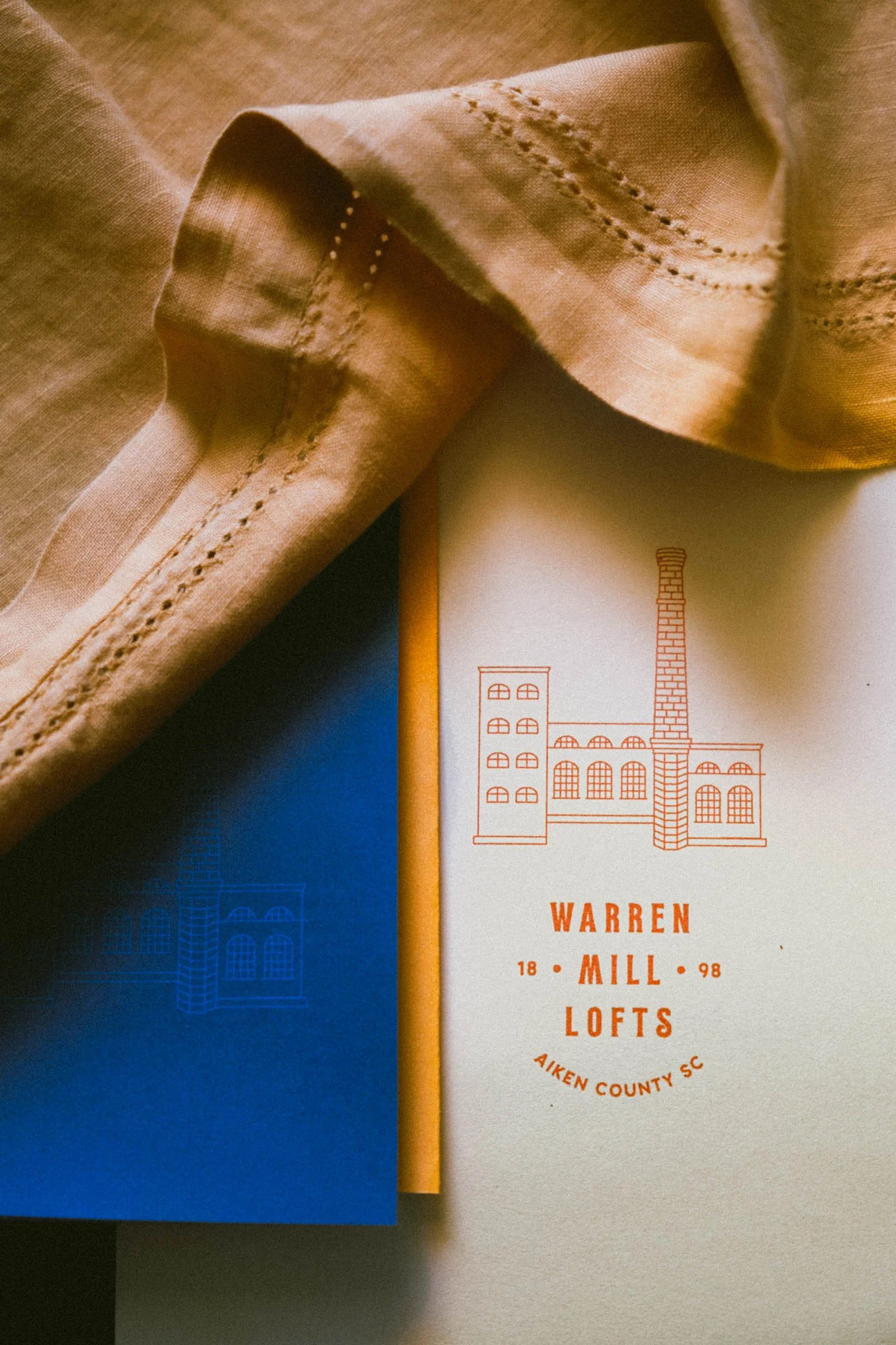
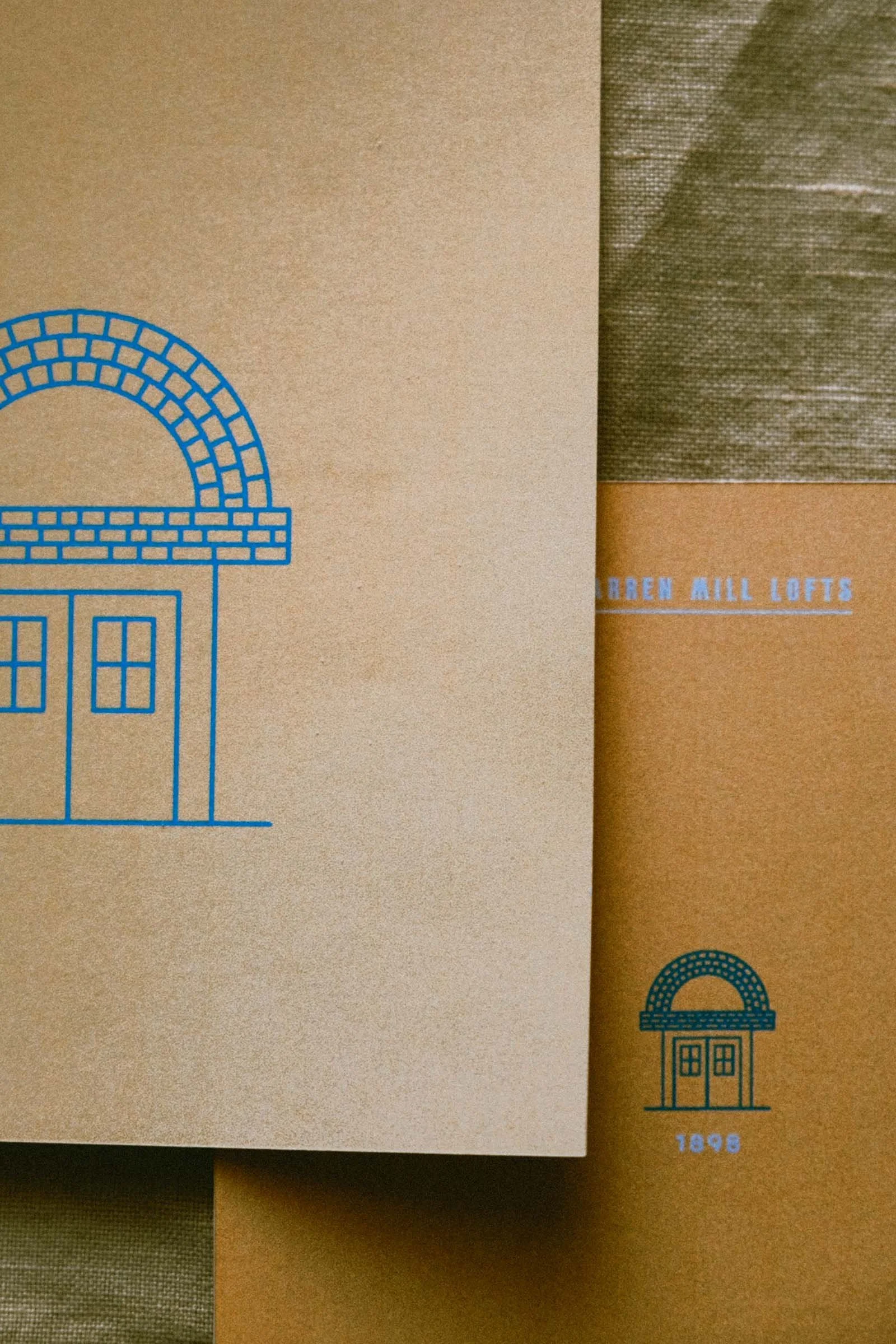
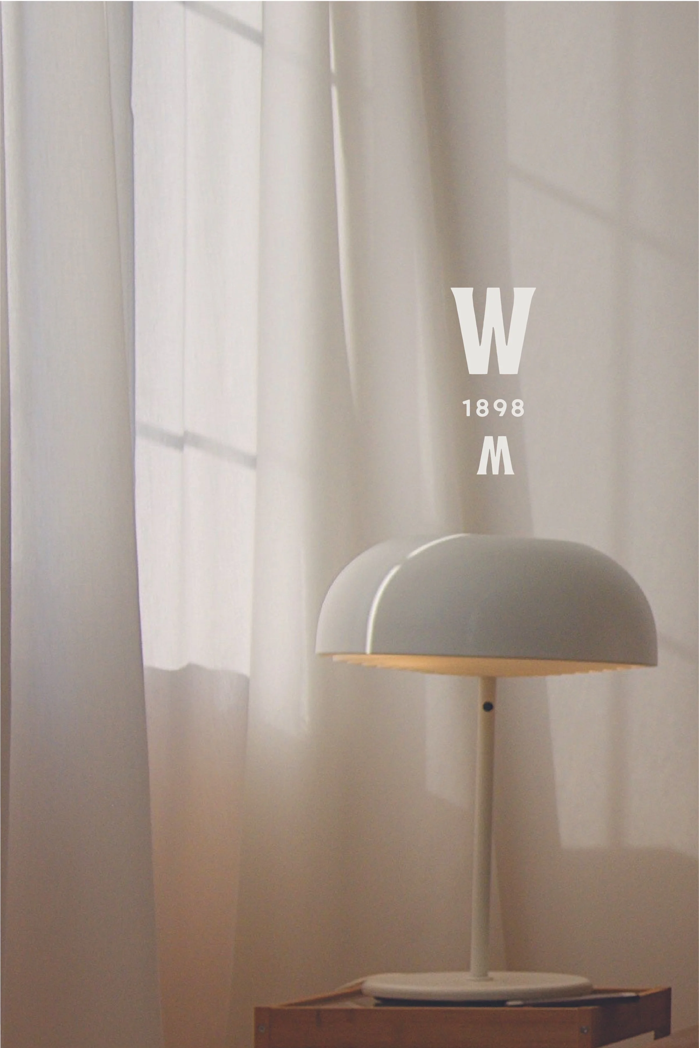
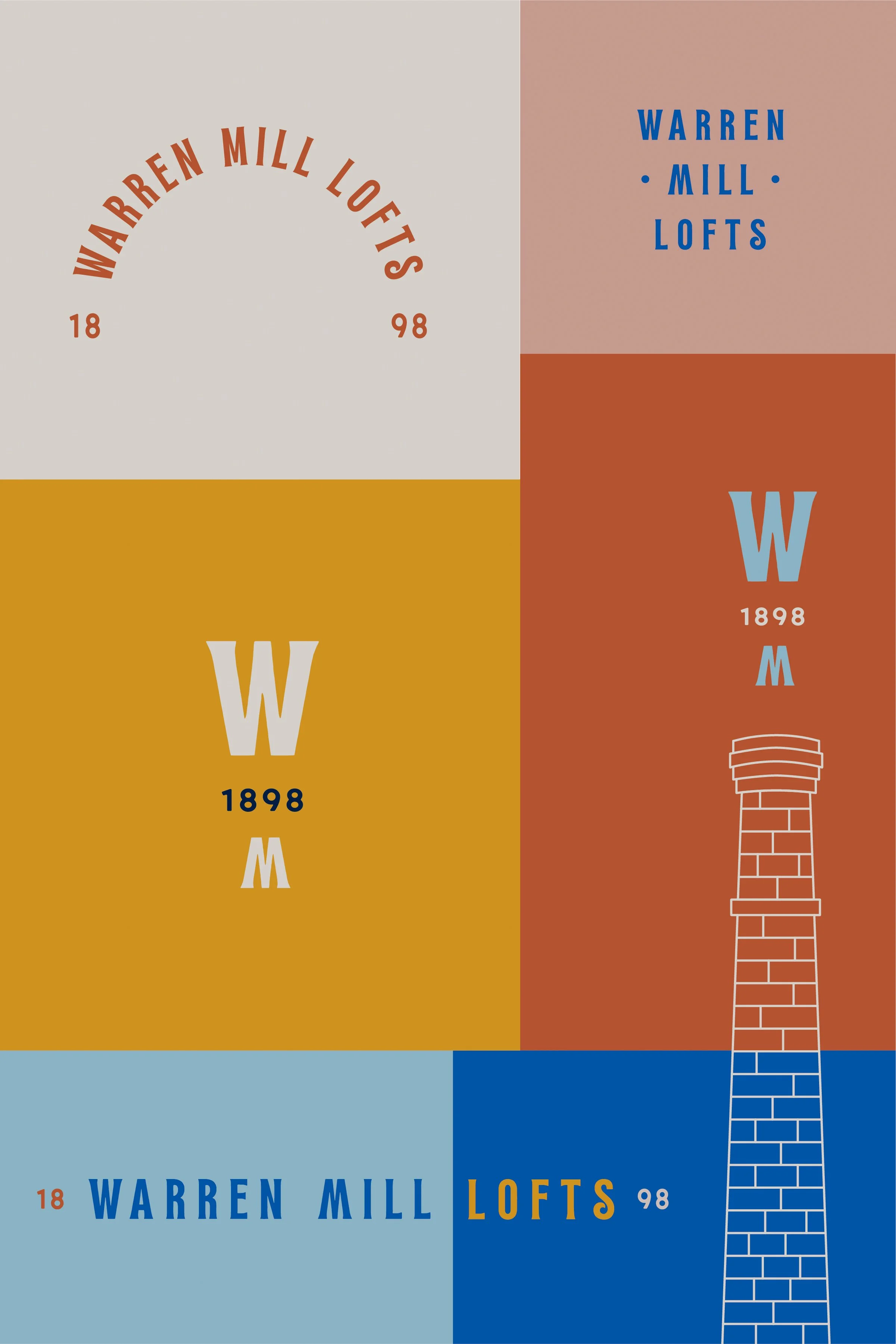
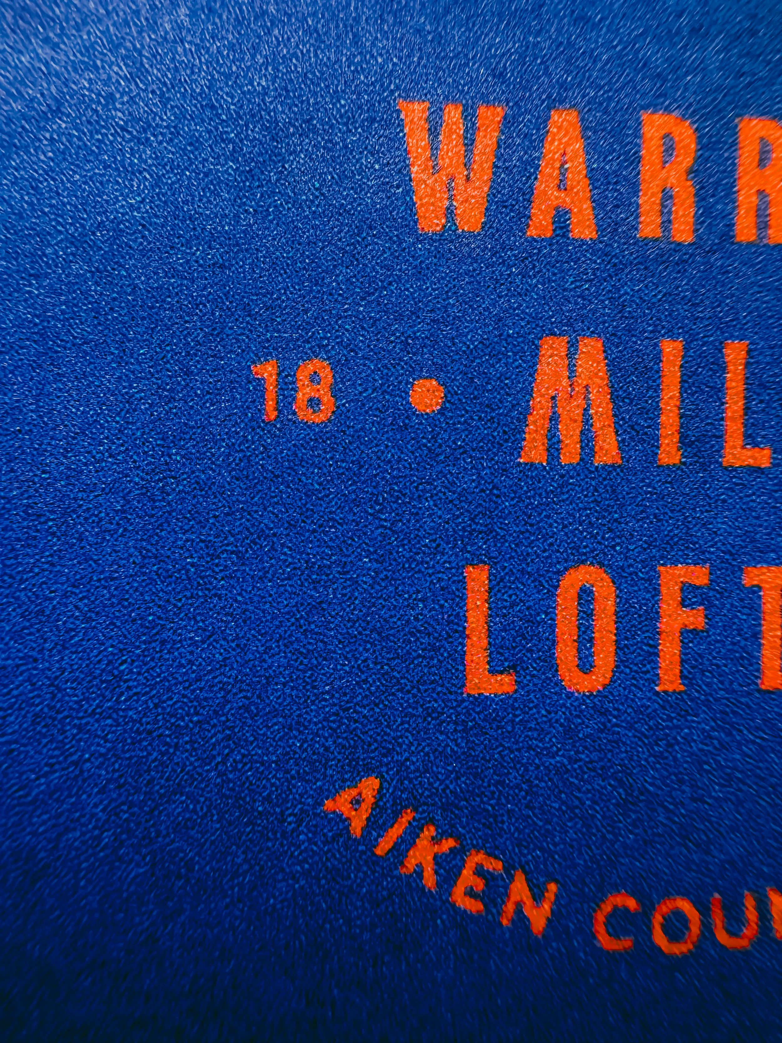
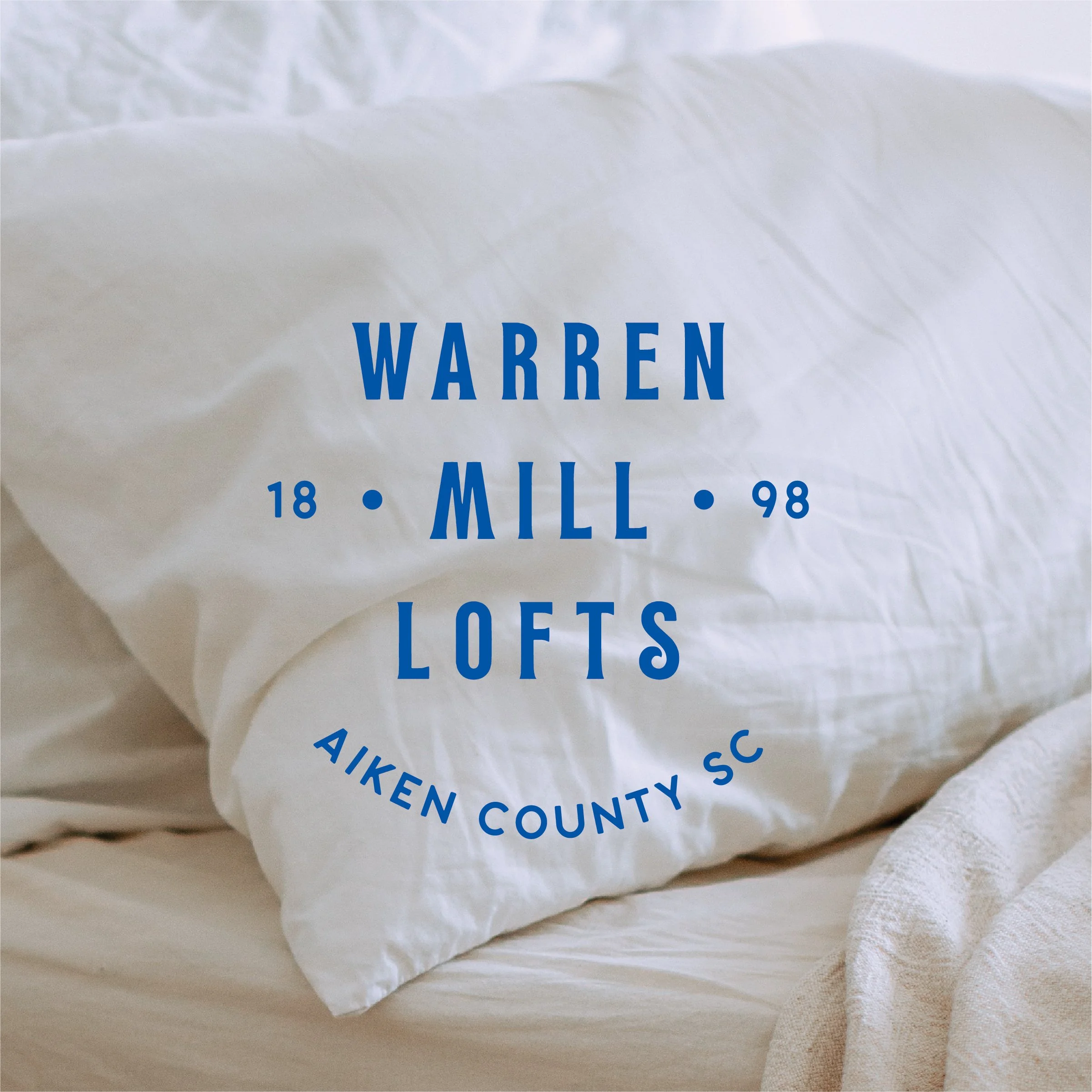
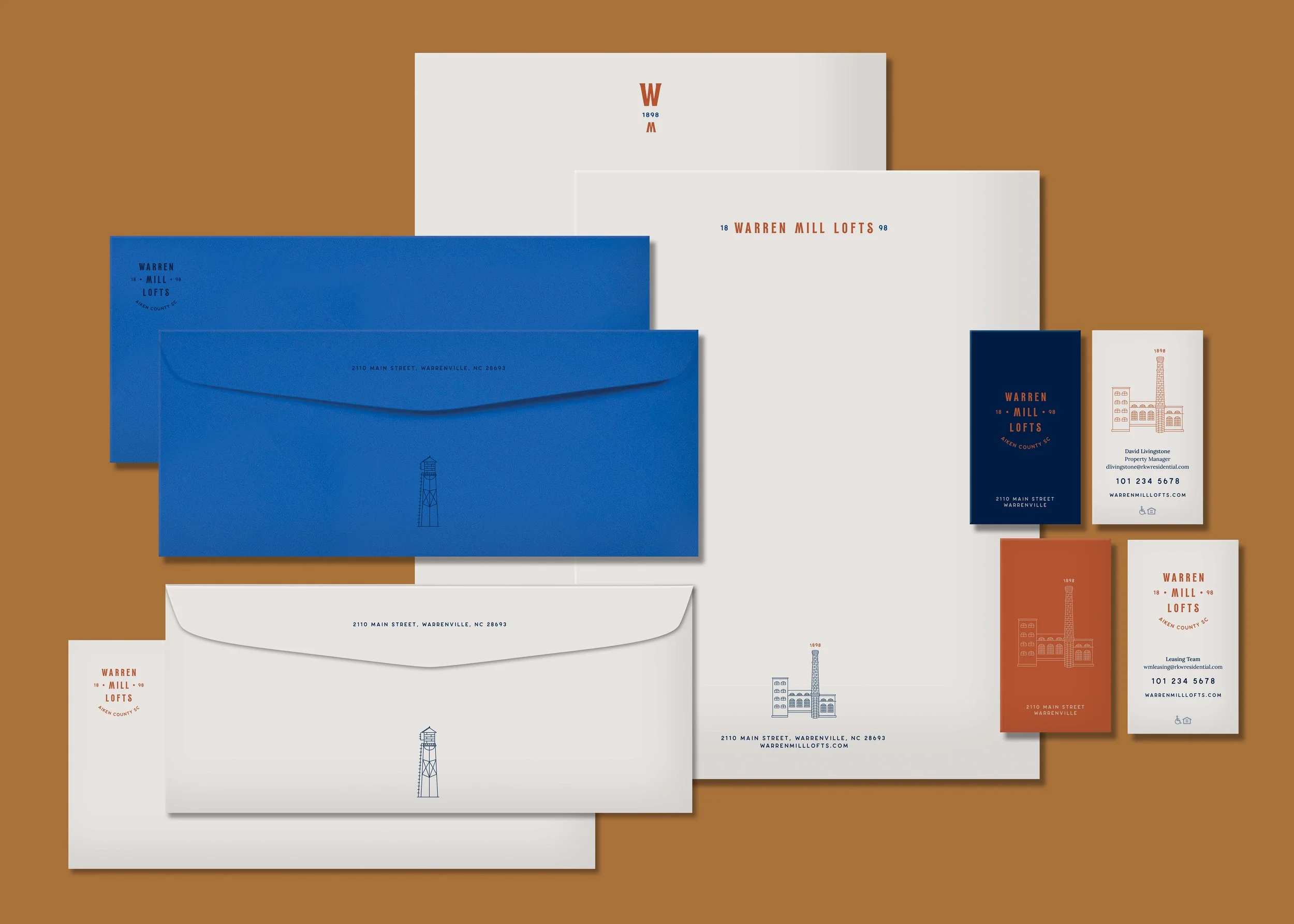
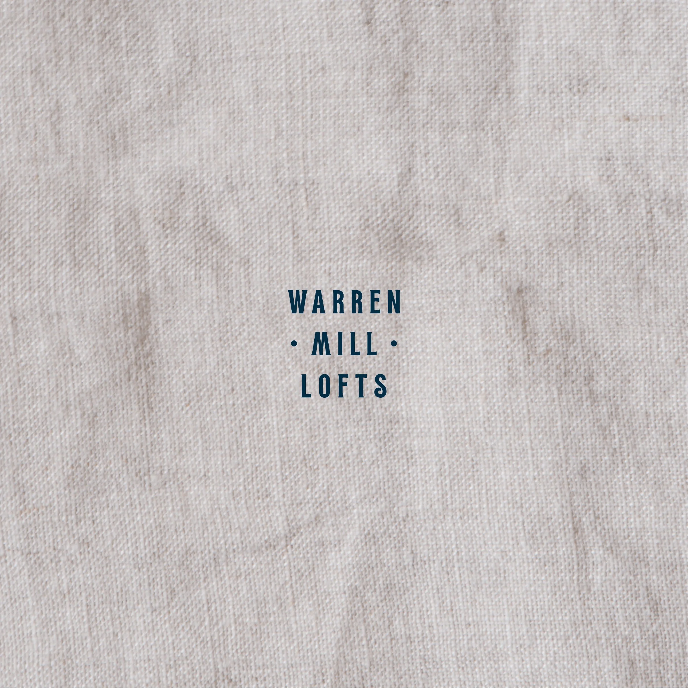
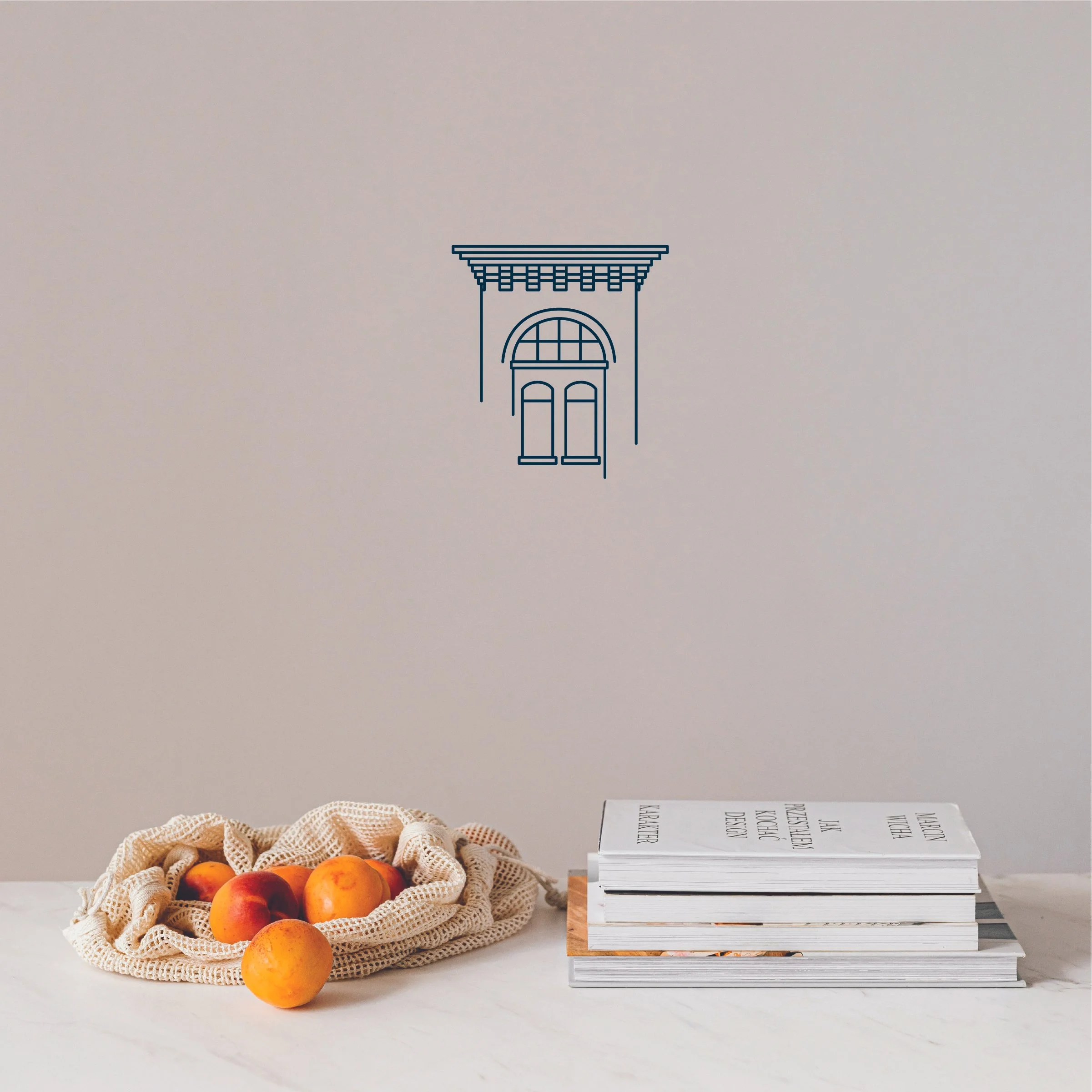
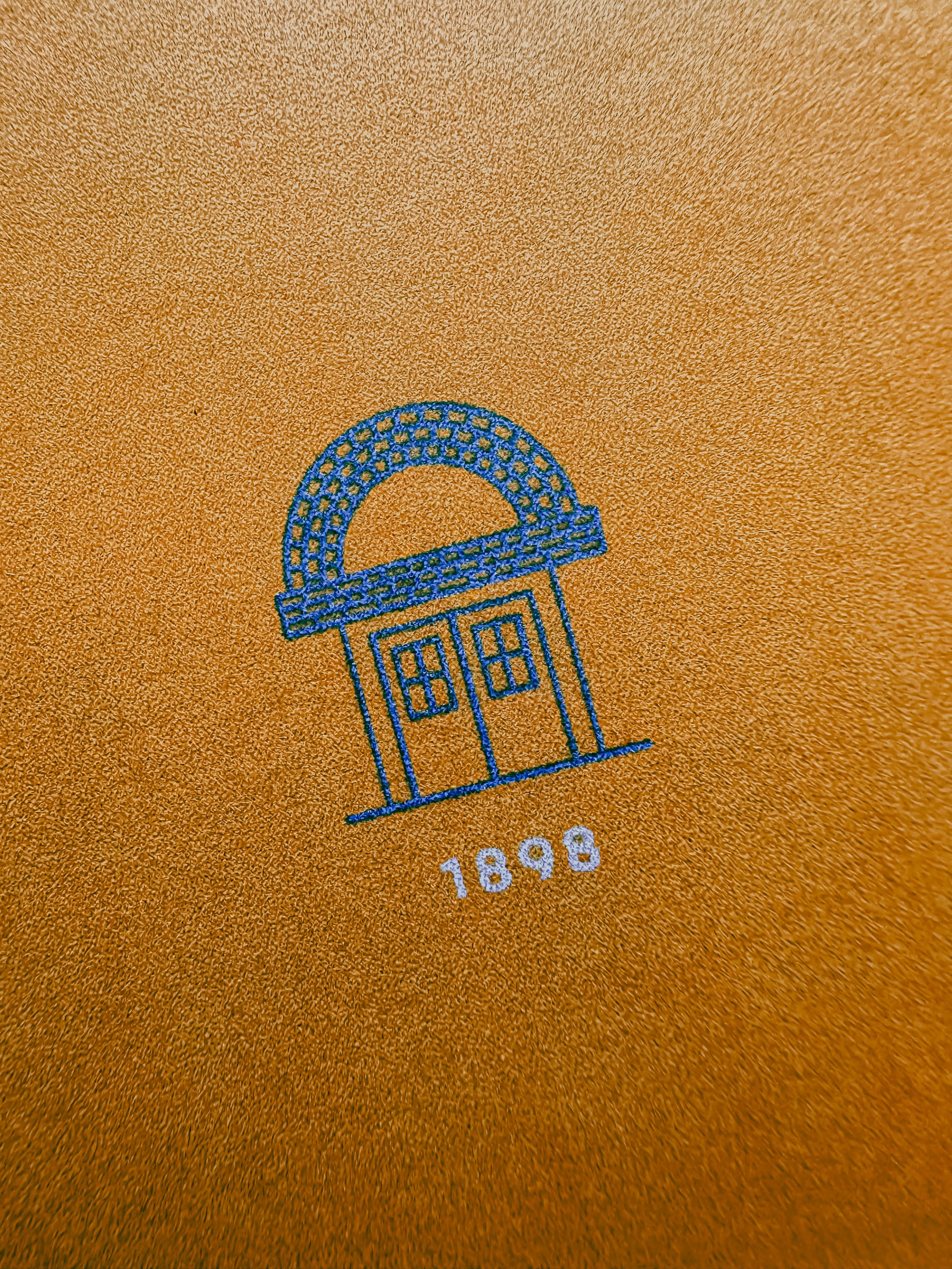
logo & alternative marks
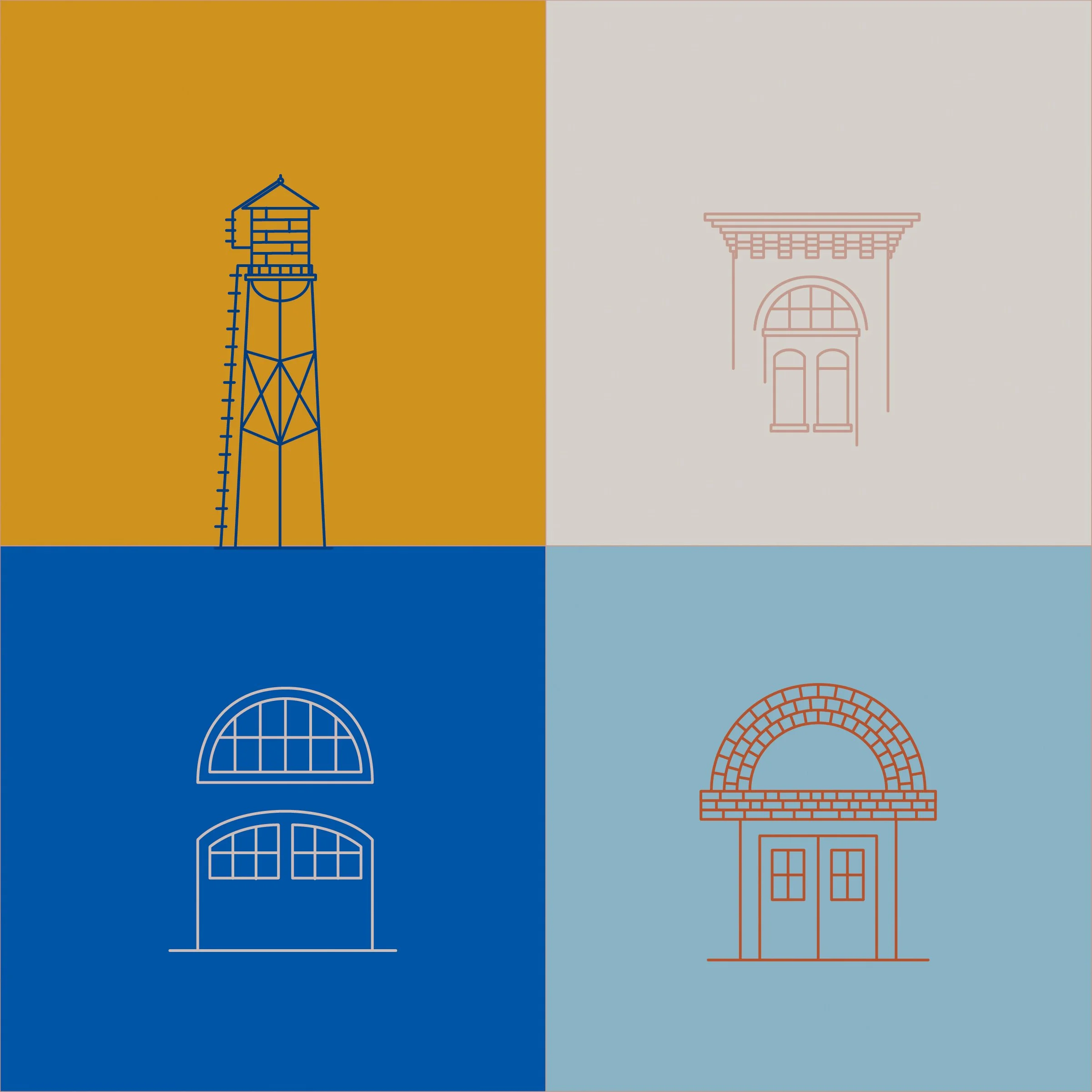
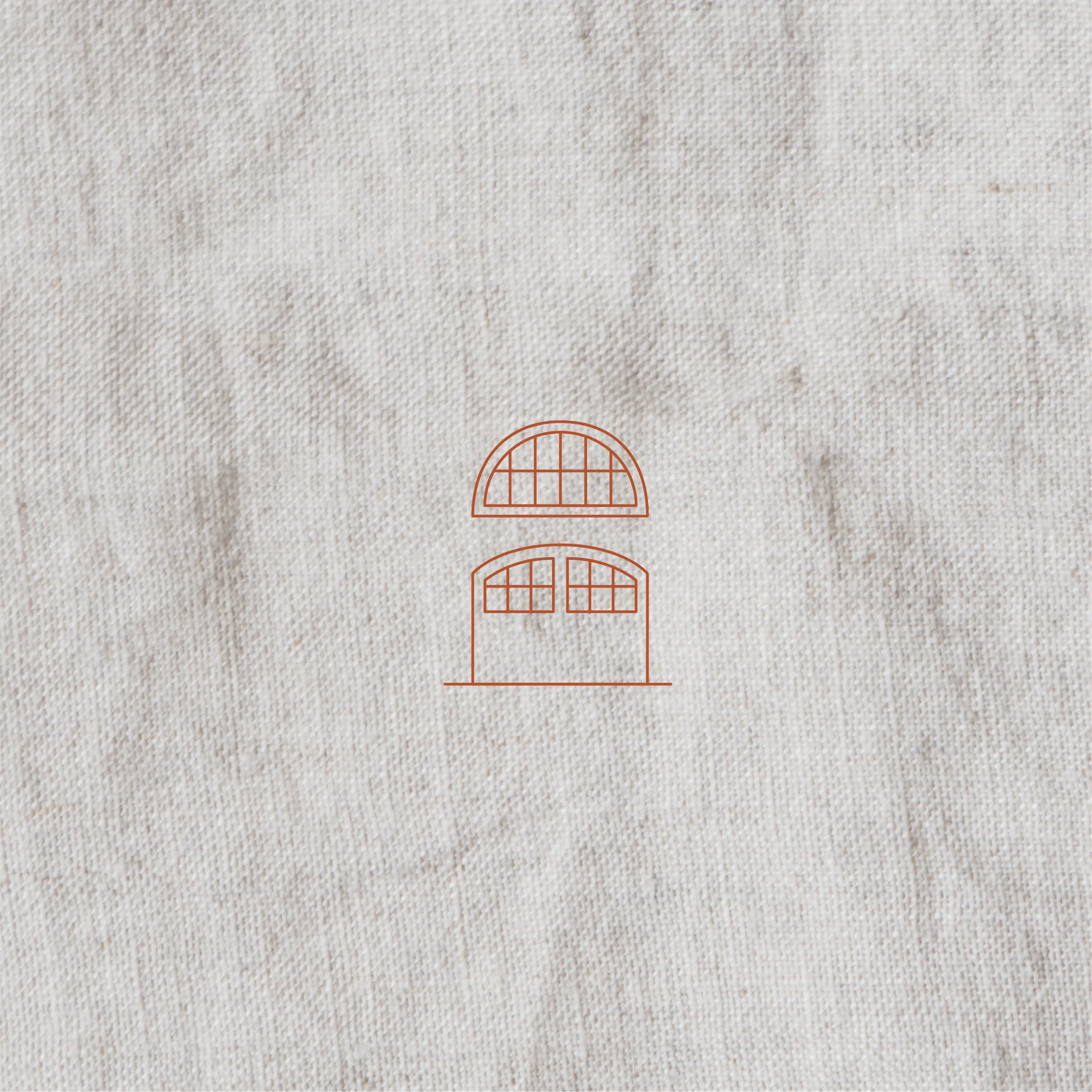
iconography
brand language
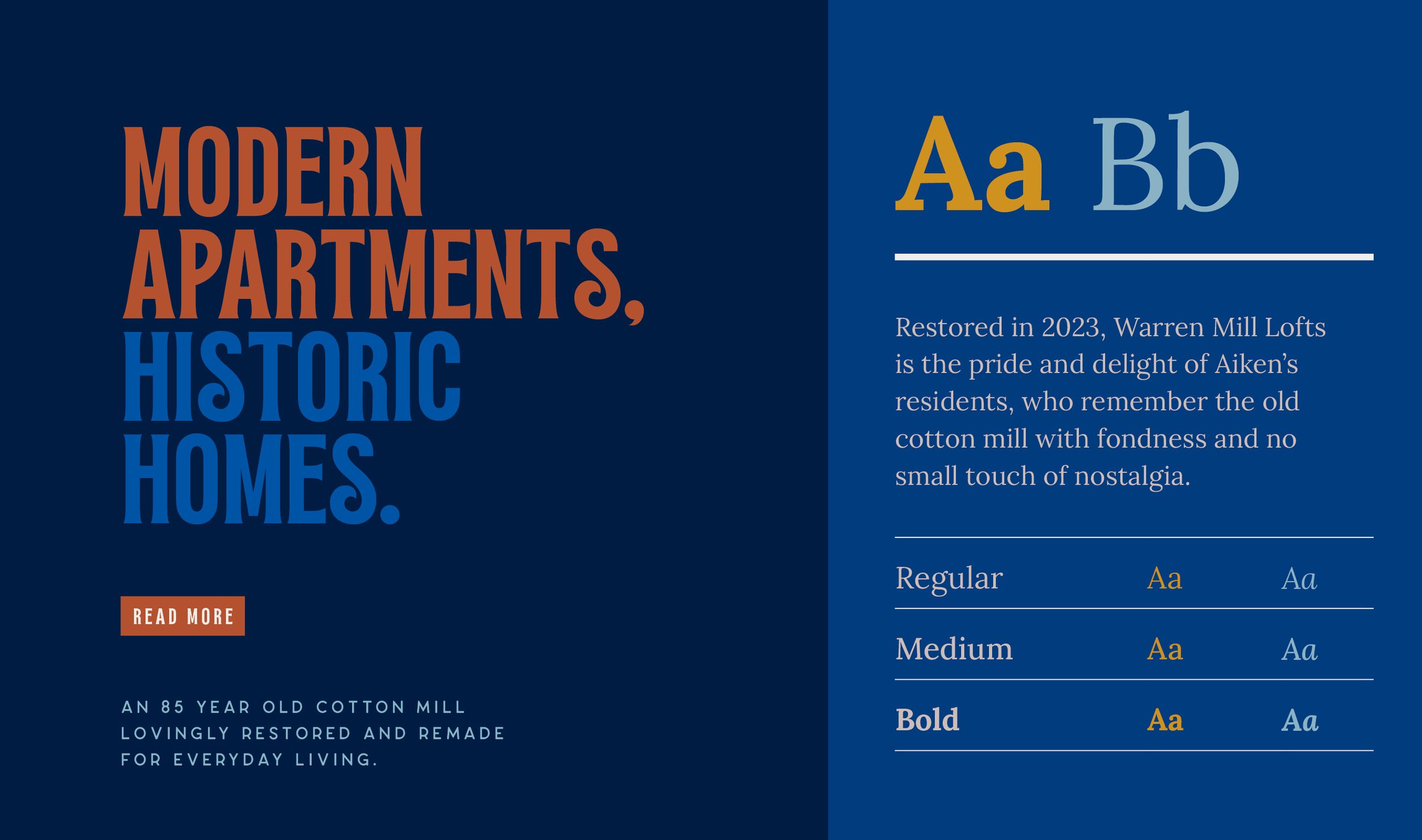
Colours & Type
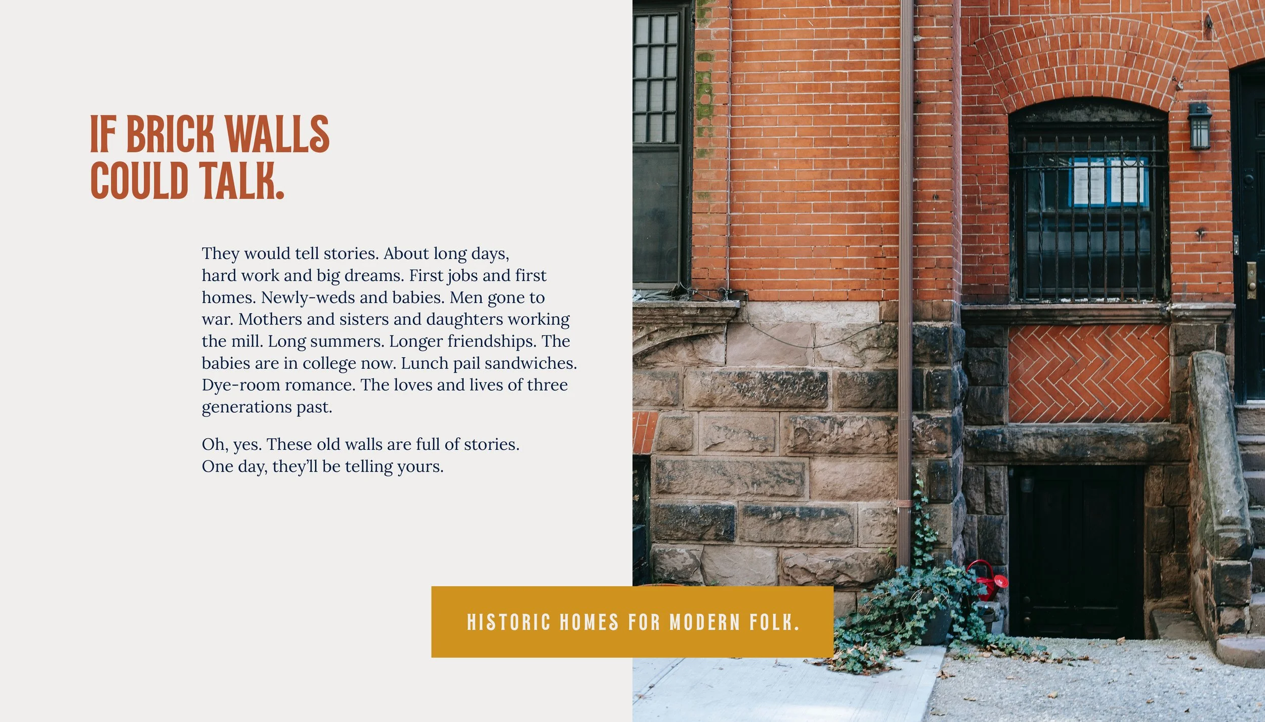
I was drawn to this project for three reasons. The first was obvious enough - the beauty of repurposing anything appealed to me. The second felt almost spiritual. Cotton mills have a complicated past in America. So it felt sobering to be part of any effort to reshape these into homes, places of safety and belonging, where new stories could be written and preserved. And lastly, the seniors of the town of Aiken, who remember the old cotton mill with fondness and no small touch of nostalgia. They were delighted to see it restored, and during the build, many old mill-workers contacted the developers and local newspapers to share their stories.
Background
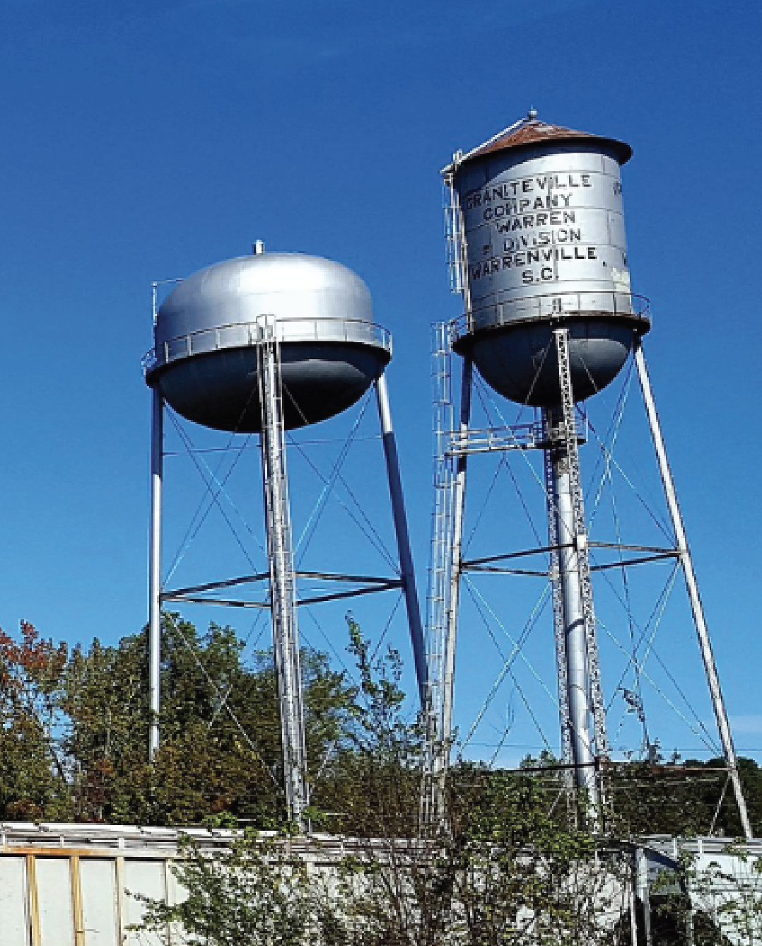
Adaptive-Reuse, the repurposing of historic and abandoned buildings rather than demolishing them, has become increasingly fashionable in America in recent years. Train stations, plane hangars and factories have all found themselves converted for residential and commercial use. Colonial style brick buildings, with their distinctive, red-hued aesthetic are highly sought after for these make-overs. Chief among them are the cotton mills of the East Coast Piedmont, which drove the post-Civil War industrial revolution from the 1880s to the 1920s.
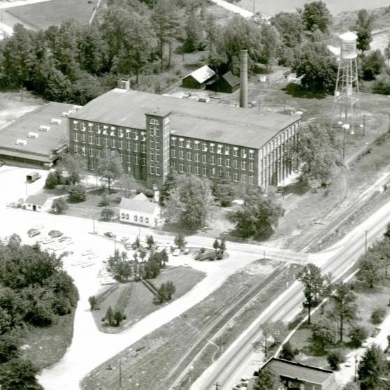
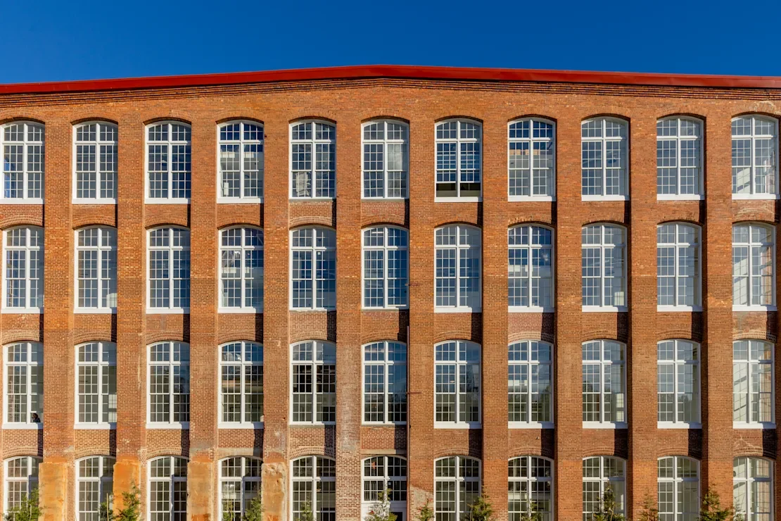
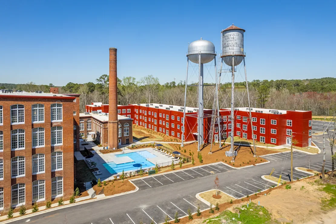
Below: Then and now.

marks
I wanted to make sure that the logo marks didn’t look too modern or wispy. They needed to feel sturdy and solid, evoking trust and nostalgia. Even the colors and type faces I chose hearken back to the era of painted signs on brick walls. As always, there is a family of alternative marks that can be used for different needs in print and digital spaces.
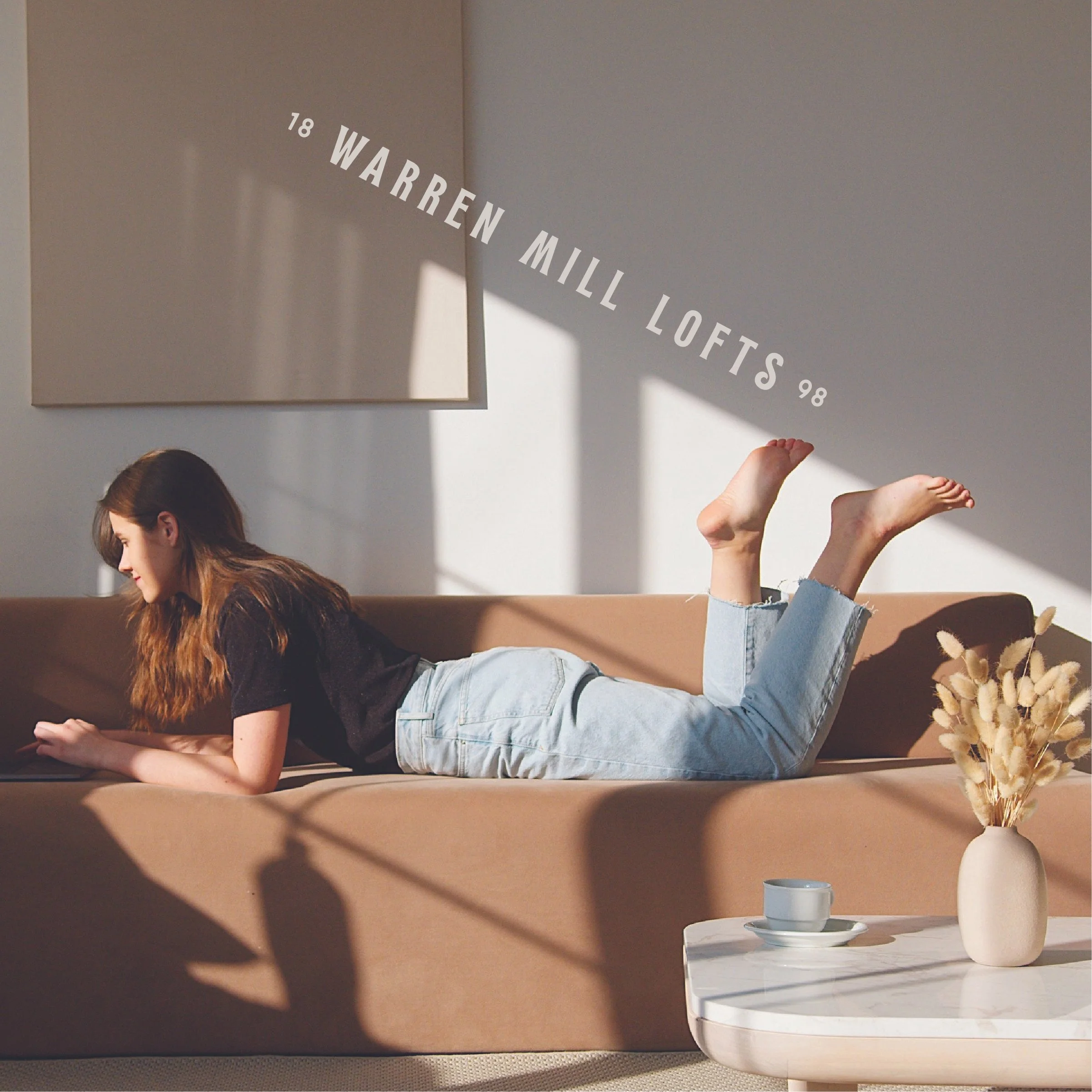
modern apartments, historic homes
Built at the end of the 19th century, Warren Mill has been knit into the fabric of Aiken County for as long as anyone can remember. It fell to disuse in the 1980s, but has remained a cherished and storied landmark.
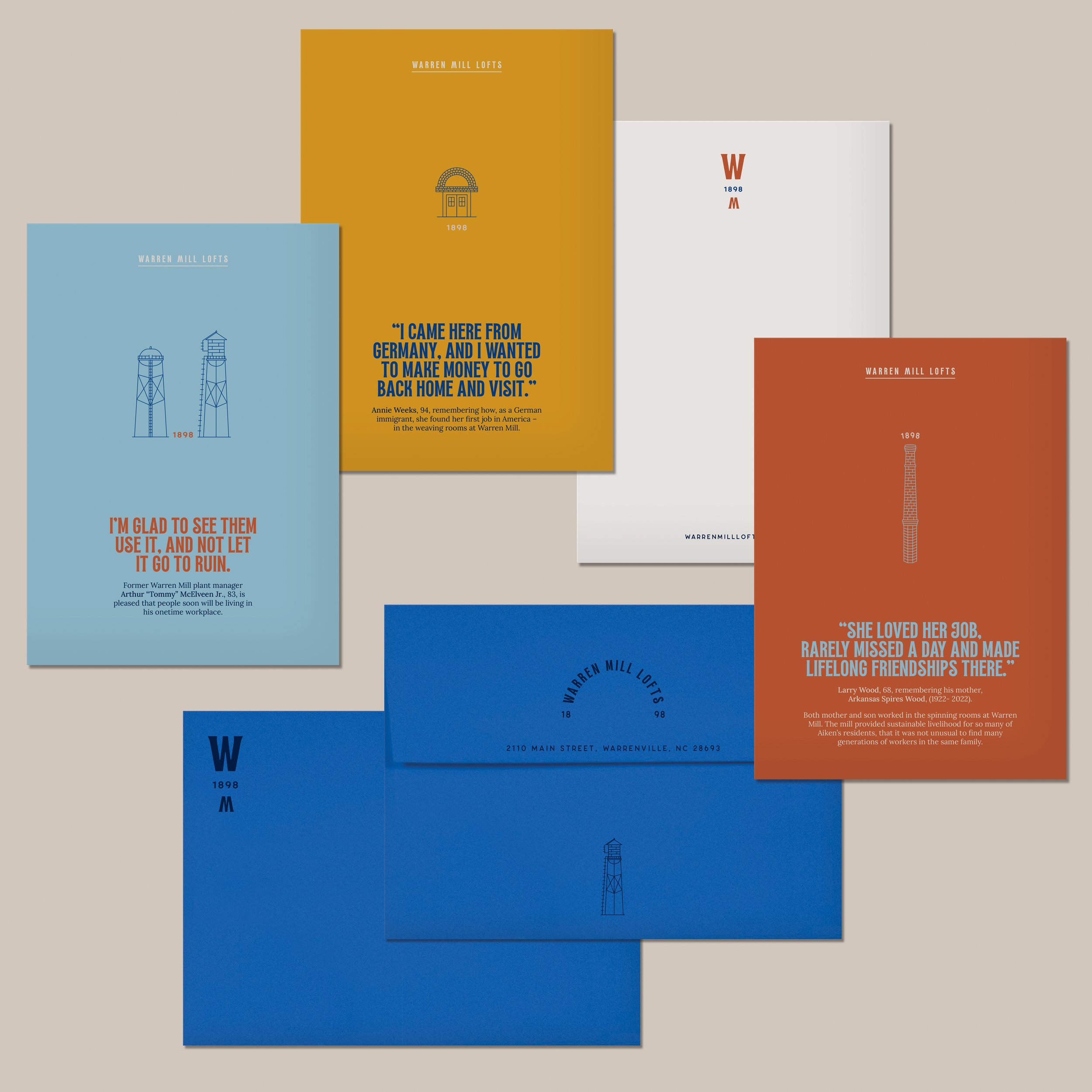
A big part of the brand narrative was that home-owners could write their own brand new stories in these spaces that already carried so much history. To build on this, we incorporated interviews with old mill workers into brand pieces.
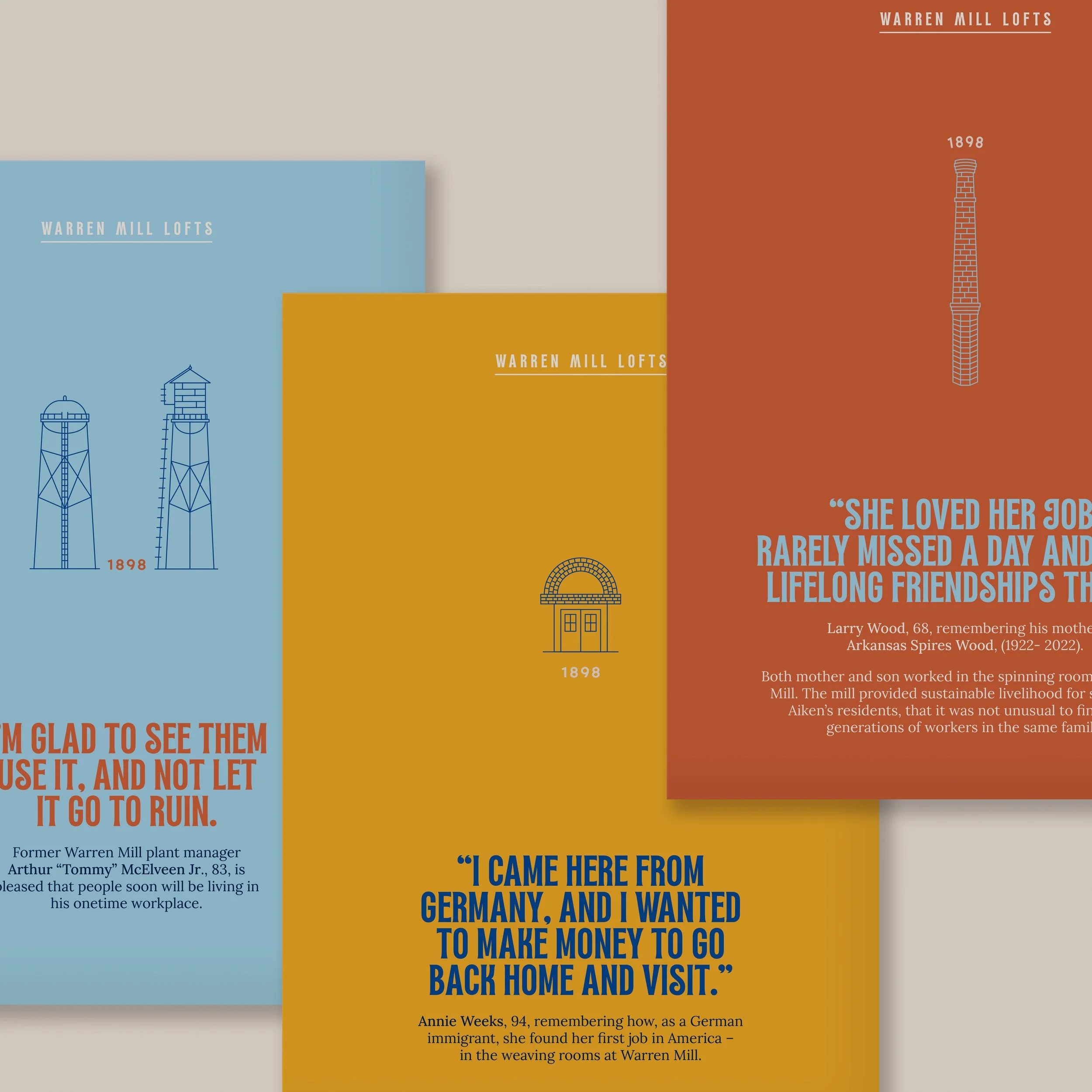
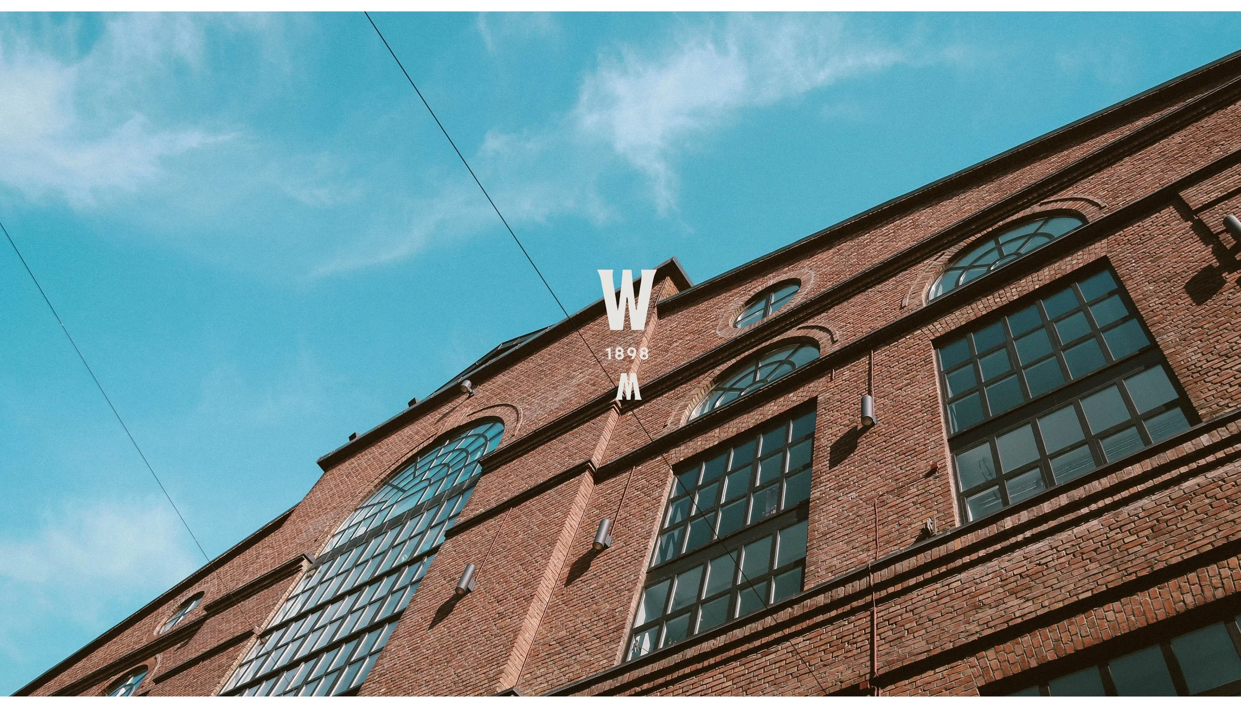
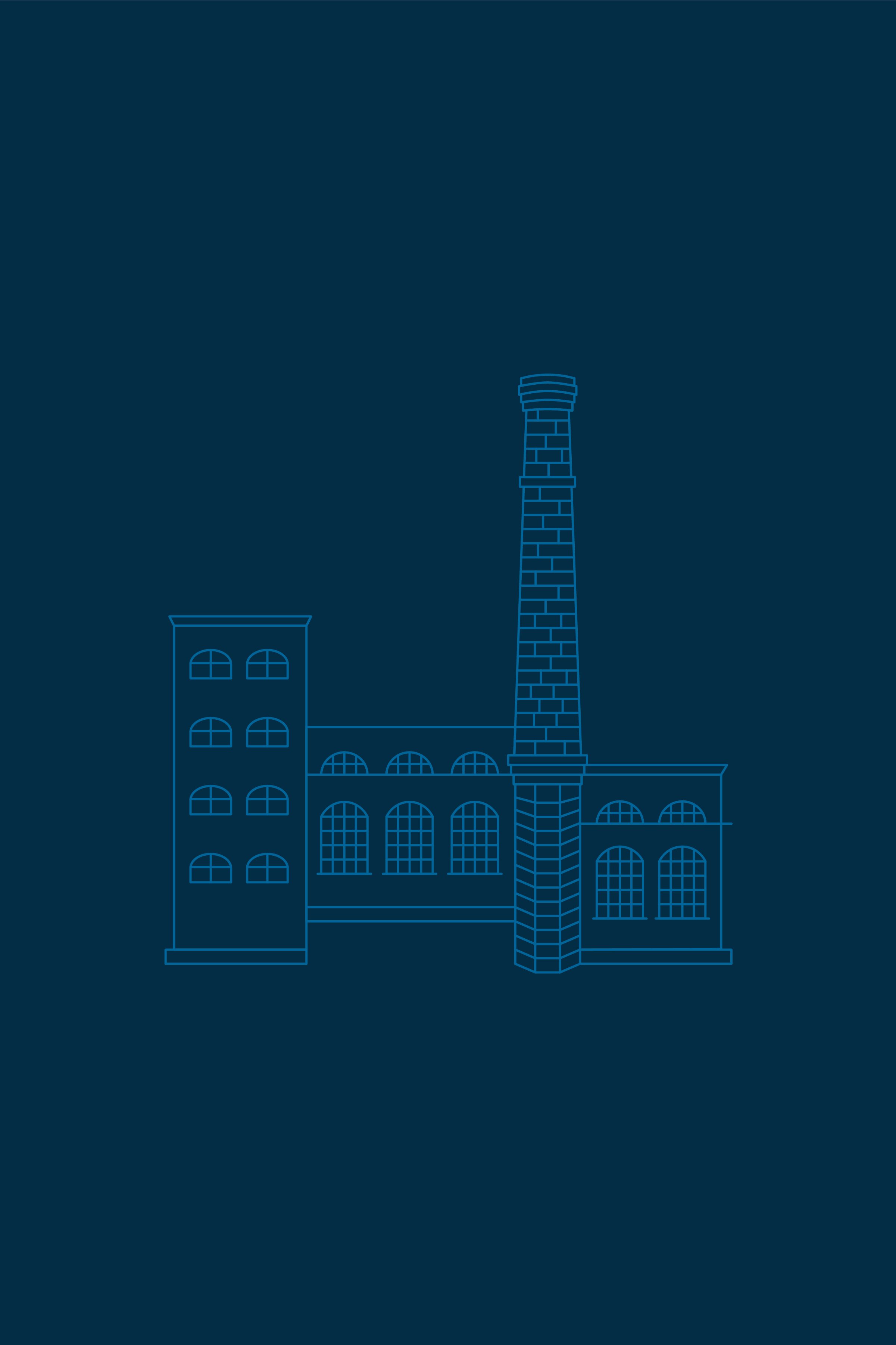
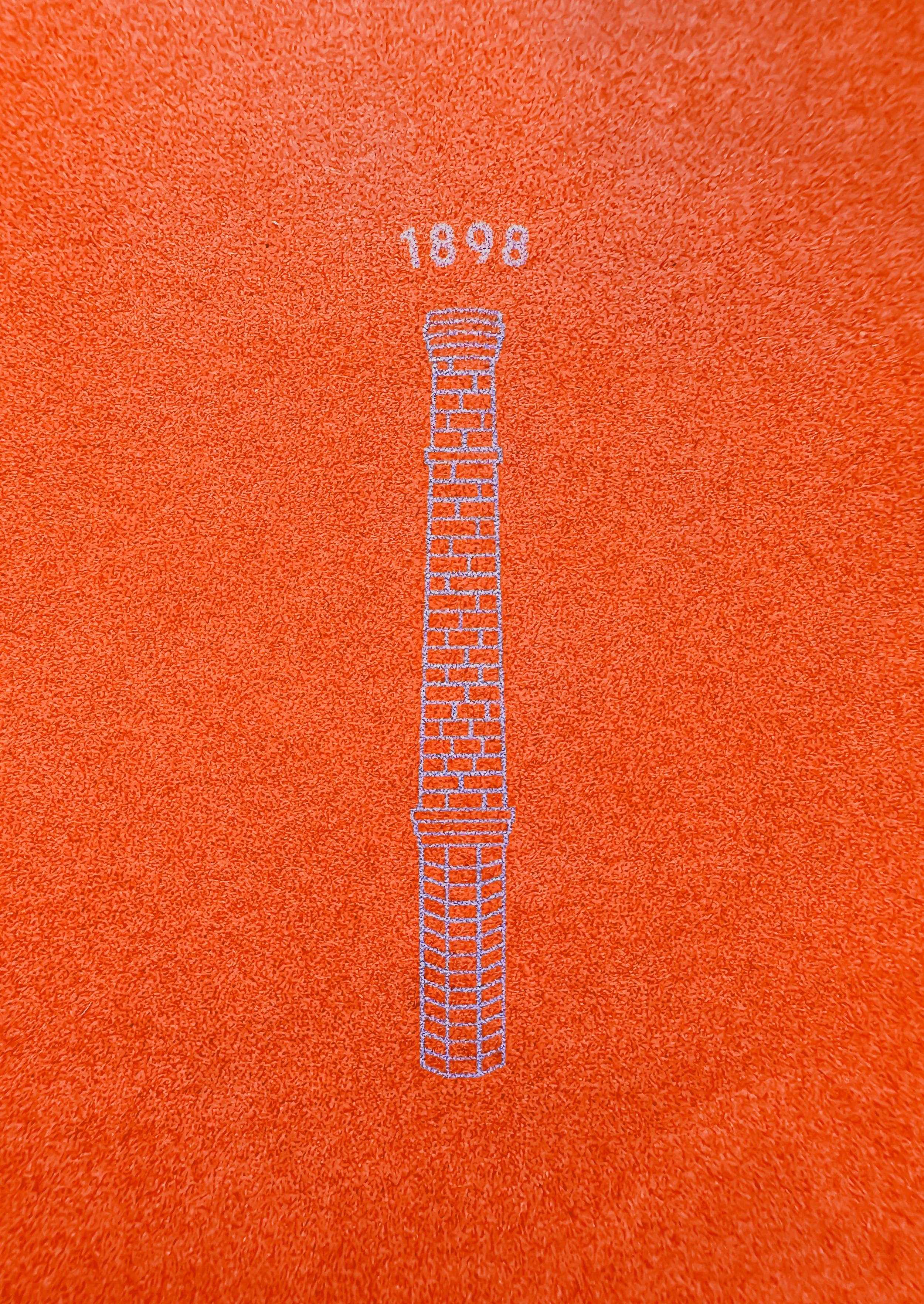
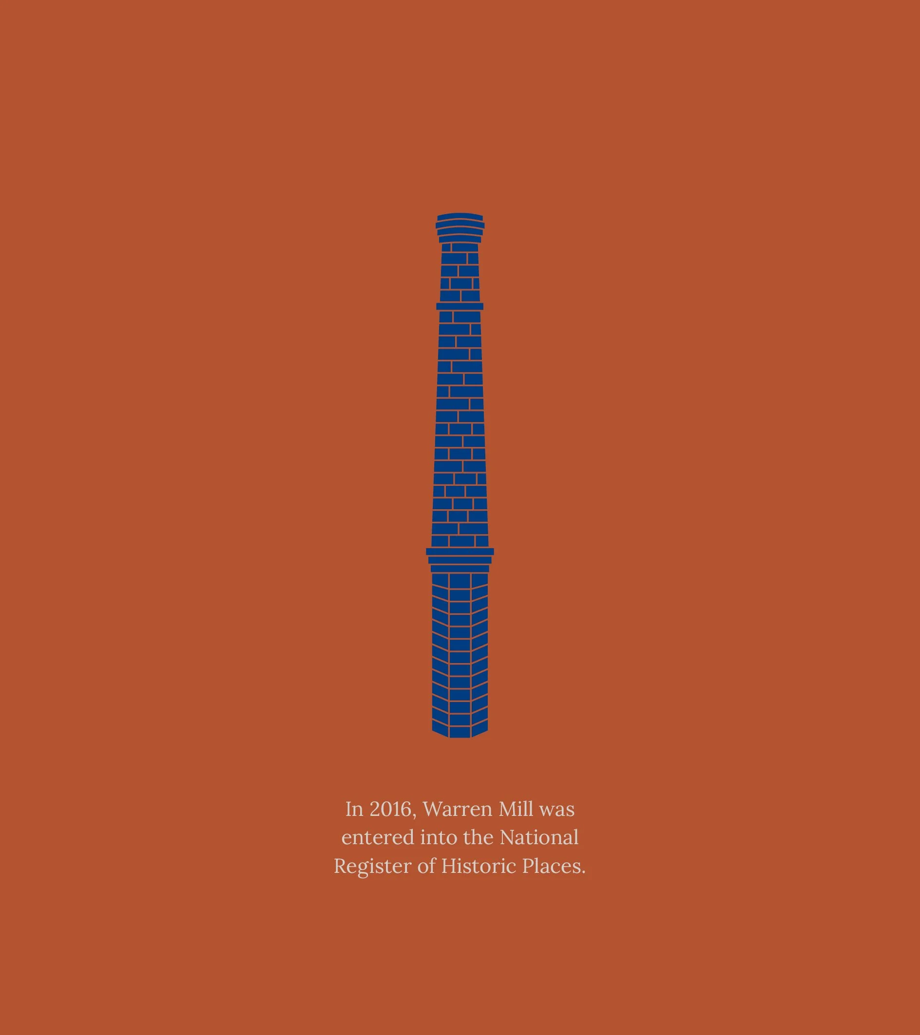
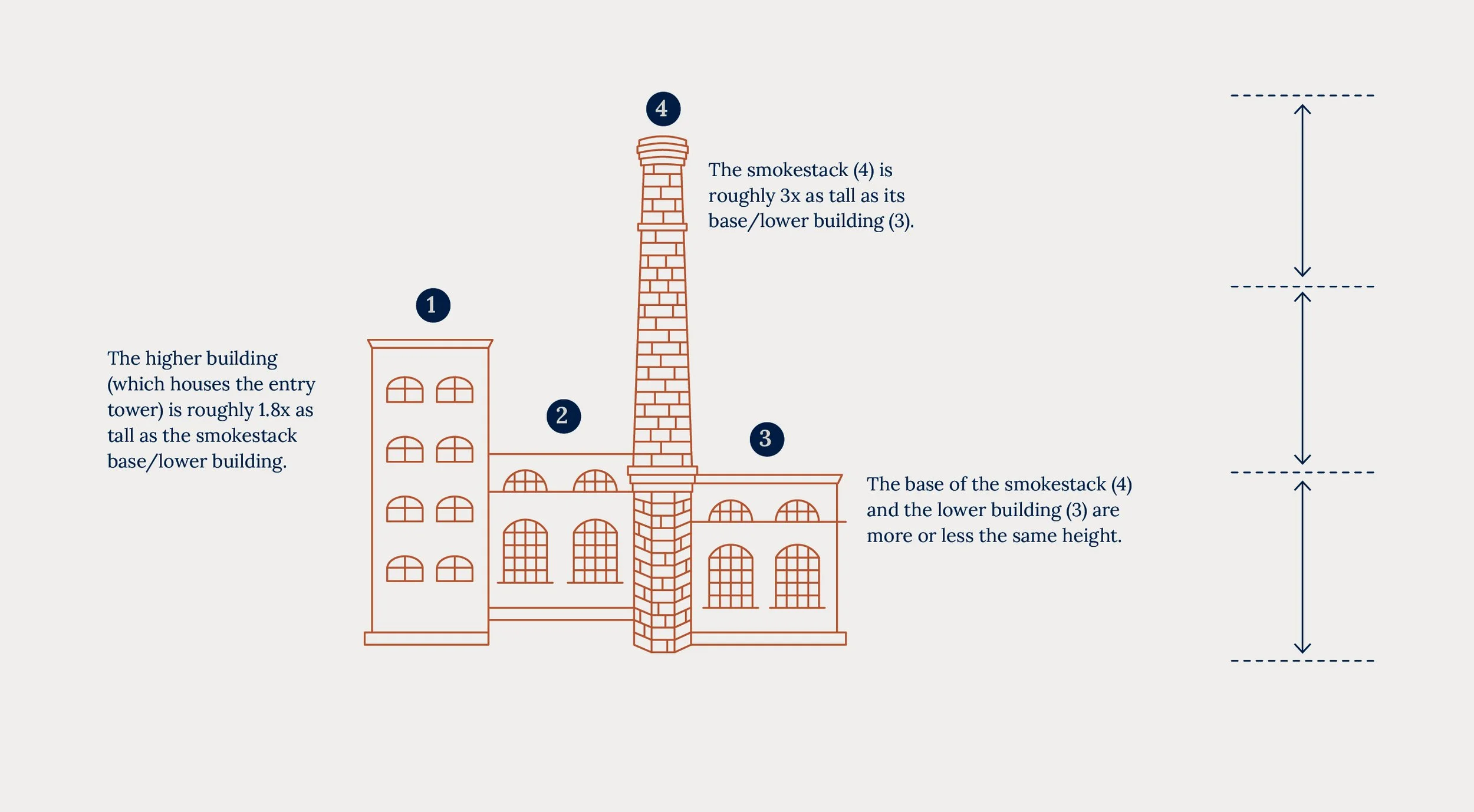
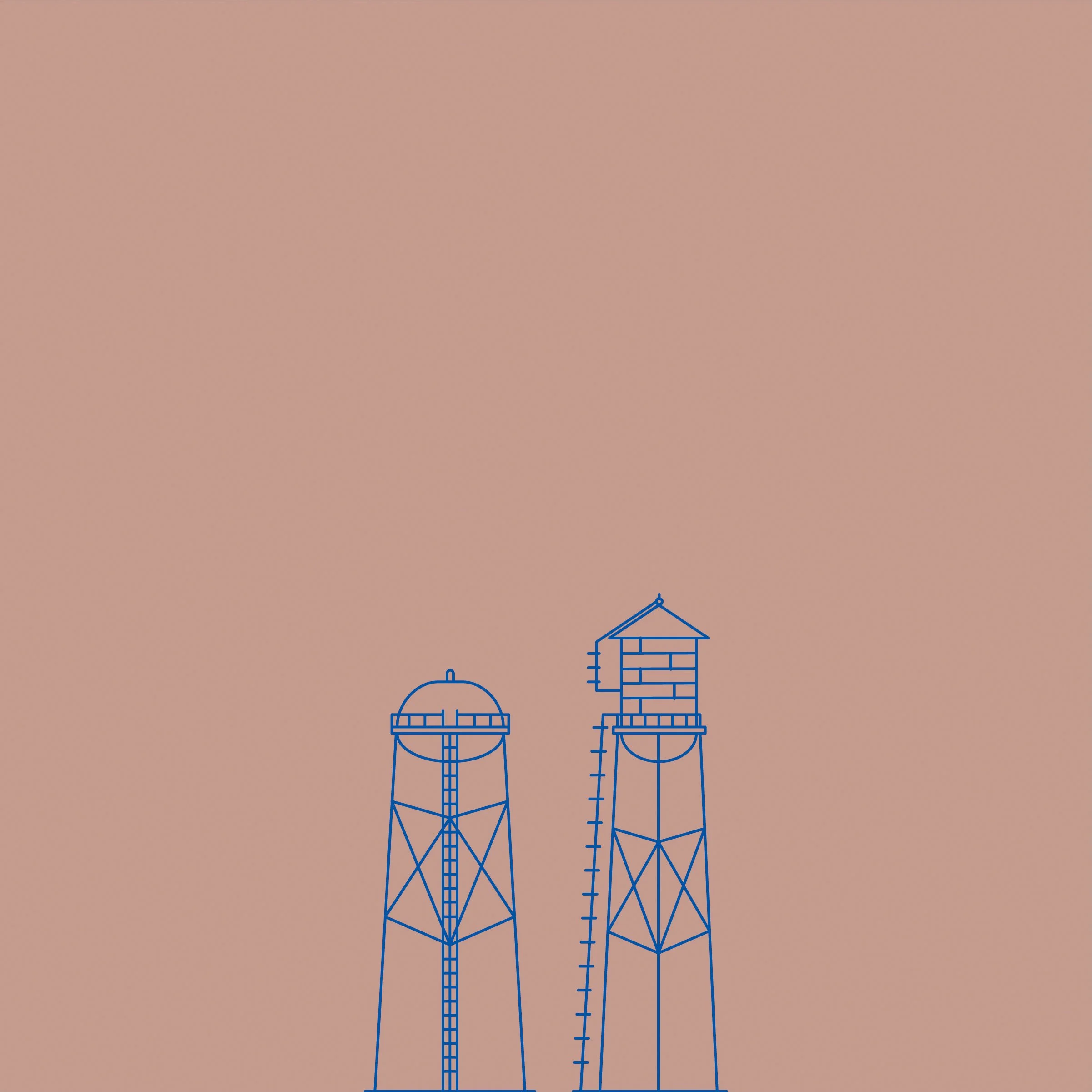
The SmokeStack
The original mill used a coal-fired steam engine to drive the looms and machinery. The giant smokestack that rose from the boiler room could be seen from miles around. While many factories from the turn of the century had similar chimneys, few are as well preserved as the one at Warren Mill.
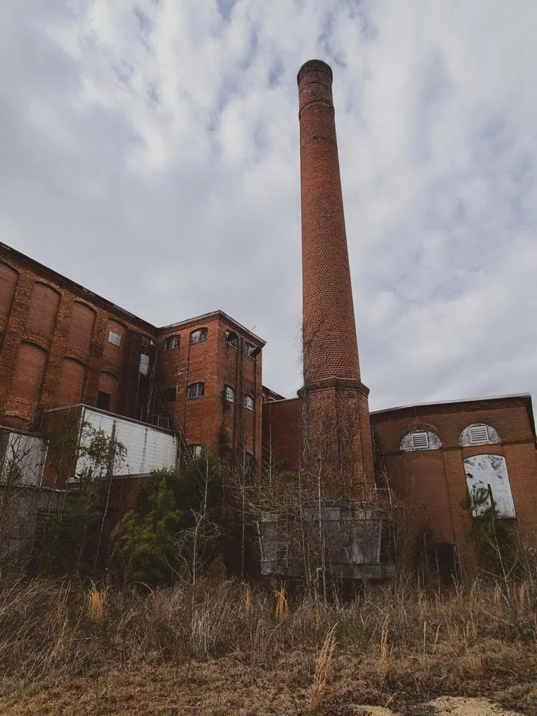
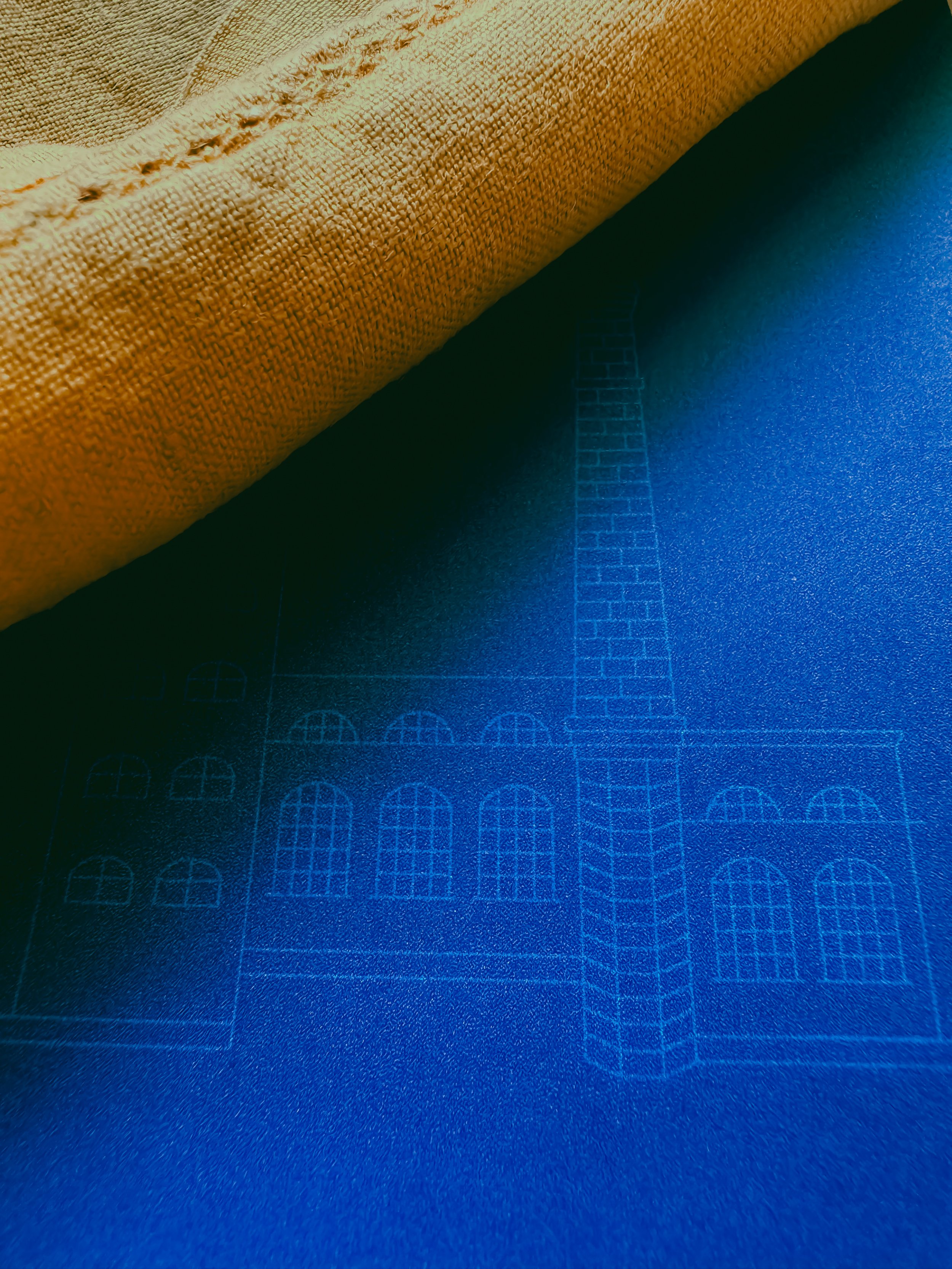
The client sent me photographs to help with an accurate rendering of the smokestack and the pool-side facade of the property. While it was not the “front-face” of the building, we agreed that it should feature prominently in the branding - an iconic artefact of America’s industrial age, and a cherished local landmark.
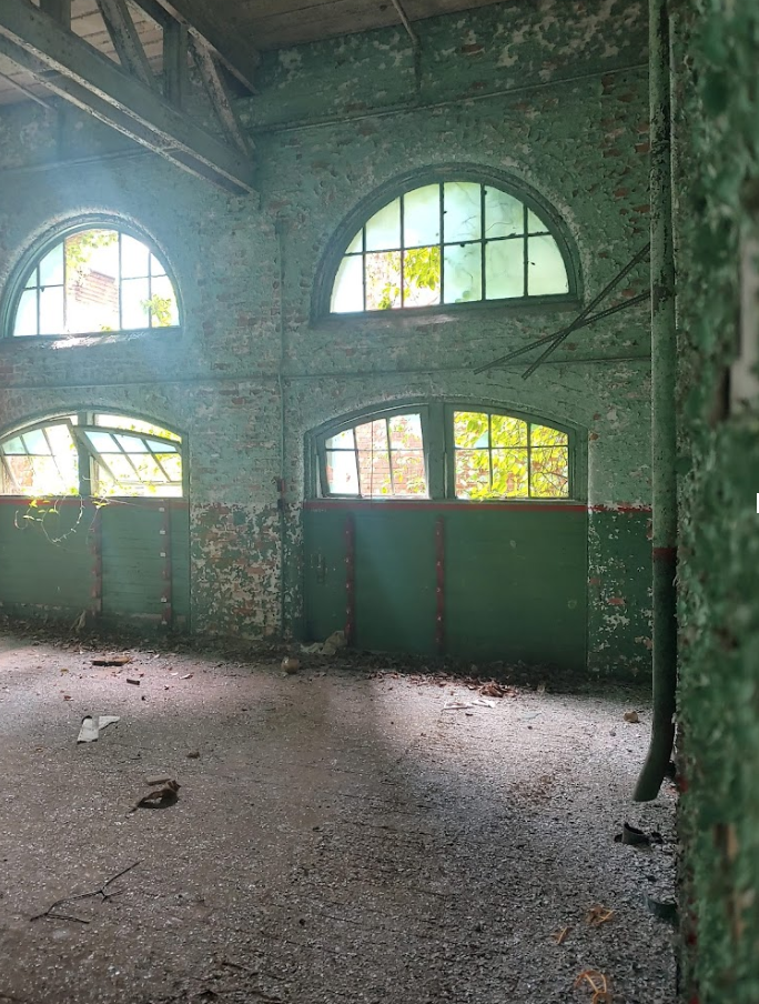
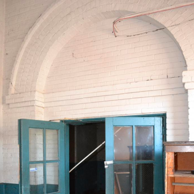
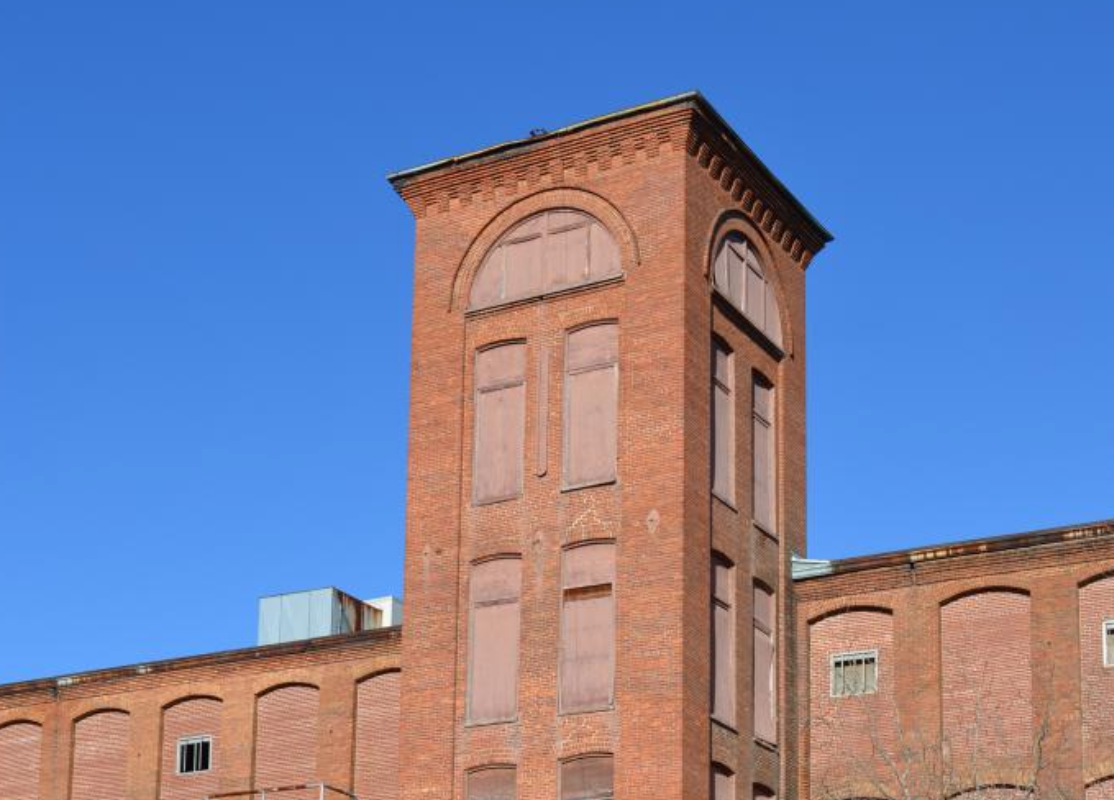
Architectural Details
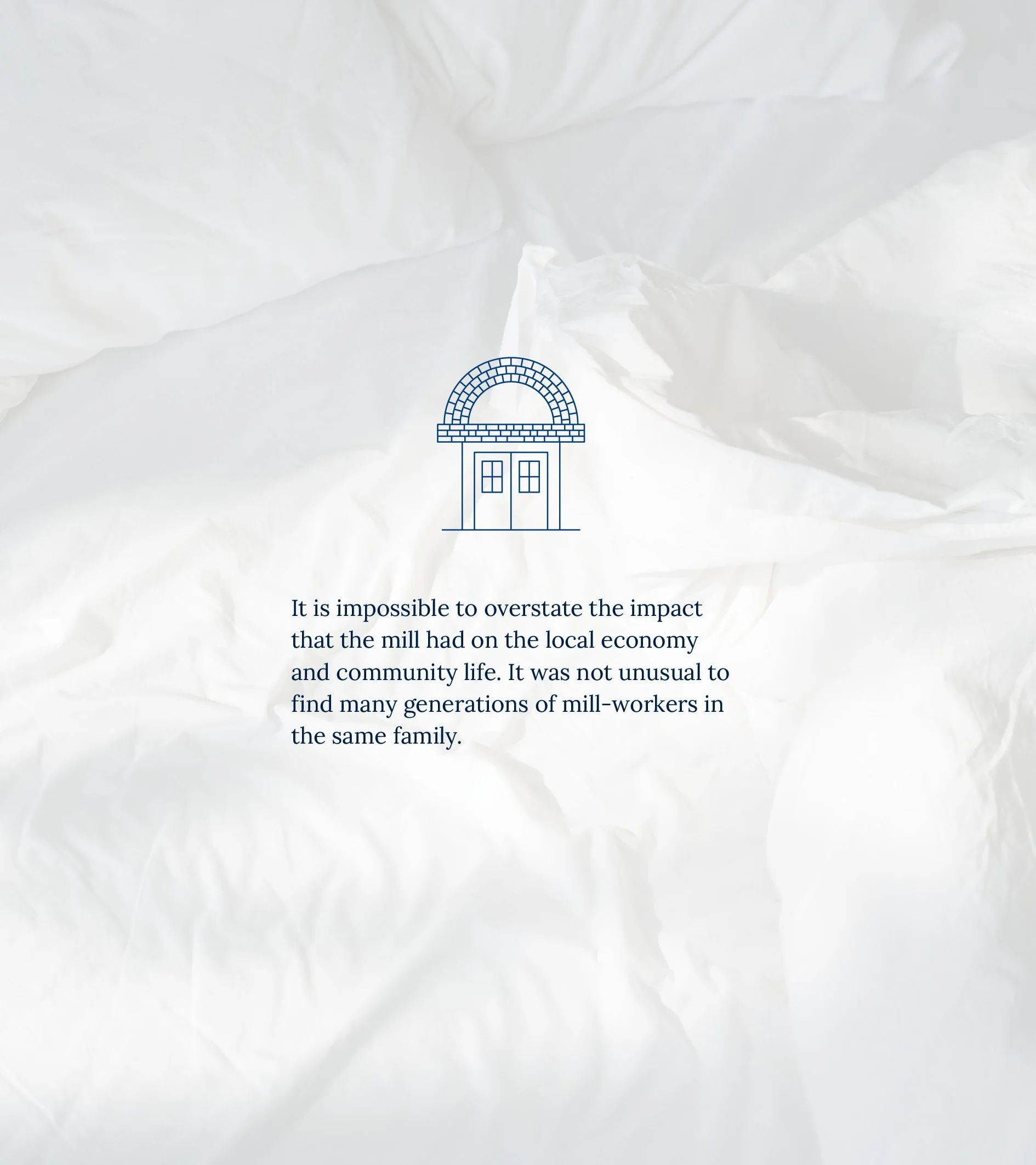
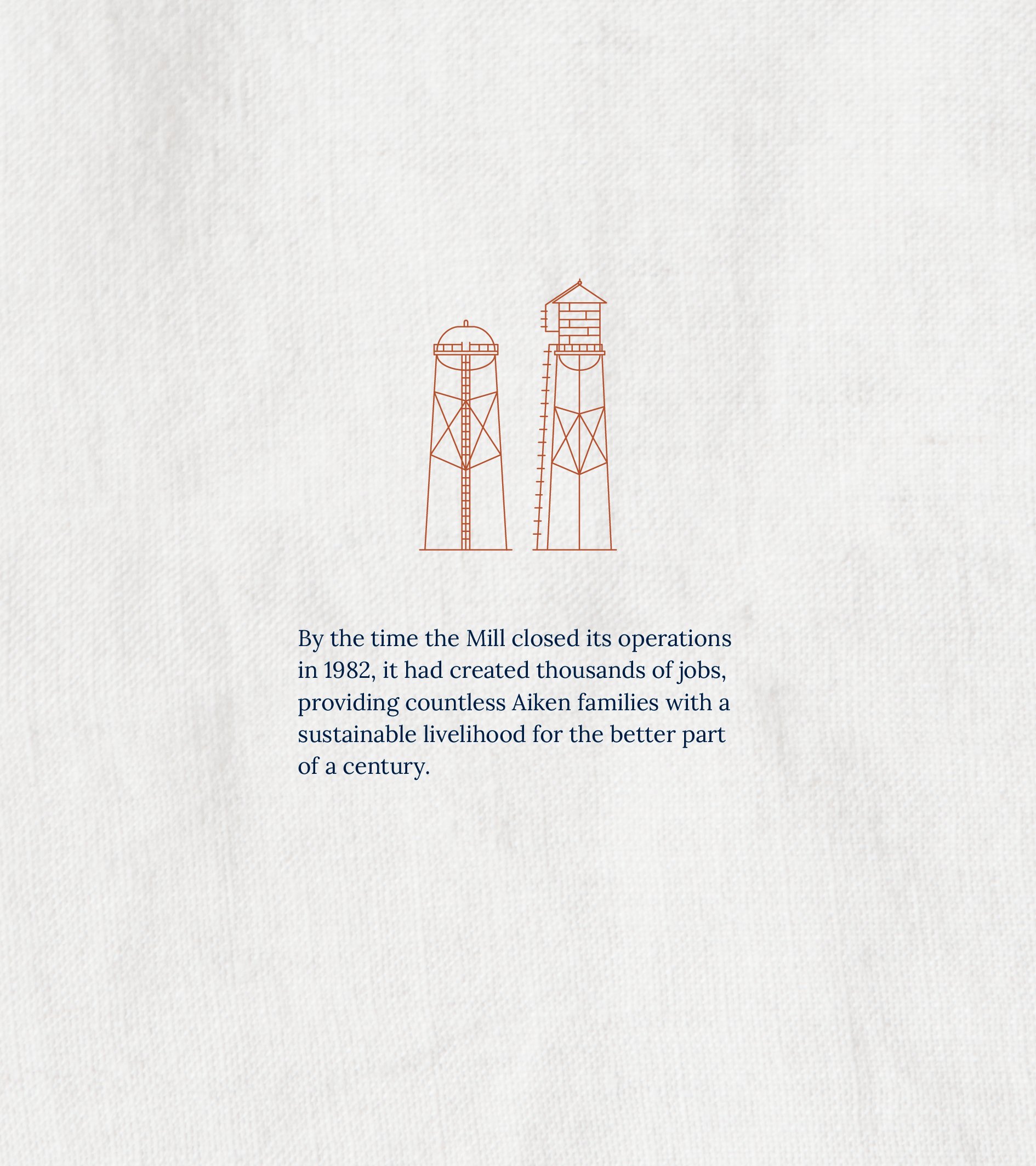
From the various photographs I was provided, I used some of the architectural details to create small line illustrations that could be used as graphic elements.
Just our type
From the start, we knew we were looking for a logo typeface with serifs and/or font contrast, to convey a sense of timeless elegance. Since it was clear that the wordmark would often feature without the smokestack, we also needed something that didn’t look too generic. Further, the protracted character length of the brand name - “Warren Mill Lofts” - meant that the word forms wouldn’t be easily memorable without a bit of help. In short, we needed: a serif typeface, with distinction and character, elegant but not too serious, relaxed and friendly but not flimsy, condensed but very readable.
With its soft serif edges, bold character forms, and just a hint of vintage, Jambore fit the bill perfectly, and then some.