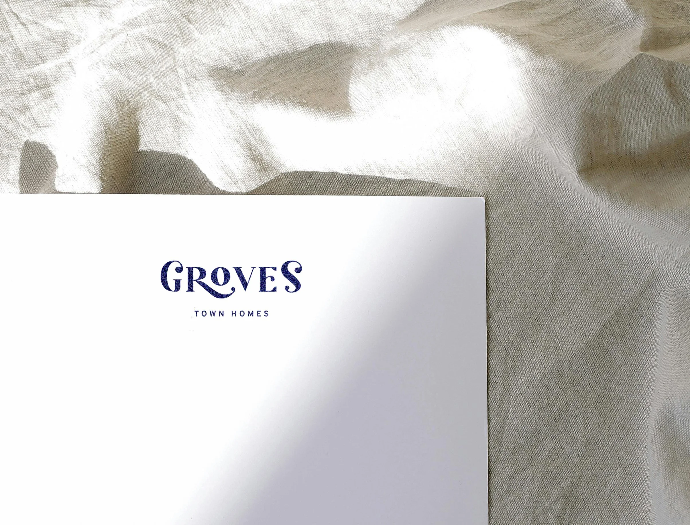
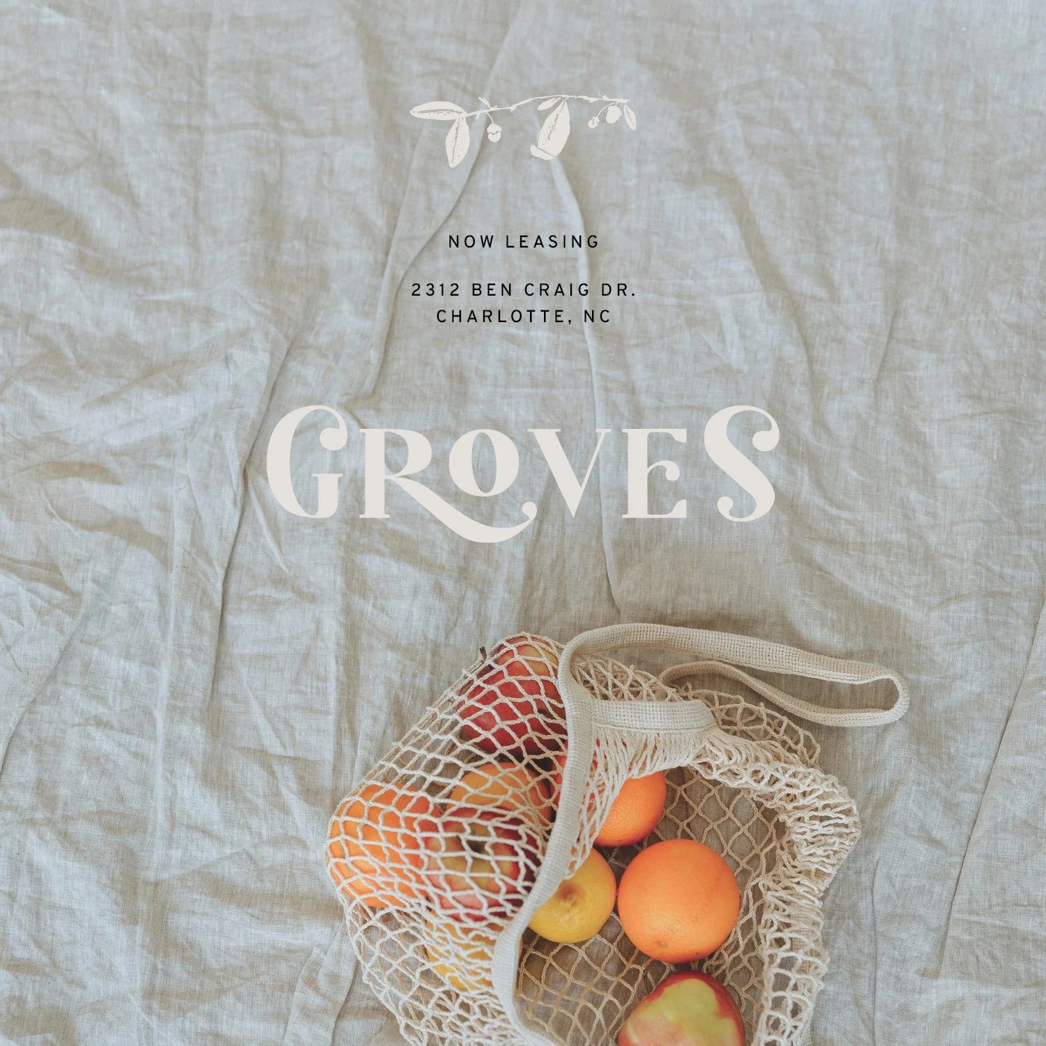
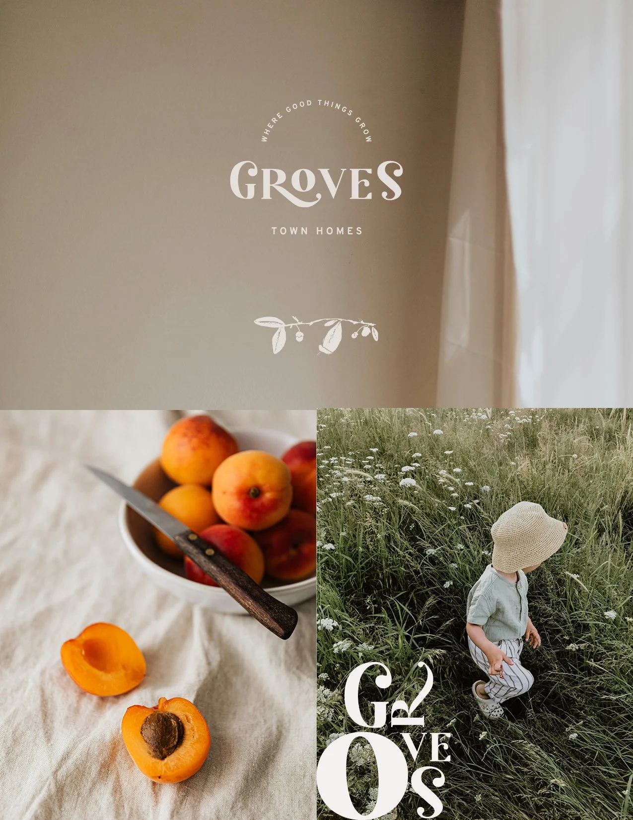
Groves Town Homes
residential apartments, charlotte, nc
brand language
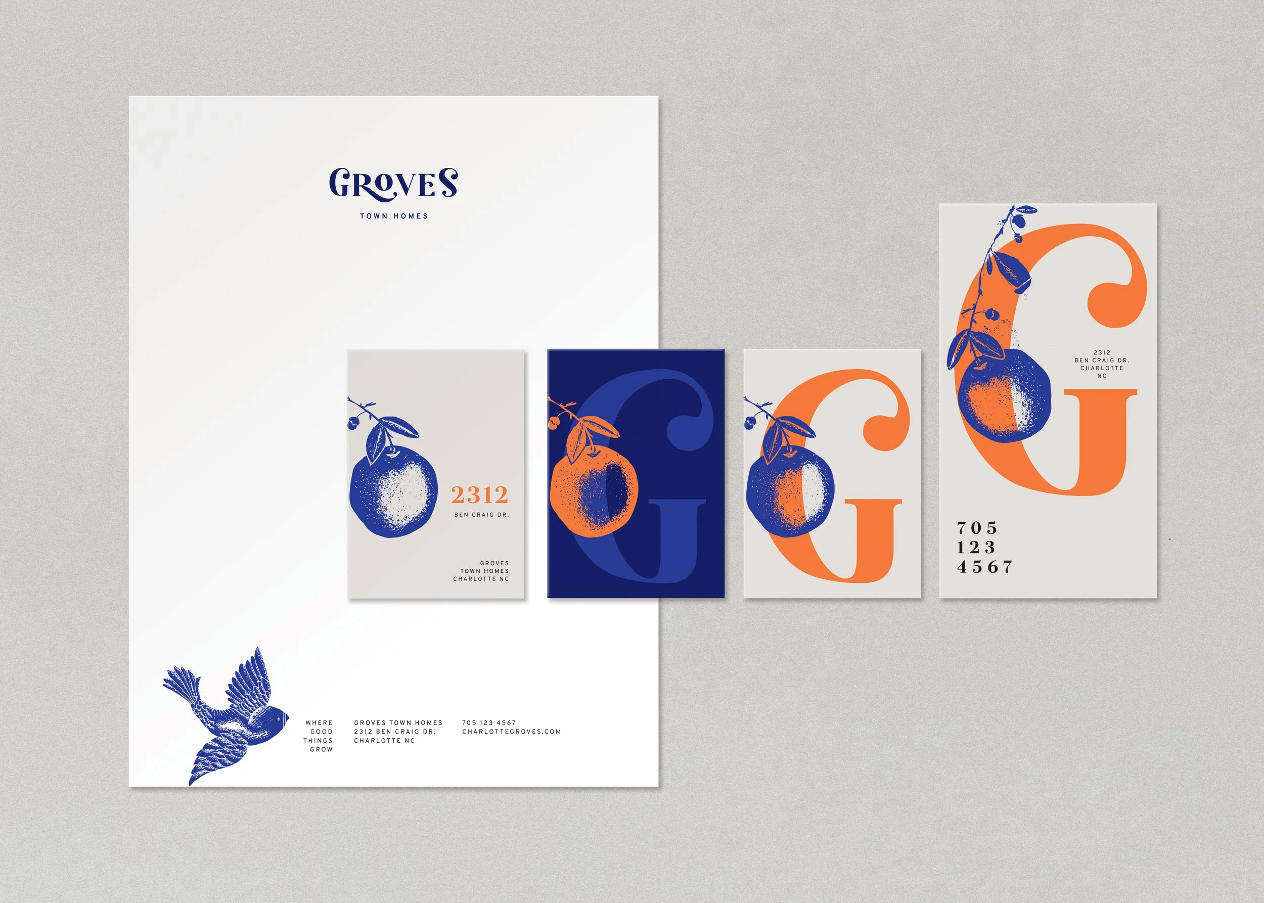
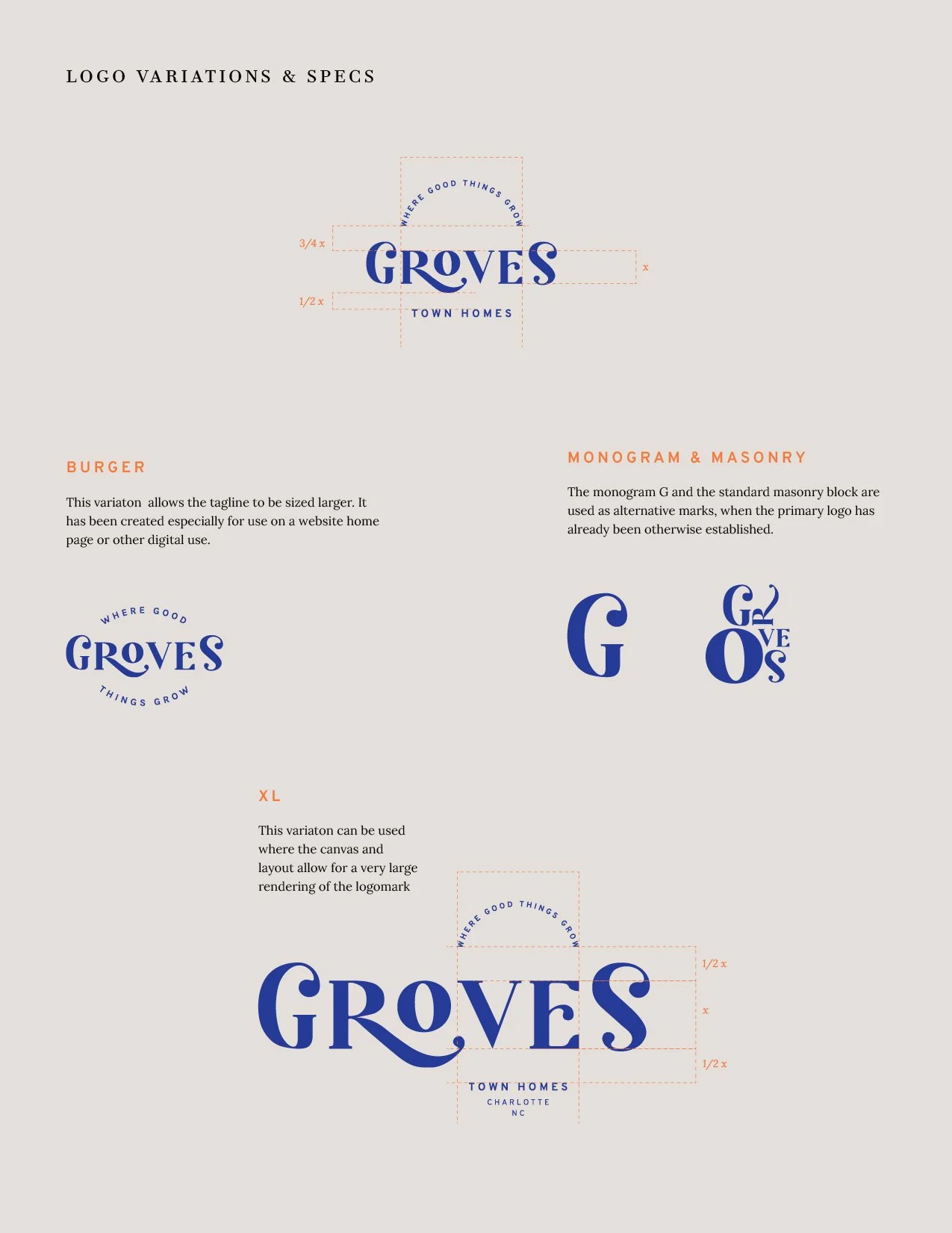
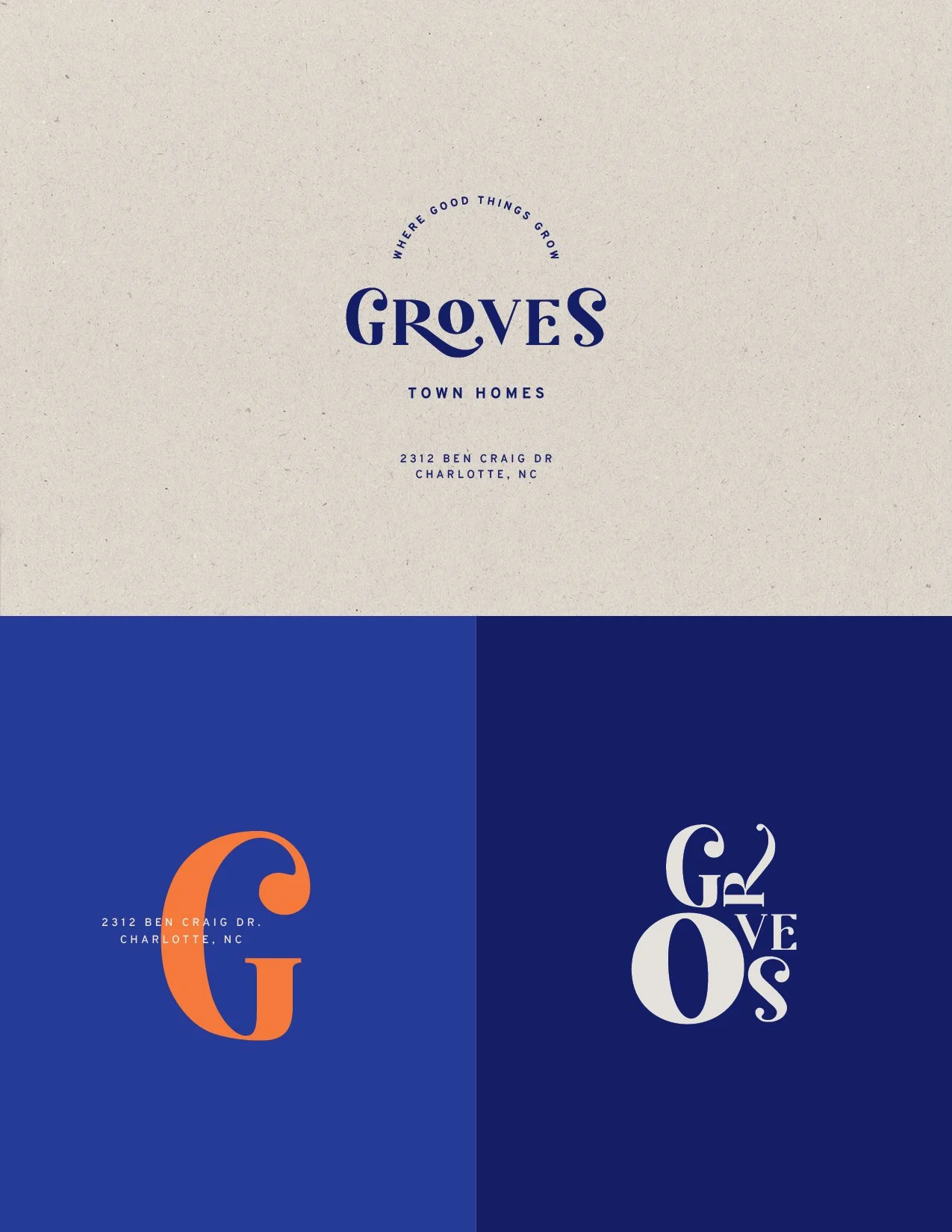
logo & alternative marks
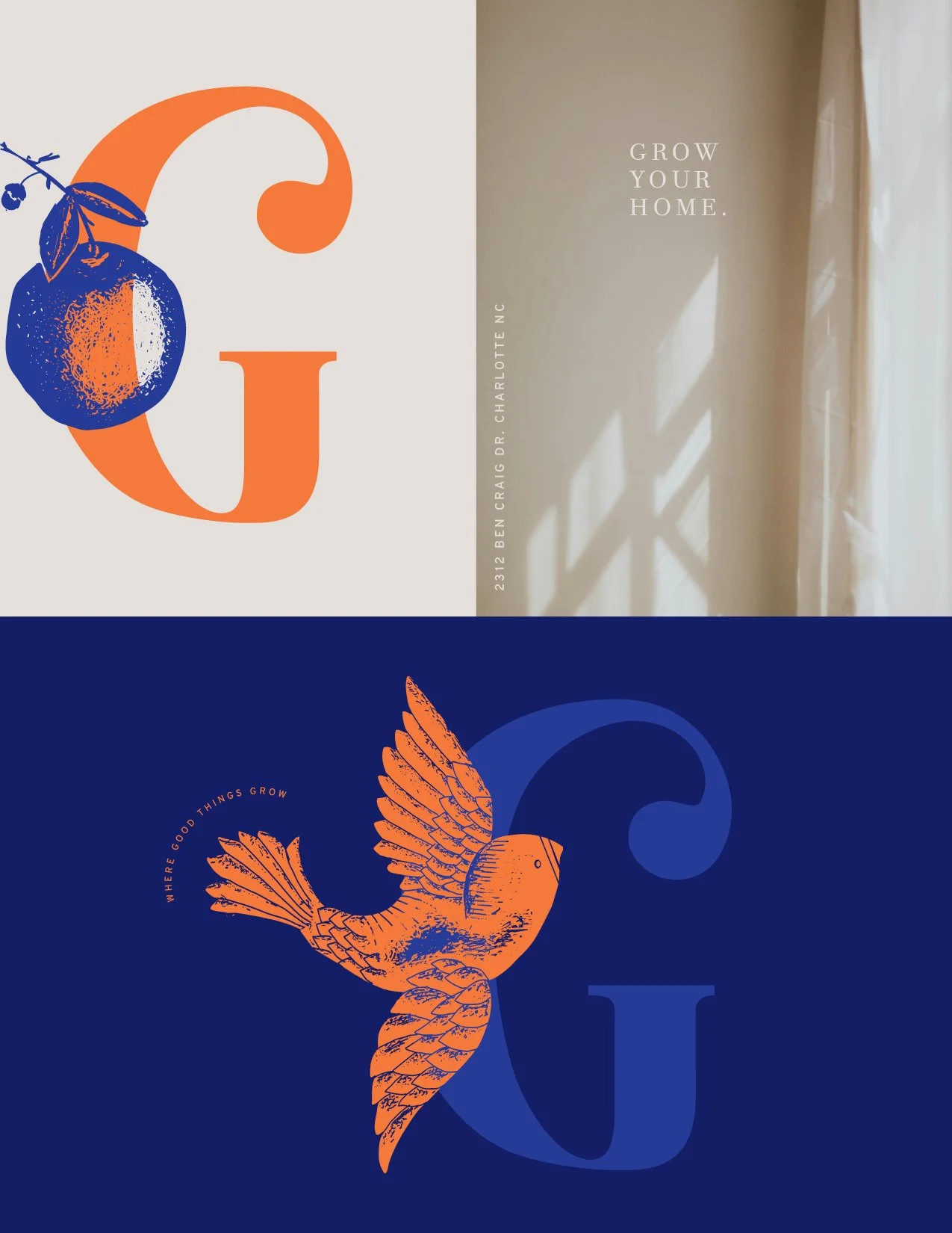
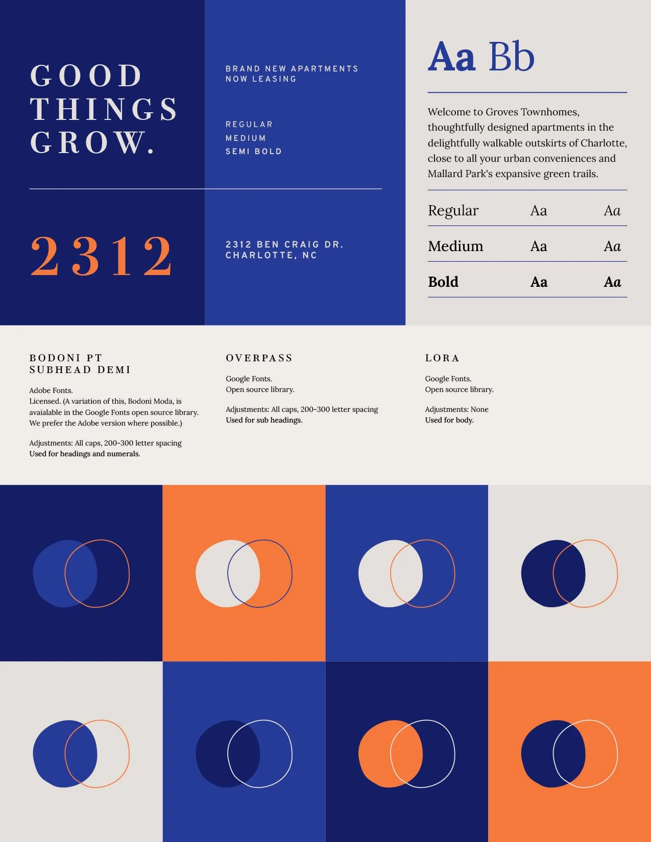
Colours & Type
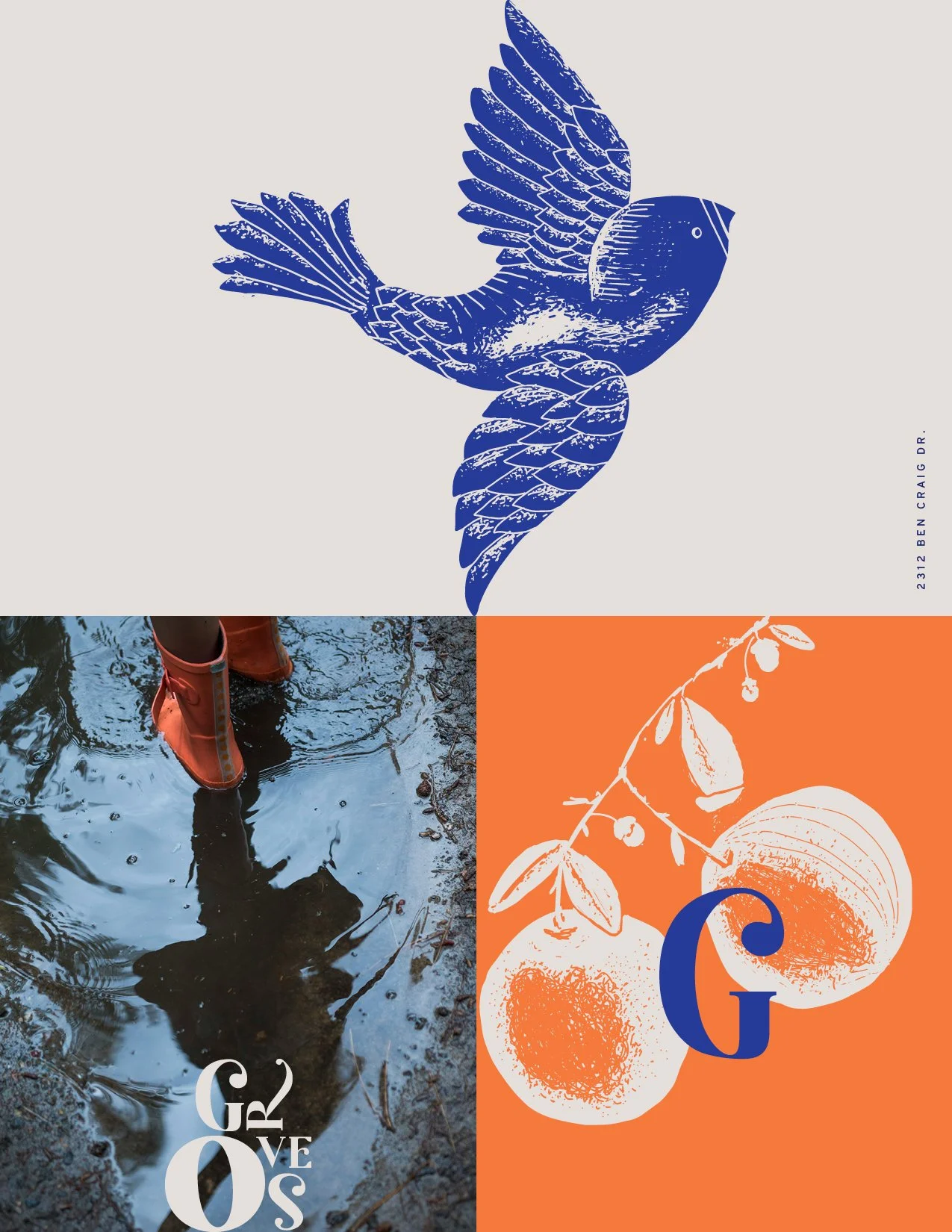
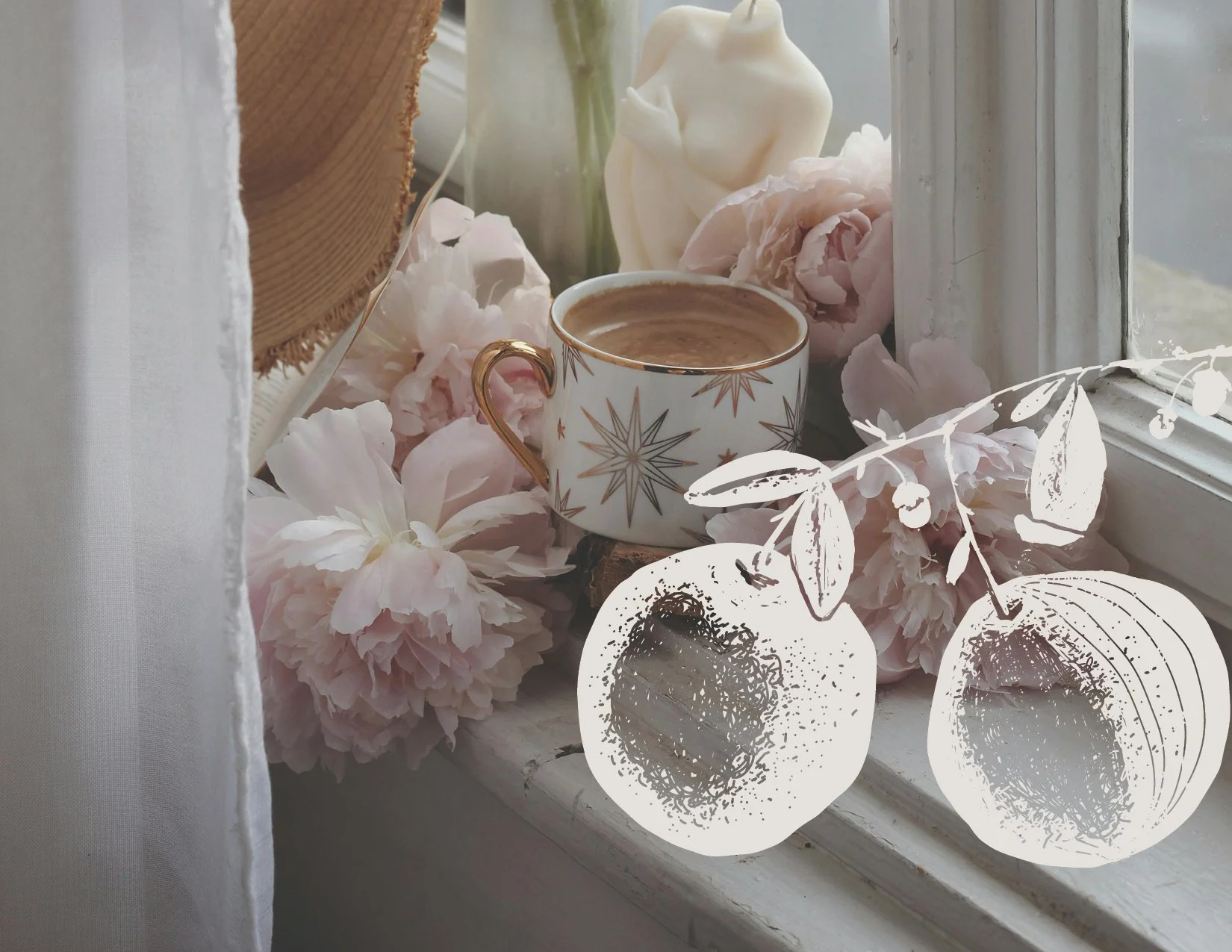
illustration
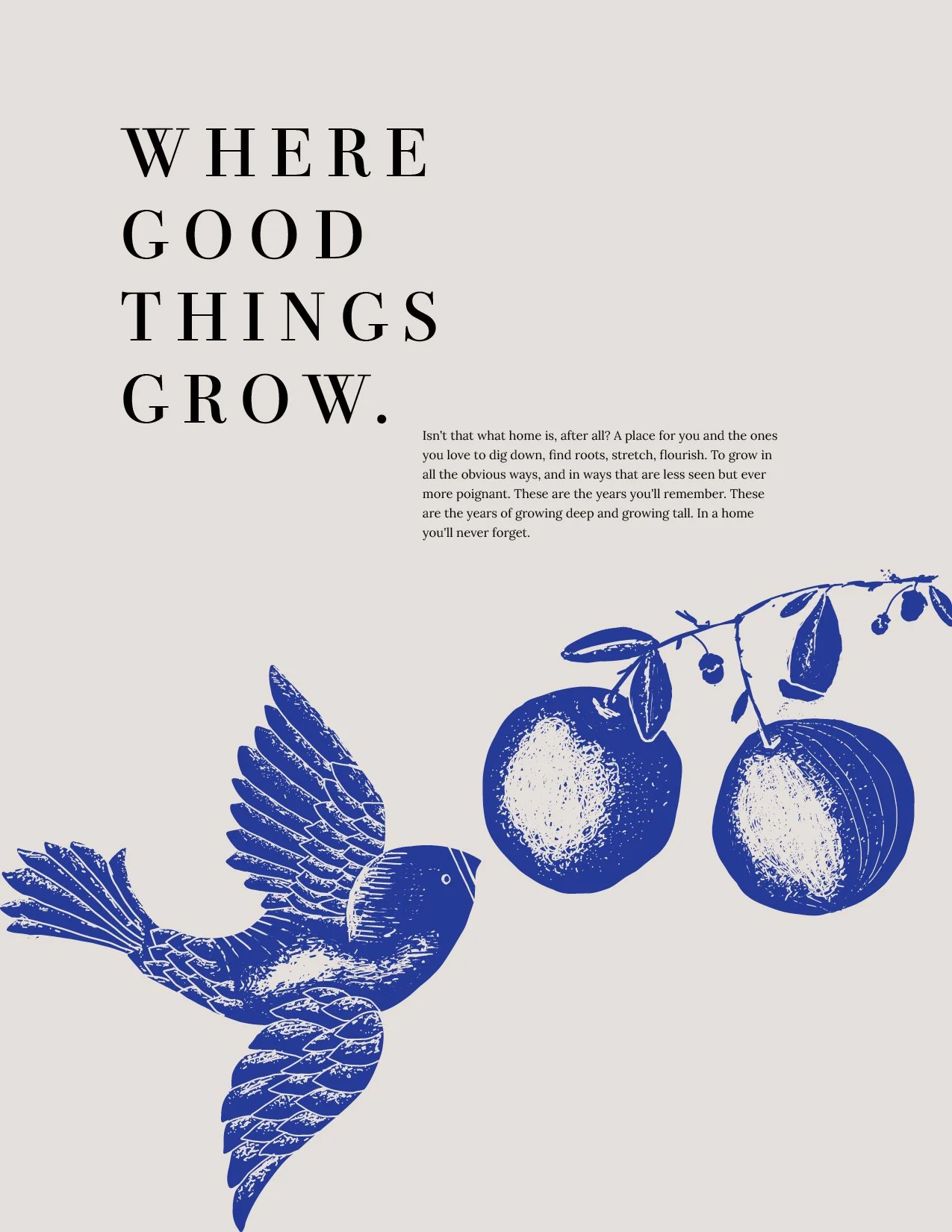
Groves. They gave me the brief and we agreed – no earthy greens and browns. We went bold. Vibrant. Purple. Orange. A little “wha–??” in the blur of middle-class rental residences. That edgy sort of luxury. Not the “money can buy” sort, but something more avant-garde, for anyone who can appreciate tasteful, thoughtful design and make it their own.
brand storY
Groves Town Homes were designed to be beautiful and young and fun, but entirely attainable for real people living real lives. I wrote the language to resonate with our primary target audience - up and coming families, young families . We wanted them to think of these apartments not as just rentals, but as places they could call home for some of the best and dearest years of their lives, where they raised little humans and dreamed big dreams. Of course, thats what a grove is - a place where good things grow.
mark & motif: “growing things”
The primary logo is a typographic wordmark loosely based on the serif font Kage by Ballibilly Design, extensively stylized. The mark has a distinctly memorable shape and form. The "G" is charmingly monogrammable. The letterforms of the wordmark are stylized in an interlocking block as an alt mark.
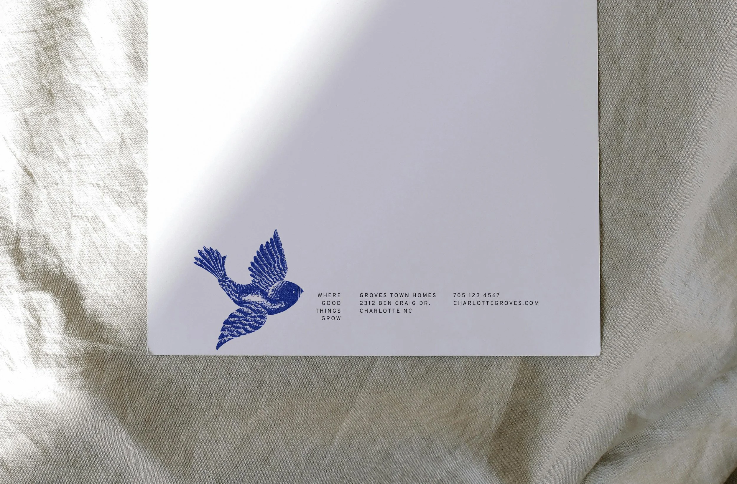
I designed a set of two artisanal, hand drawn illustrations – a young bird in flight and a branch of citrus fruit, both reminiscent of springtime and seasons of growth. These were used in different configurations across various collateral.