Page & Holmes
wedding photographers, vancouver bc
logo design
brand language
website (squarespace)
The creatives behind Page & Holmes have also been darling friends of mine for over 15 years. I designed their first logo over a decade ago, and suffice to say that over the years, both they and I have evolved significantly in our art and craft. Serendipitously, in the same direction. So it brought me a great deal of joy and pride that we could collaborate again on a make-over.
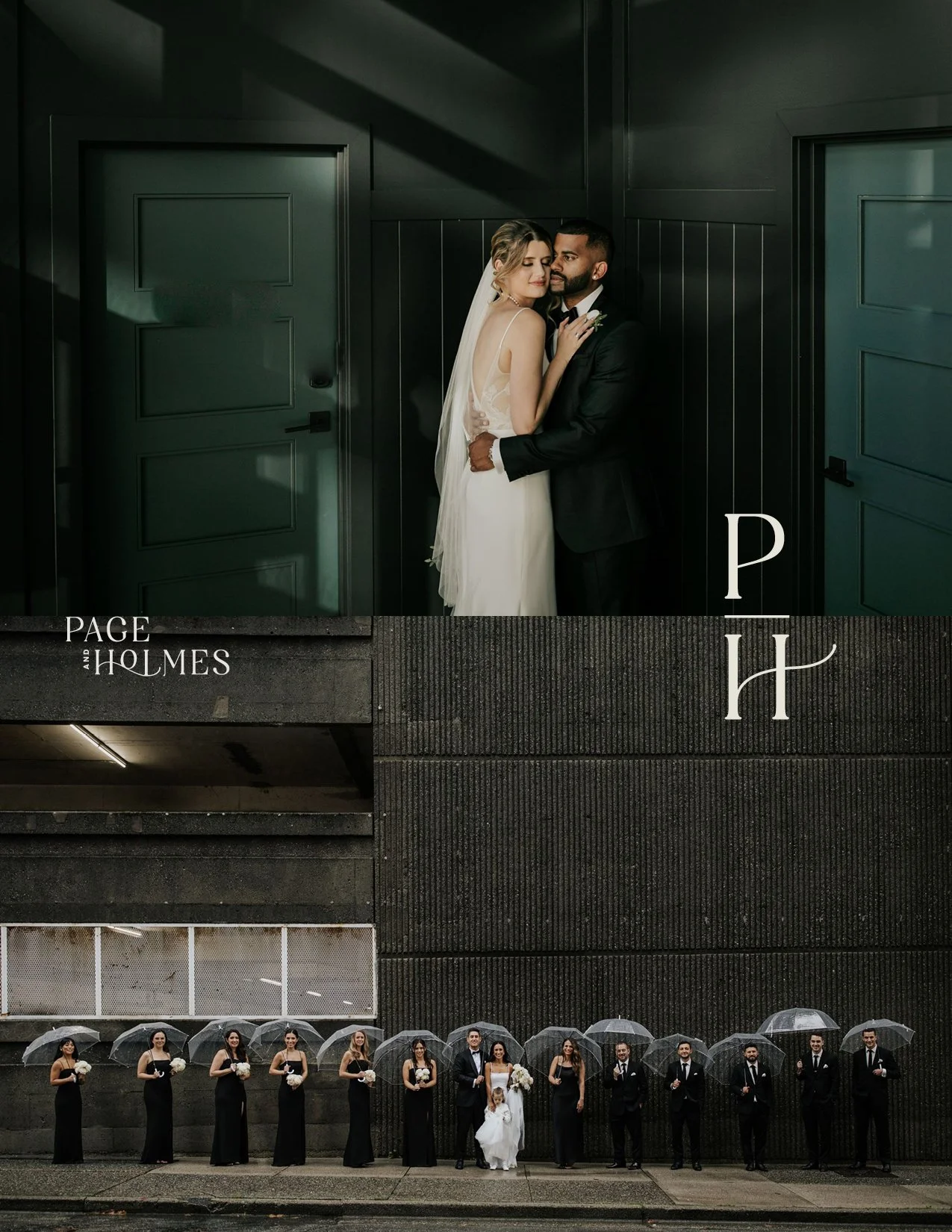
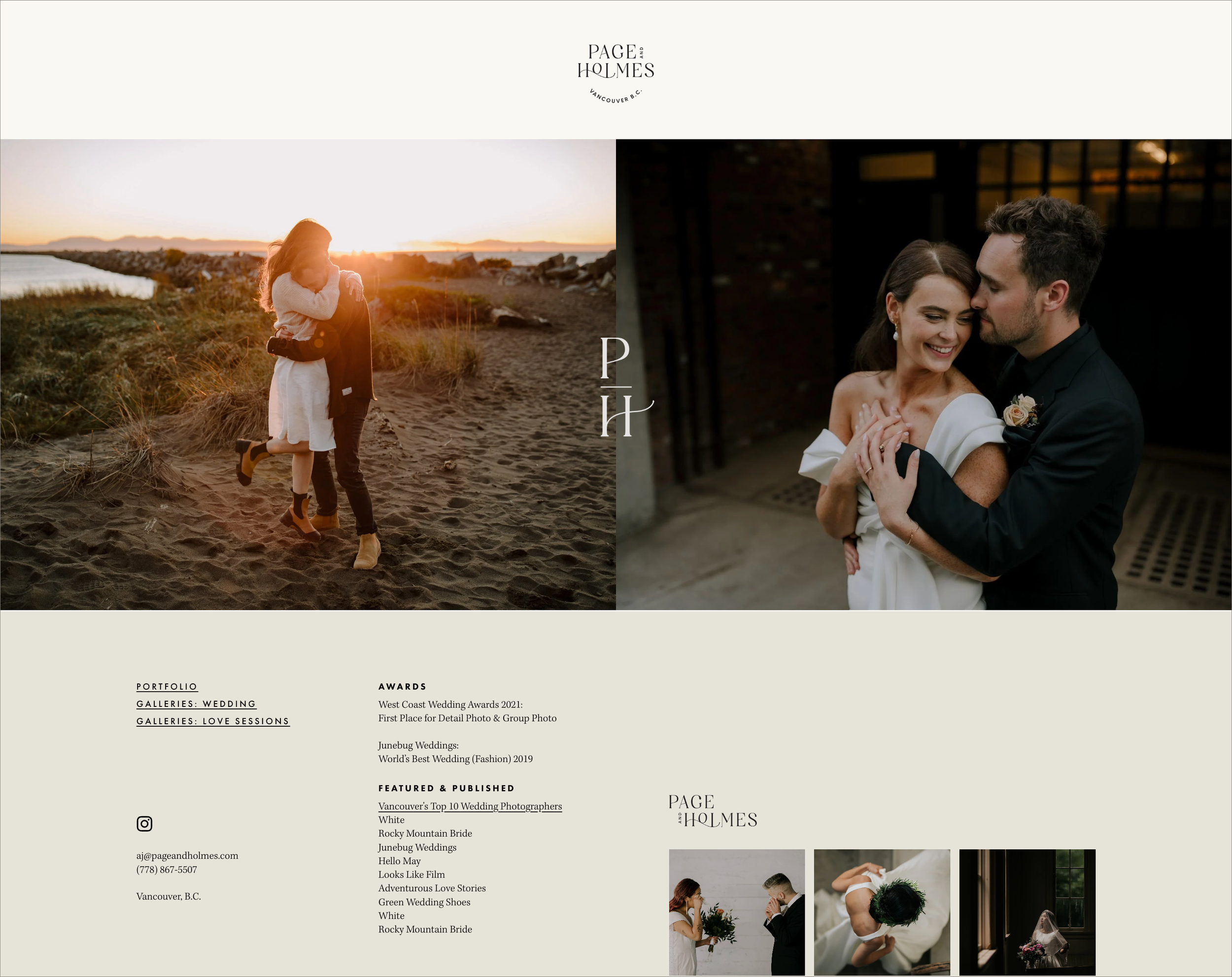
logomark
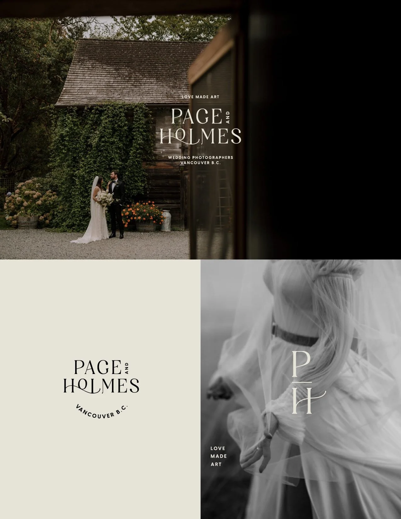
Previous iterations of their logo had included intricate hand-drawn and vintage elements, but we agreed we wanted to avoid anything too trendy or “artisanal”, in favour of something more elegant and timeless. As wedding photographers in one of the most beautiful cities in the world, we wanted the logo and brand to match the elevated sophistication of their art, their clientele, the sort of venues they showcase, and the publications that feature them.
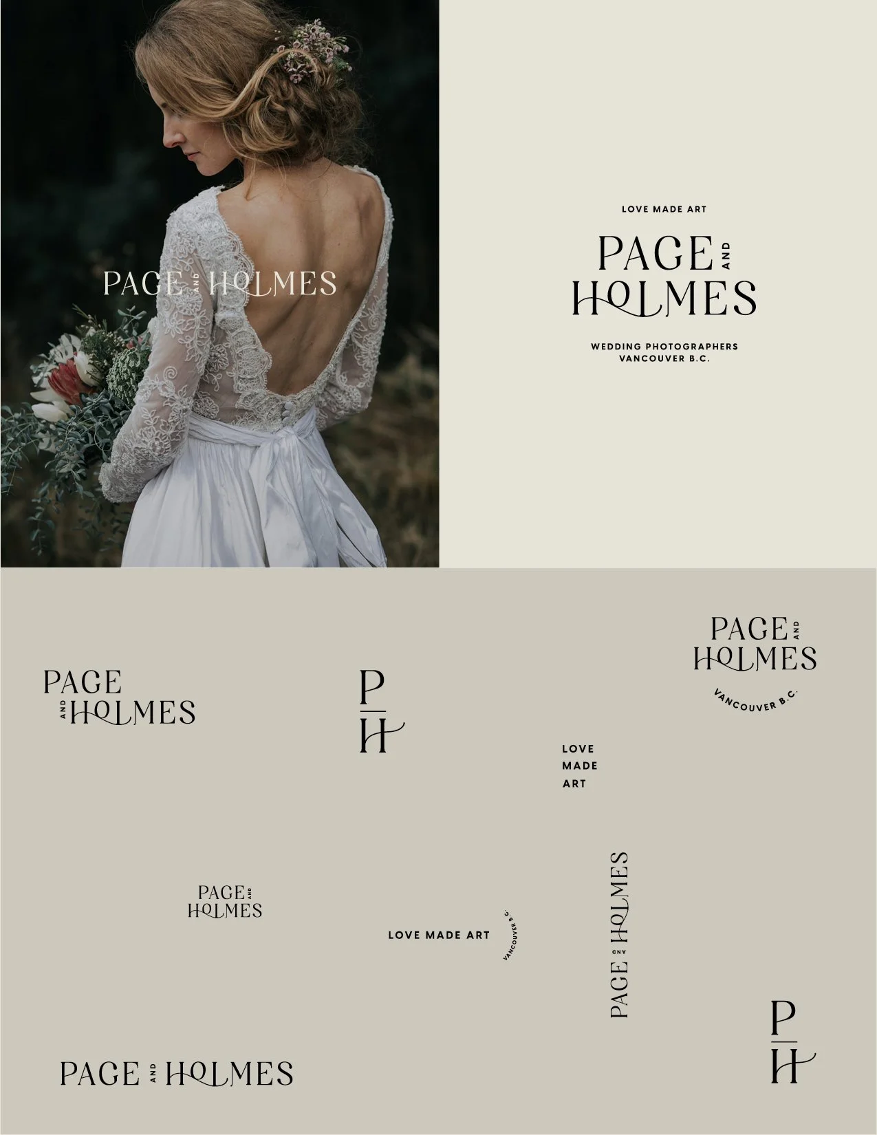
I tested several serif fonts with a variety contrasts and terminals, and landed on Simple Michael by Letterena Studios. After a generous amount of tinkering and stylizing, I arrived at a mark and variations that we were all delighted with.
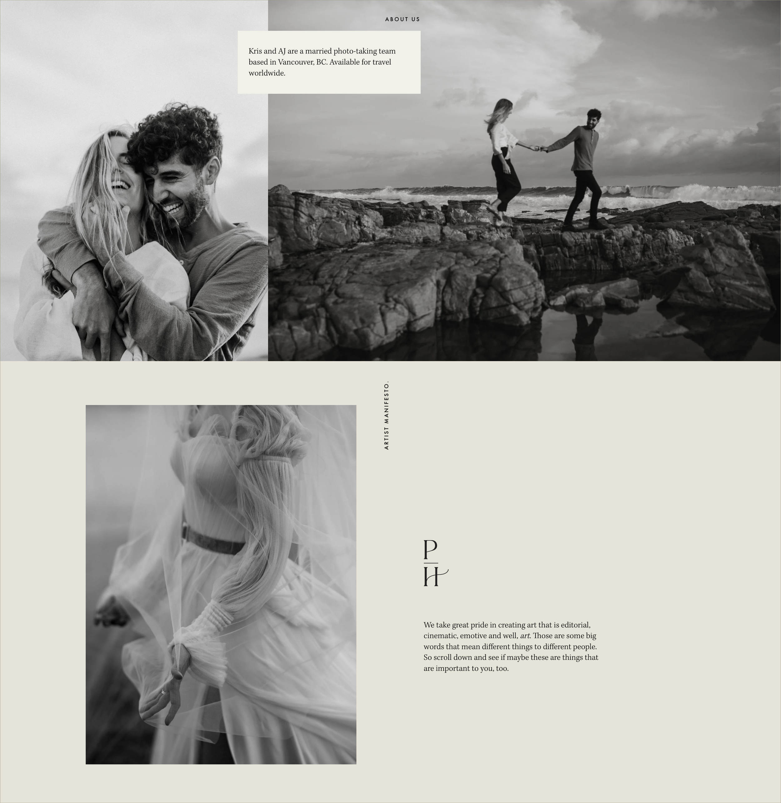
Artist Manifesto.
After interviewing my clients/friends (it helped that I knew them well), I was able to distill the essence of their style and ethic into four things. What started out as some copy for the website morphed into an Artist Manifesto of sorts. And the last of these four - “Love Made Art” - became the brand’s tagline with little effort.
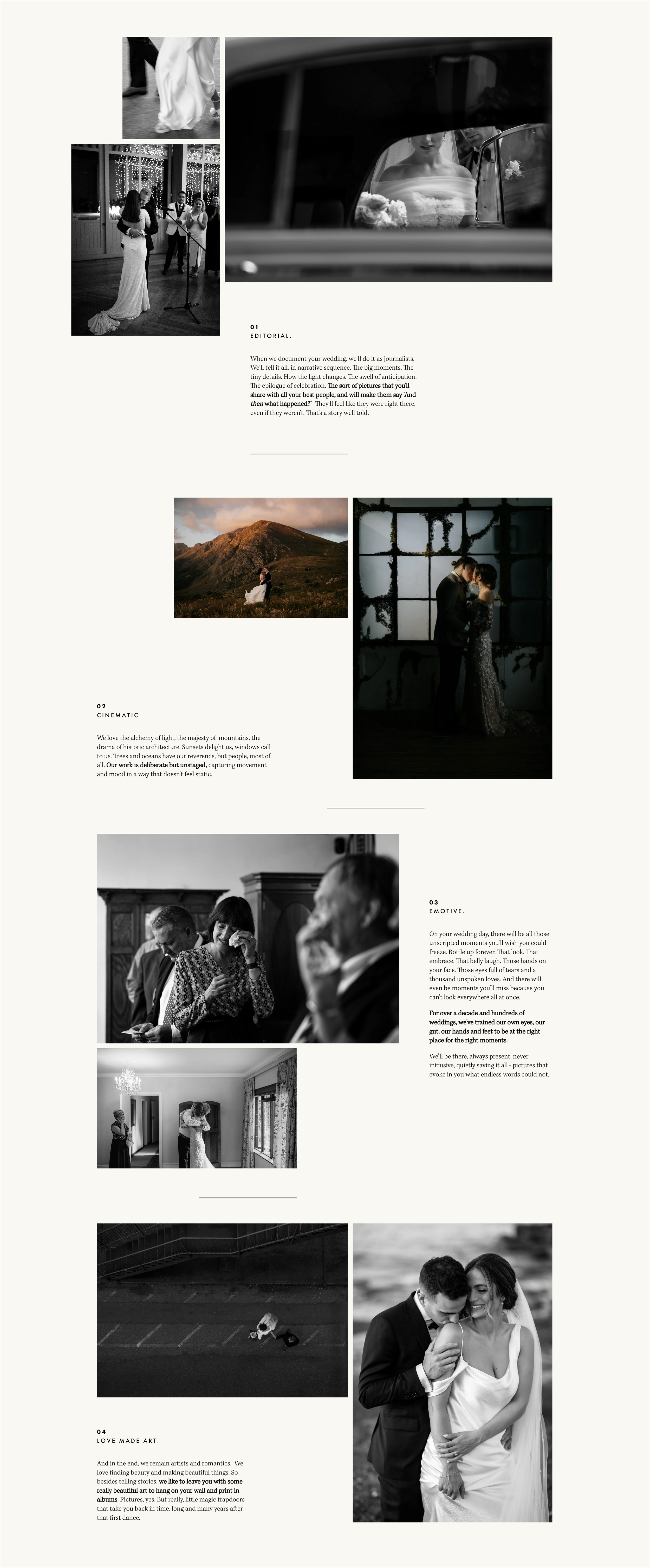
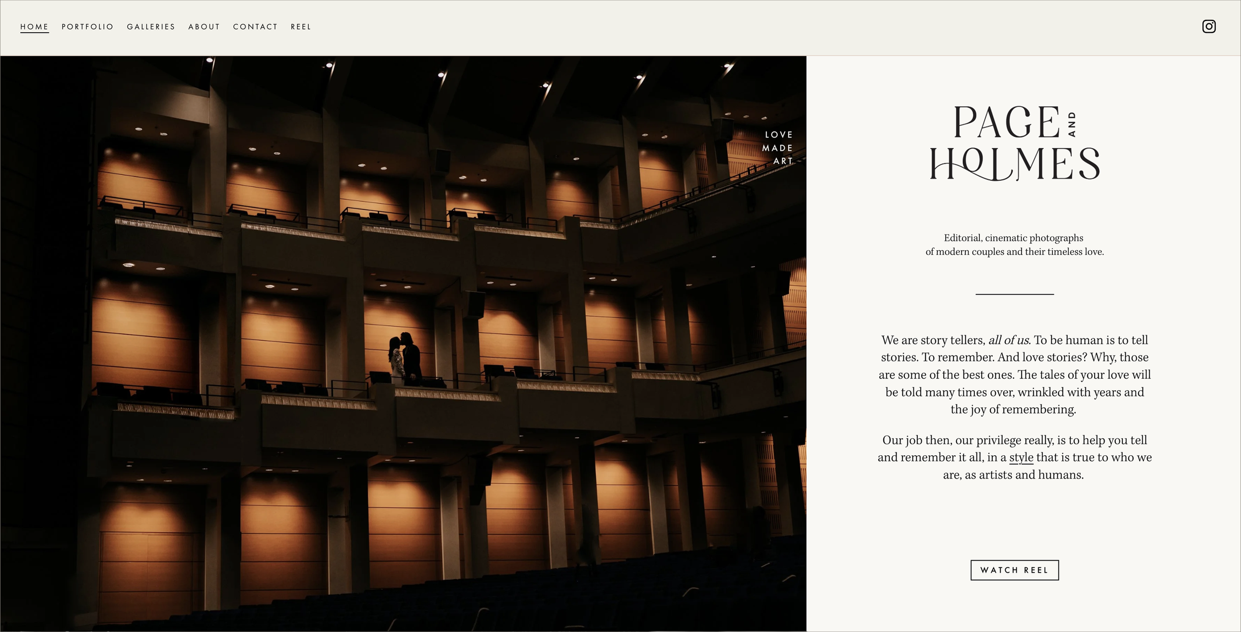
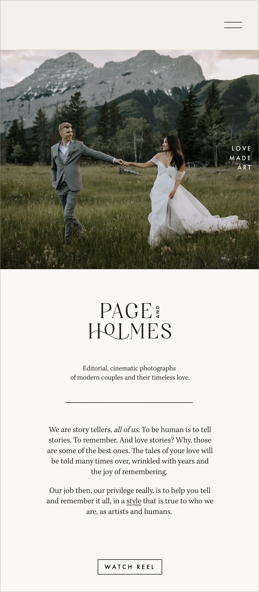
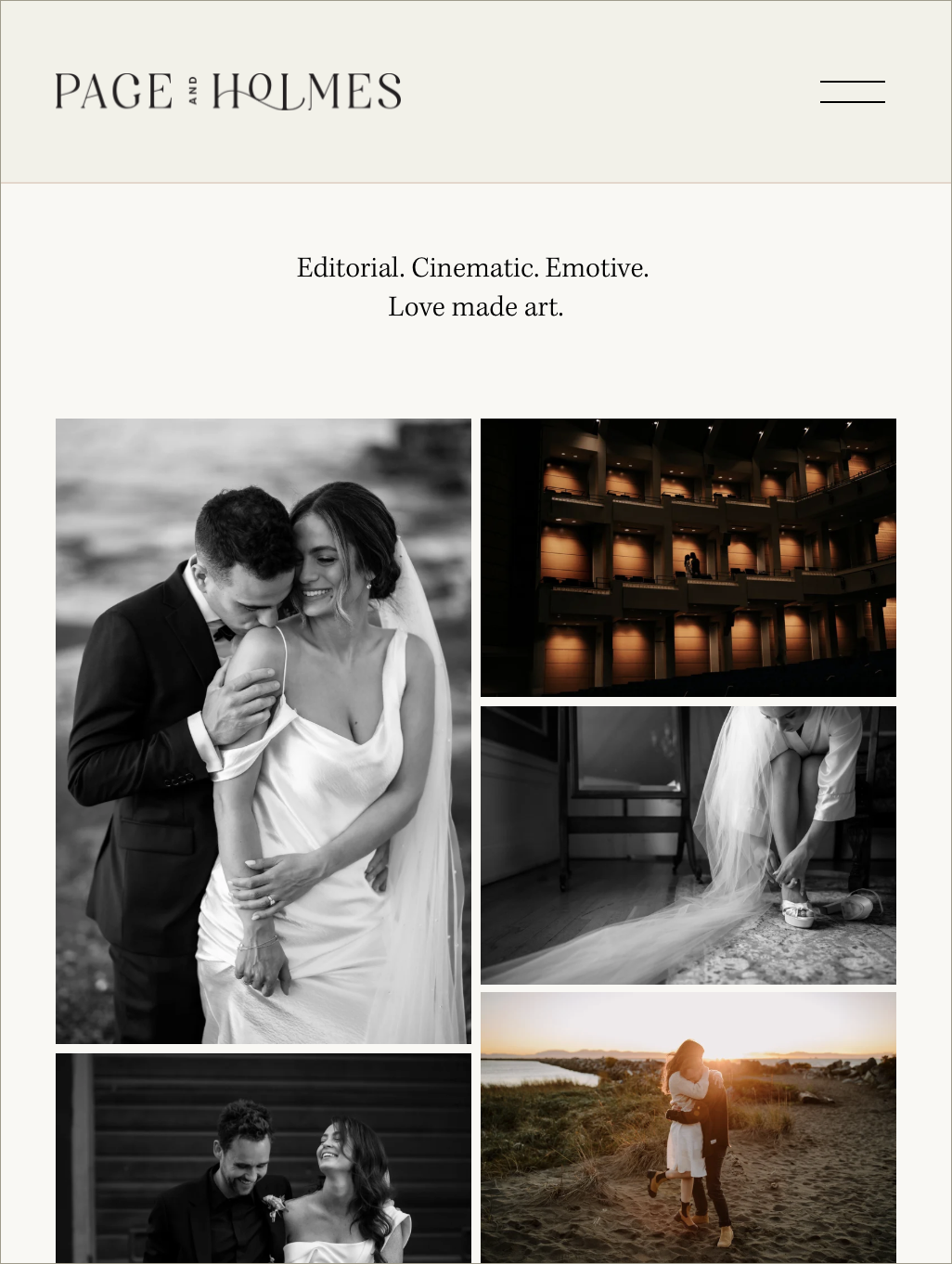
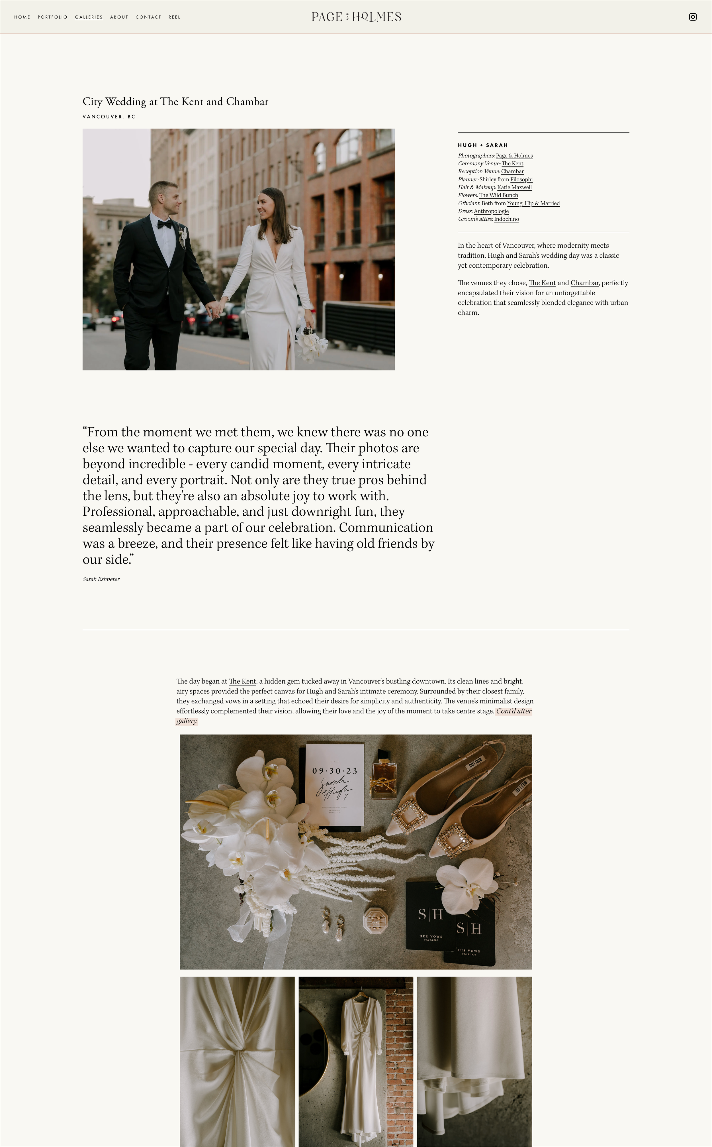
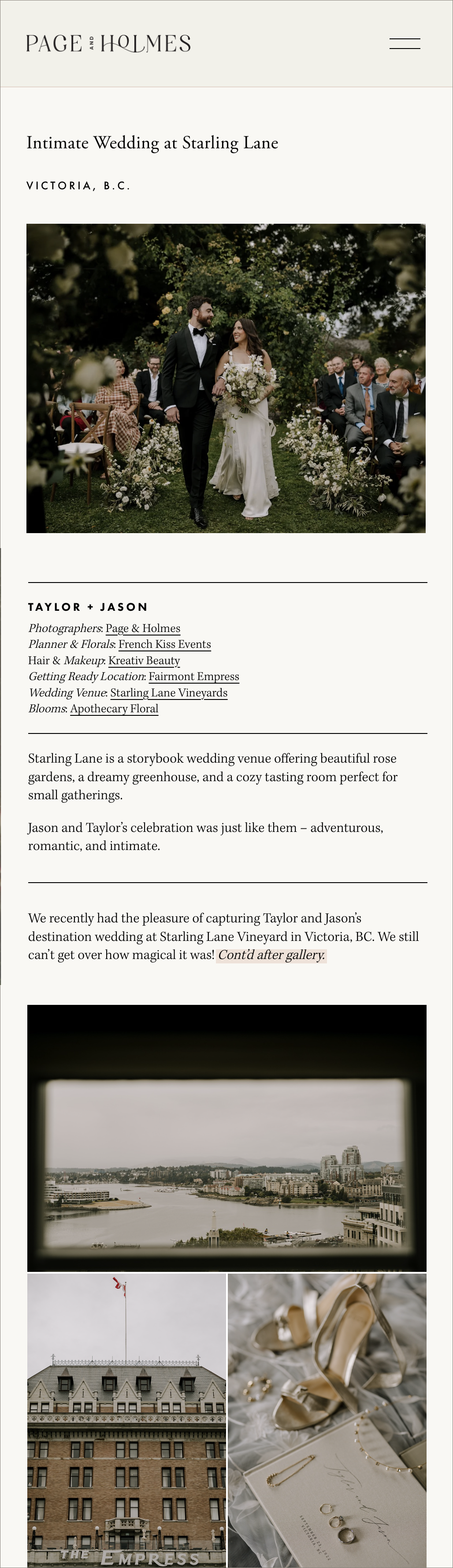
website design.
The responsive website was designed in Squarespace. Below are some screenshots, but you can visit the live site and view more of their spectacular work at pageandholmes.com