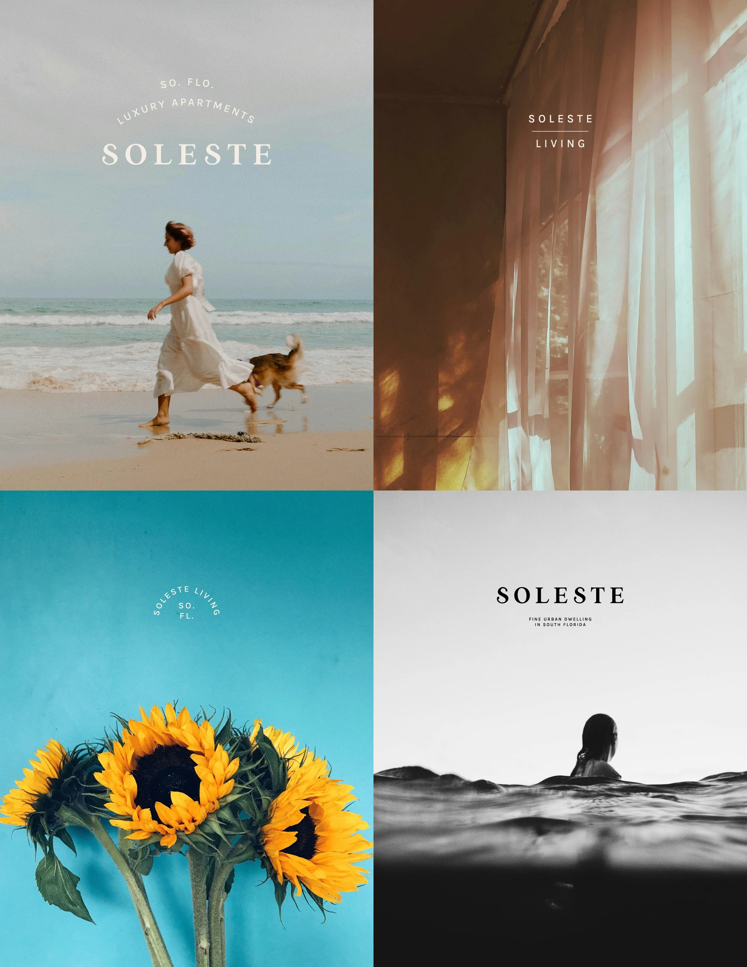
Soleste
luxury apartments in south florida
umbrella/parent logo, sub brand logos
alt marks, unified brand system
illustration, print collateral
bACKGROUND
Soleste is the parent brand for a large portfolio of luxury apartments in South Florida, most of them by or near the ocean. These multi-family residential and mixed-use complexes each have their own distinct branding, target demographic and unique local flair. I was first hired to work on some brand elements for one of their properties, Soleste Spring Gardens. During that project, it quickly became apparent that their existing brand system lacked any sense of cohesion. Their parent logo used an ultra-thin font that was barely legible. The individual properties didn’t have any strong sense of identity - neither uniformity nor differentiation, where each was needed. The clients agreed, and soon after, we did a complete brand overhaul.
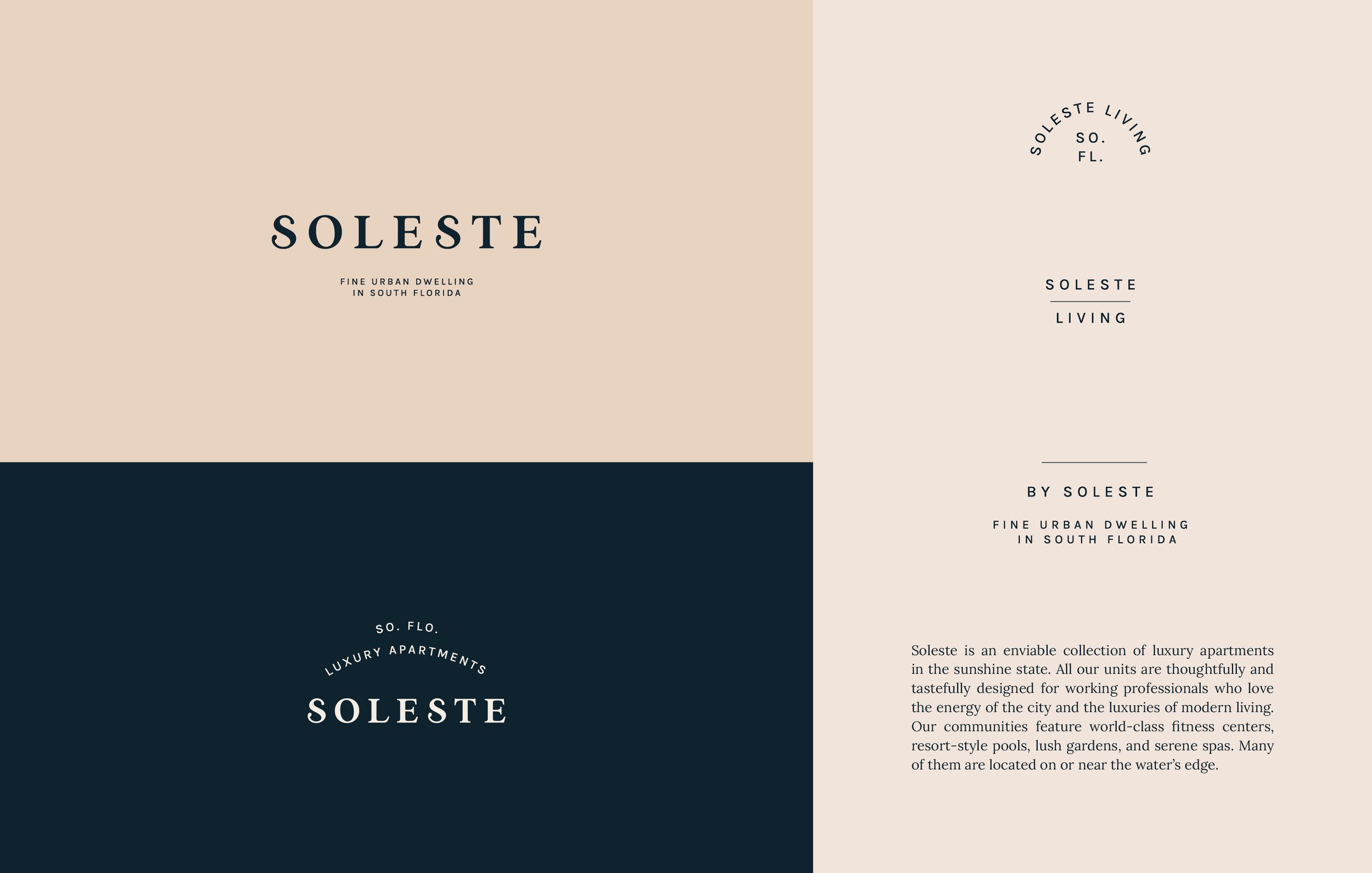
PARENT BRAND
First, I created a standalone logo for the parent brand – that would be used for higher level, corporate communications. Alternative marks included ones for Soleste Living, their related lifestyle brand, and a few small, inobtrusive marks that could be used in concert with the individual property logos.
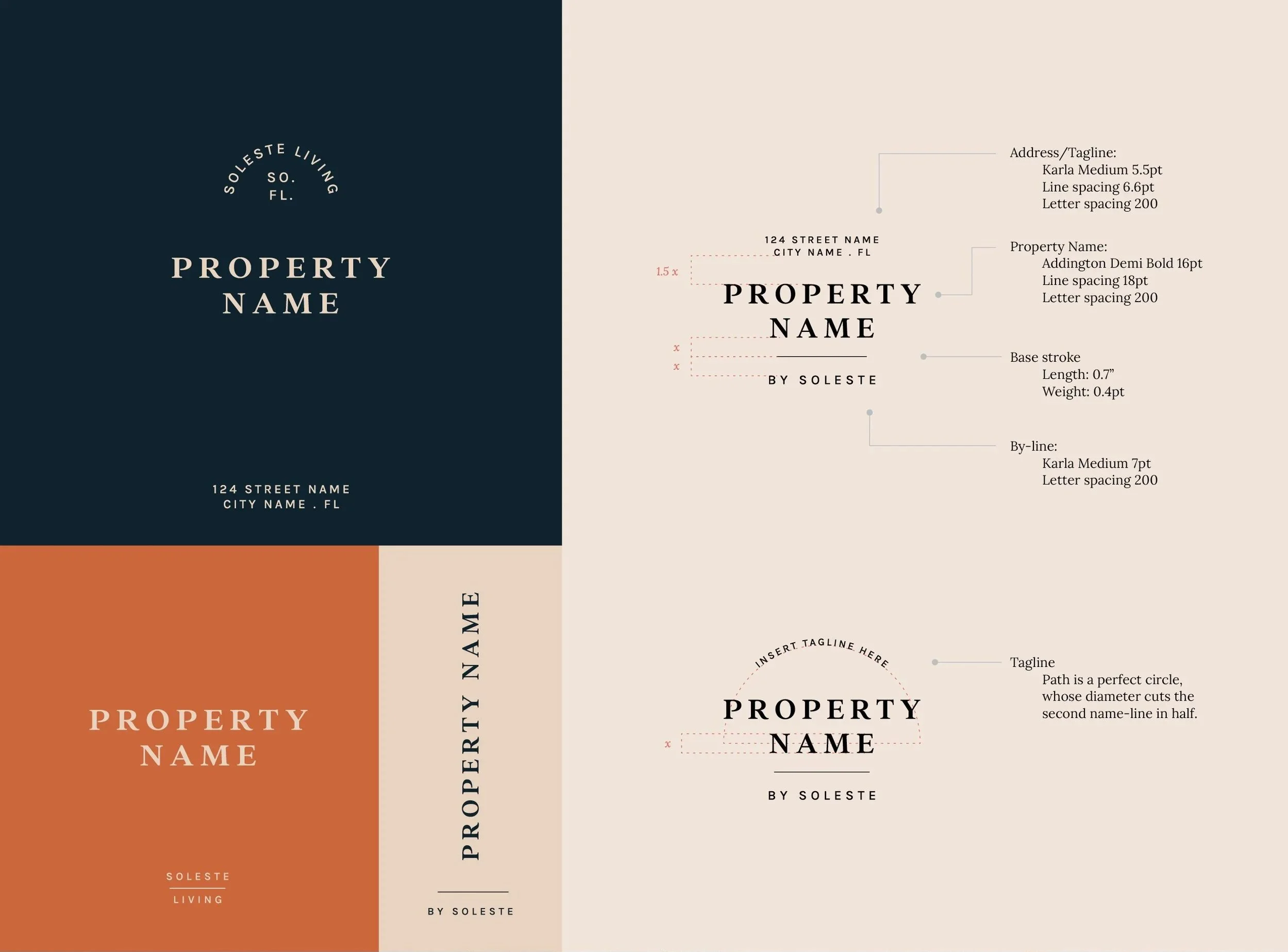
one master template
Then I created a standard template, that would be used for every property in the Soleste portfolio. These could be used with the smaller supplementary marks we created for the Soleste Living brand.
WHAT EVERY FAMILY NEEDS:
UNIFORMITY & DIFFERENTIATION
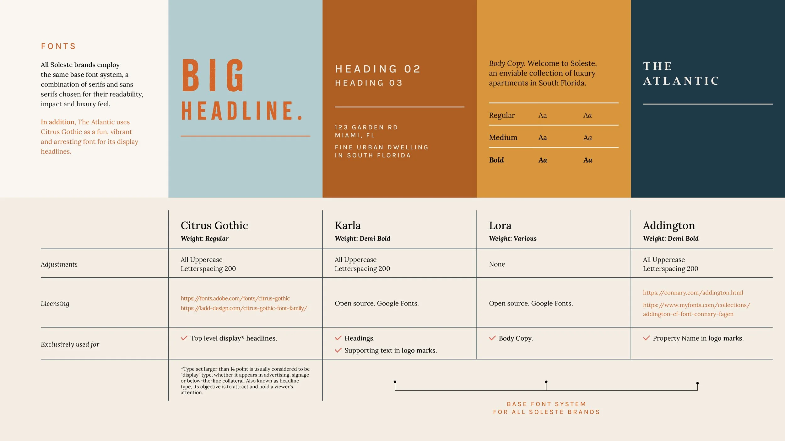
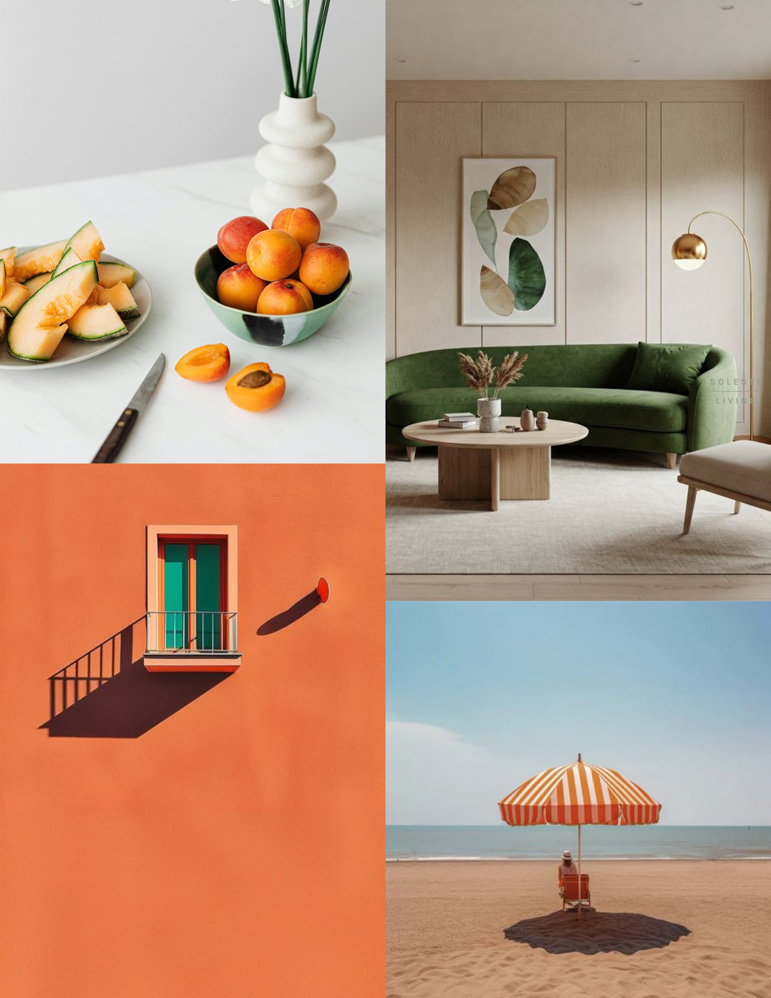
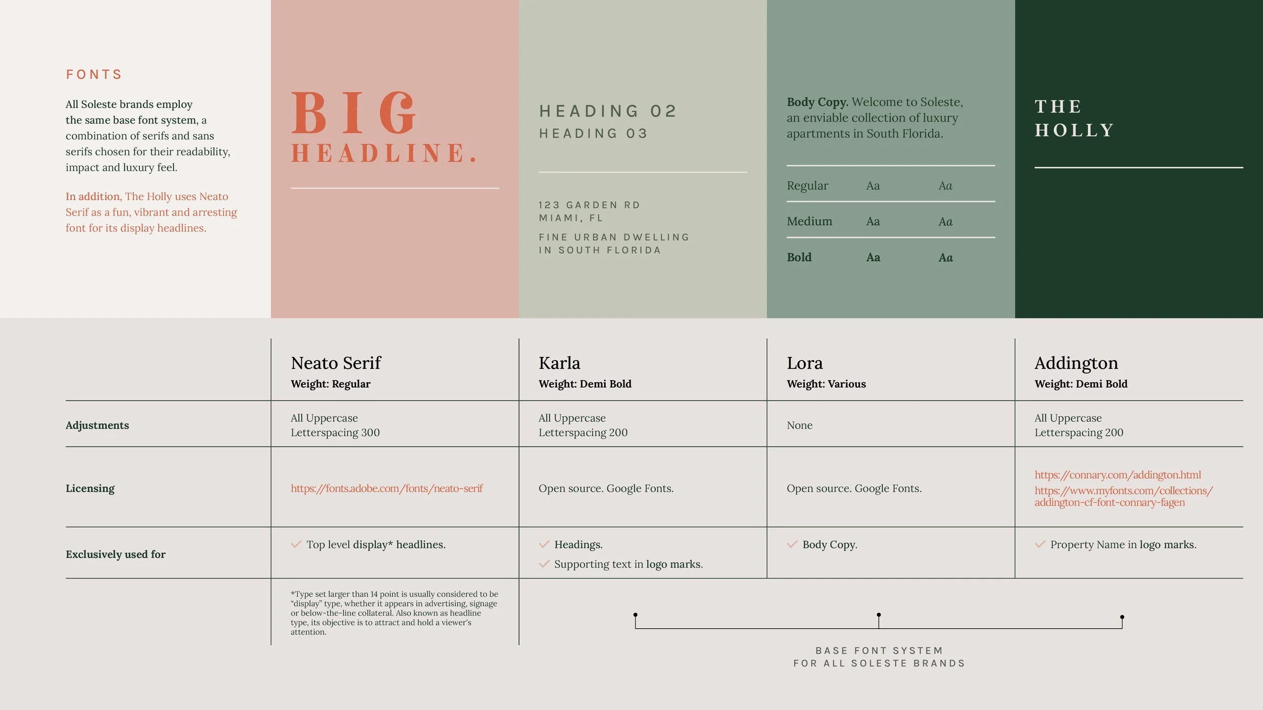
Each property shares the same master logo template, parent logo marks and base font system. These help to tie them all together as part of the same family. But each property also has its own color palette, a single “creative” font for limited use, copy, illustrations and other graphic elements. Below are two examples of properties/sub brands that were created under the Soleste parent brand.
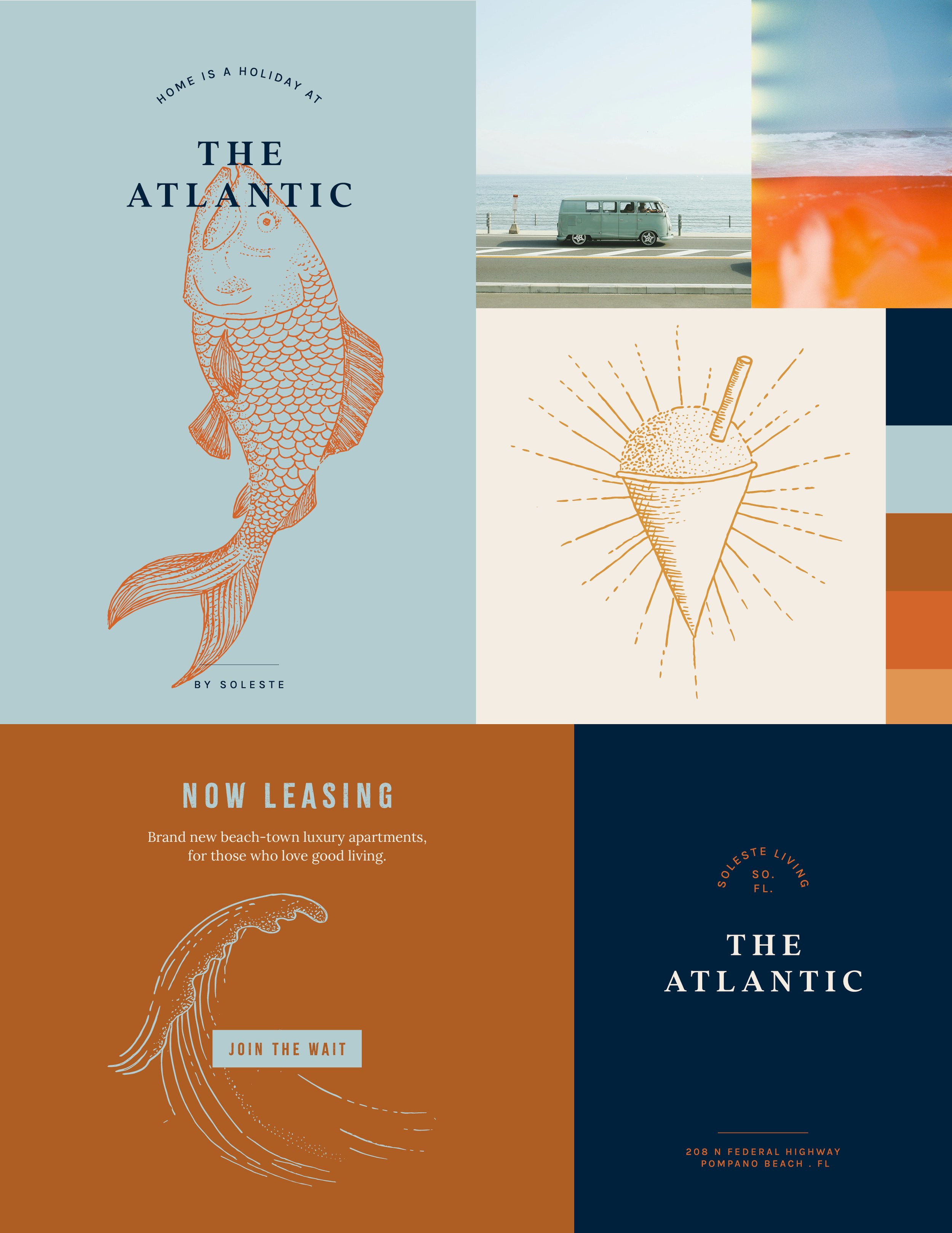
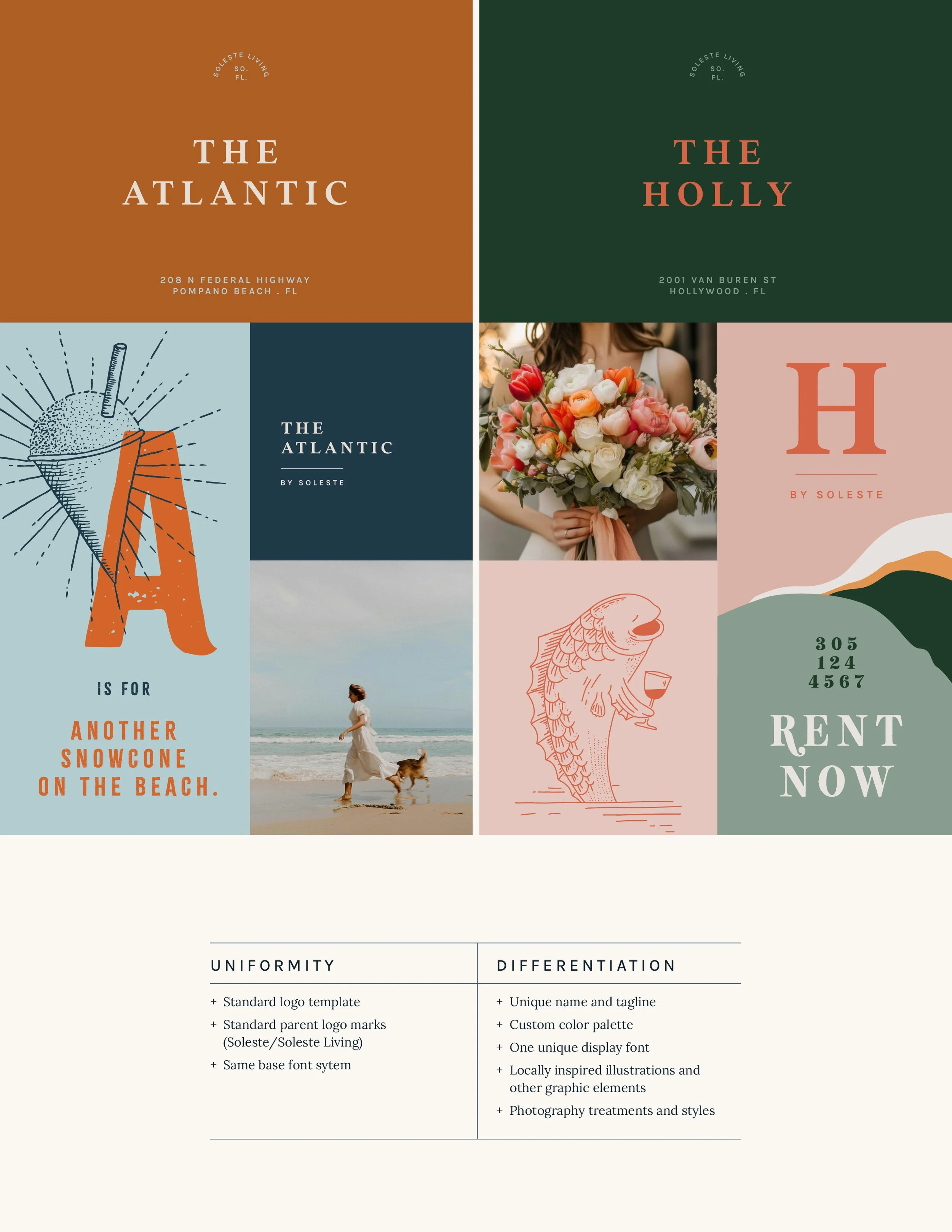
EXAMPLE 1.
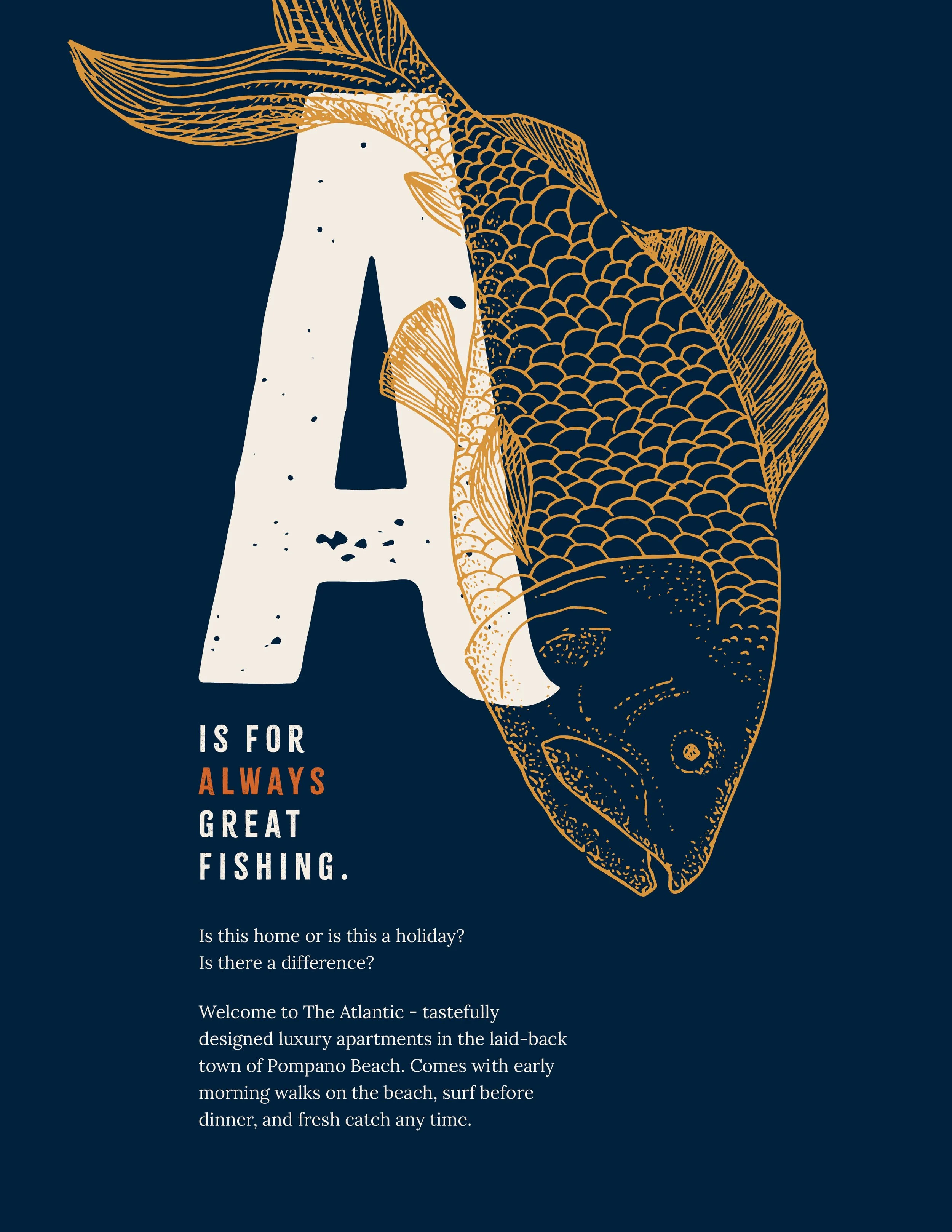
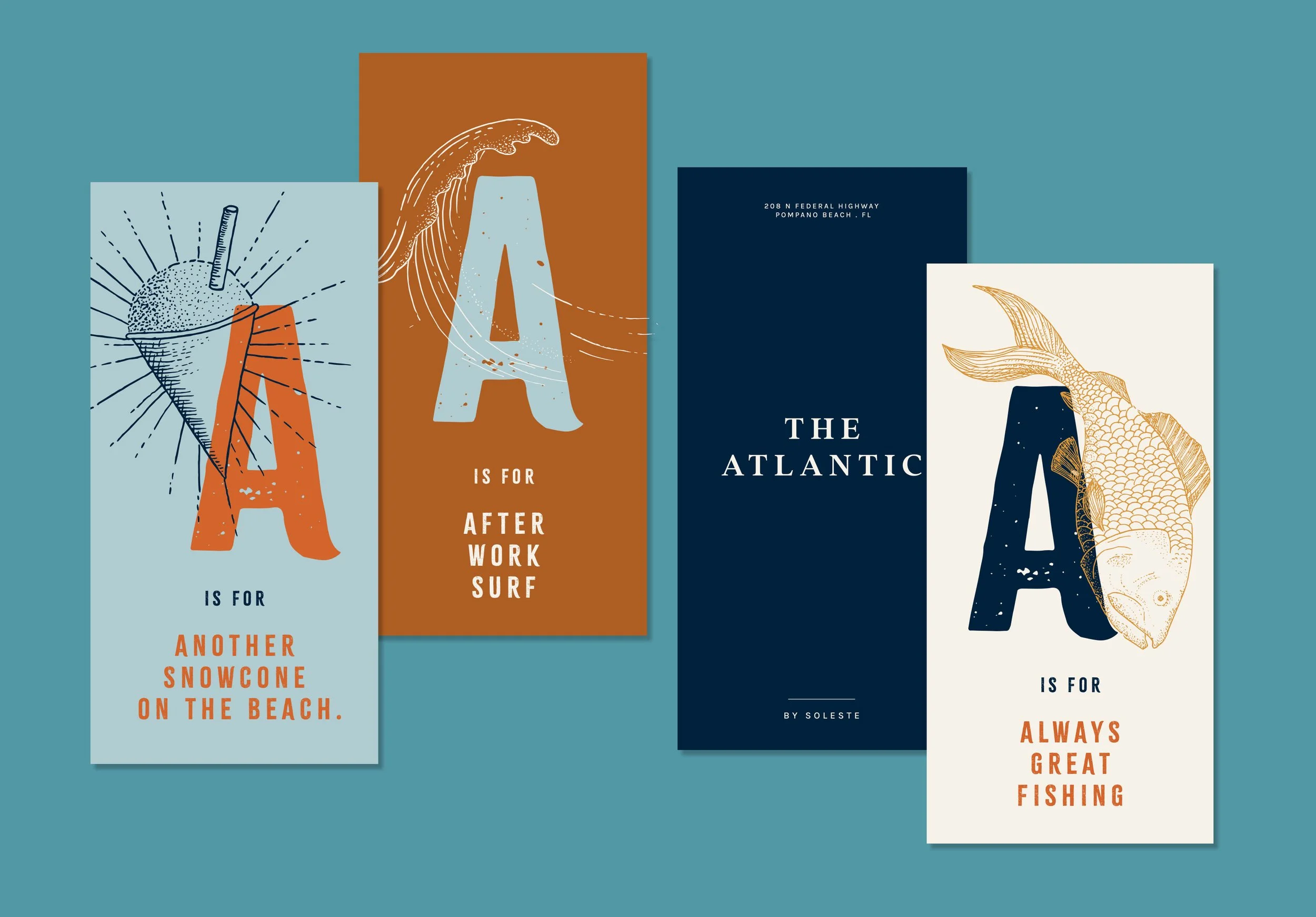
THE ATLANTIC BY SOLESTE
Signature line: Home is a holiday at The Atlantic.
Brand motifs: The Atlantic targets a demographic of working folk who value relaxation, the coastal outdoors and an active lifestyle, who can afford to live right by the ocean and spend their evenings and weekends fishing and enjoying the breeze. We used a nostalic color palette, a casual display font, and fun language - all appealing to these values. I also drew a series of custom illustrations depicting the laid-back oceanside culture of Pompano Beach.
EXAMPLE 2.
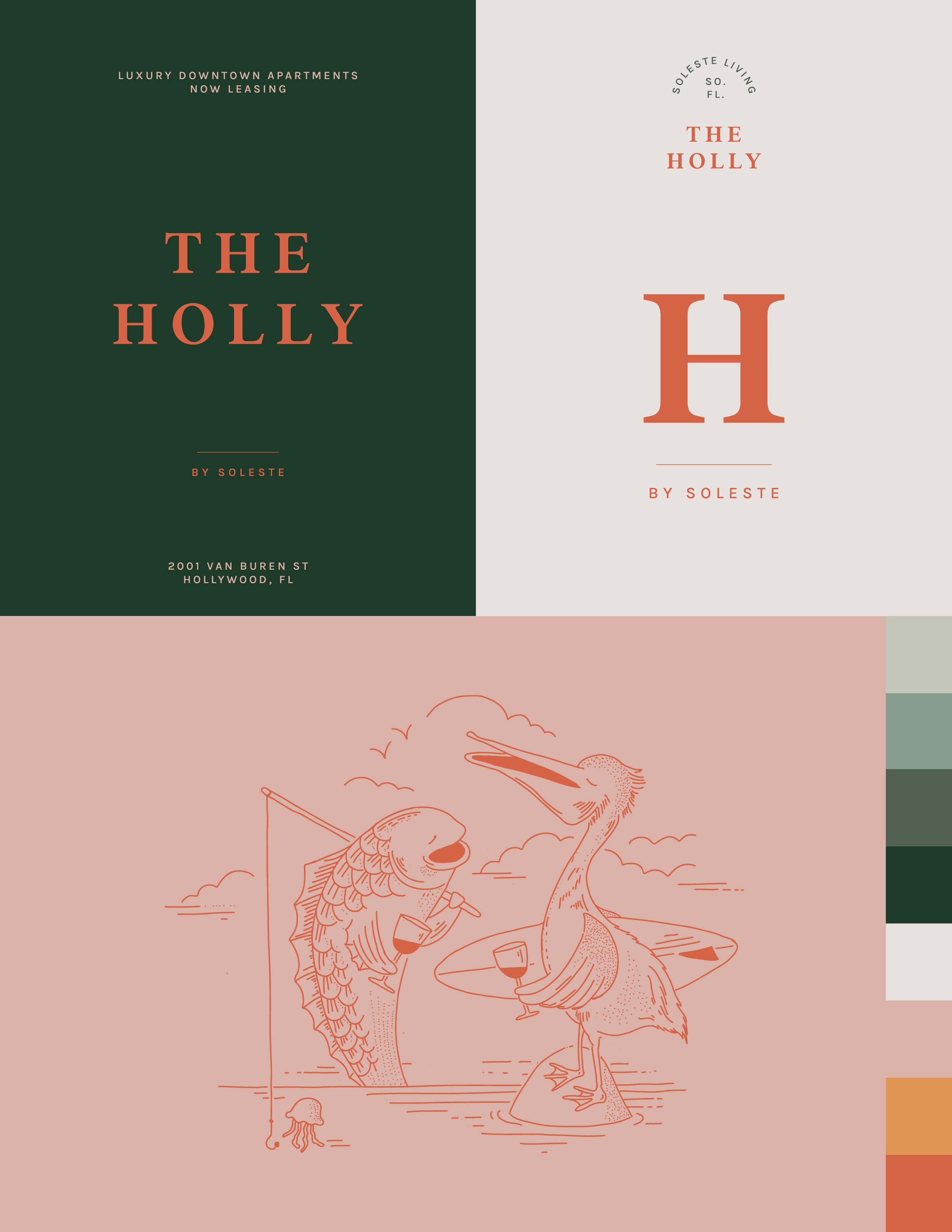
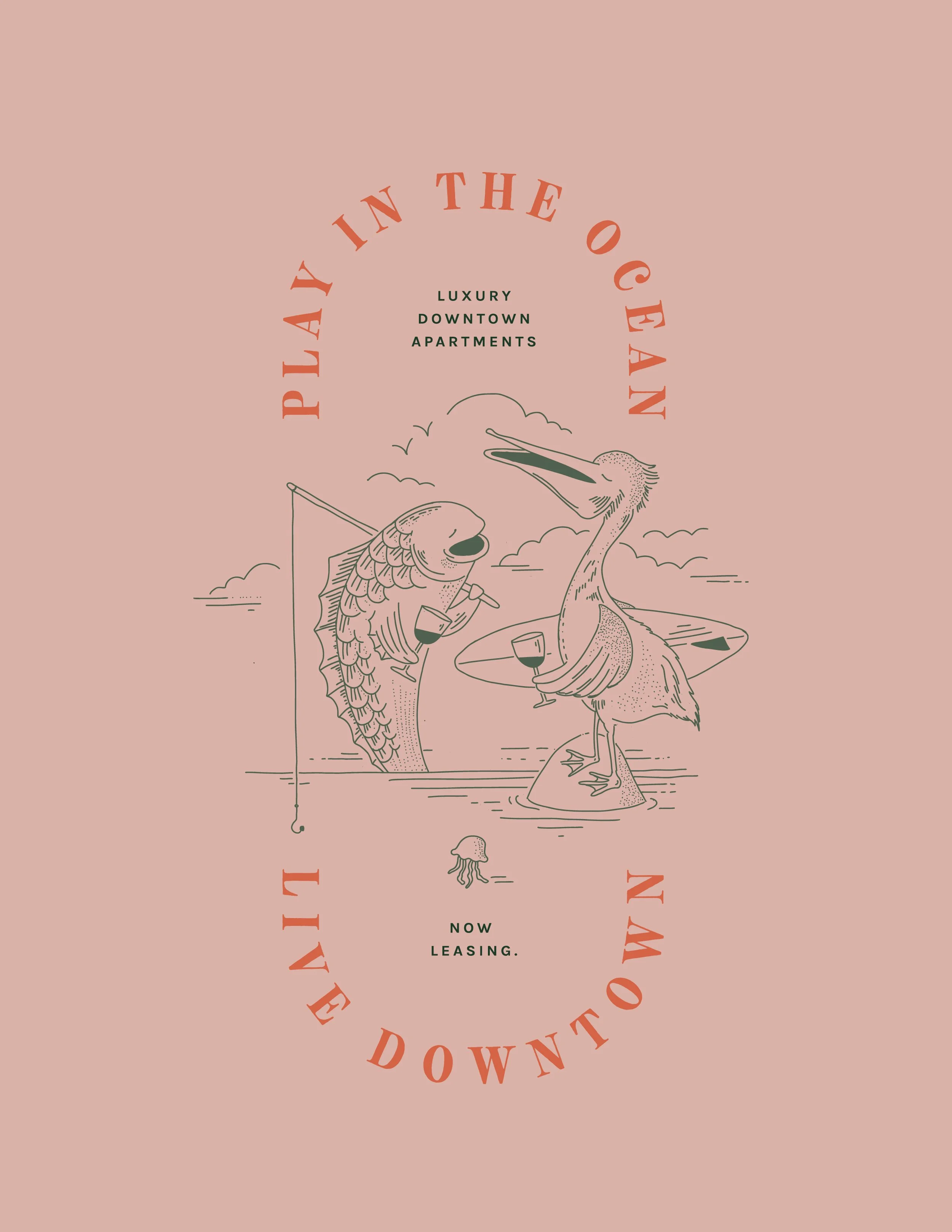
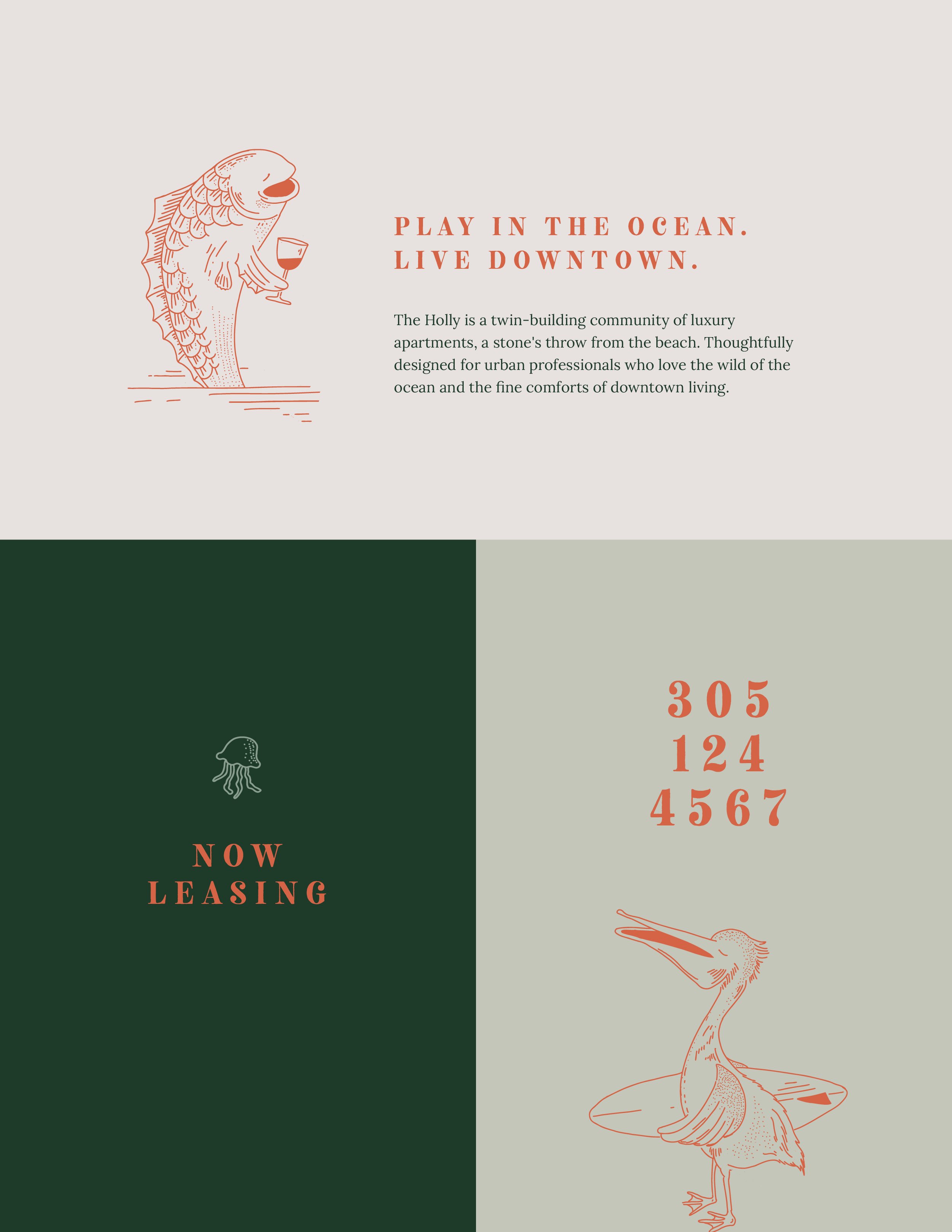
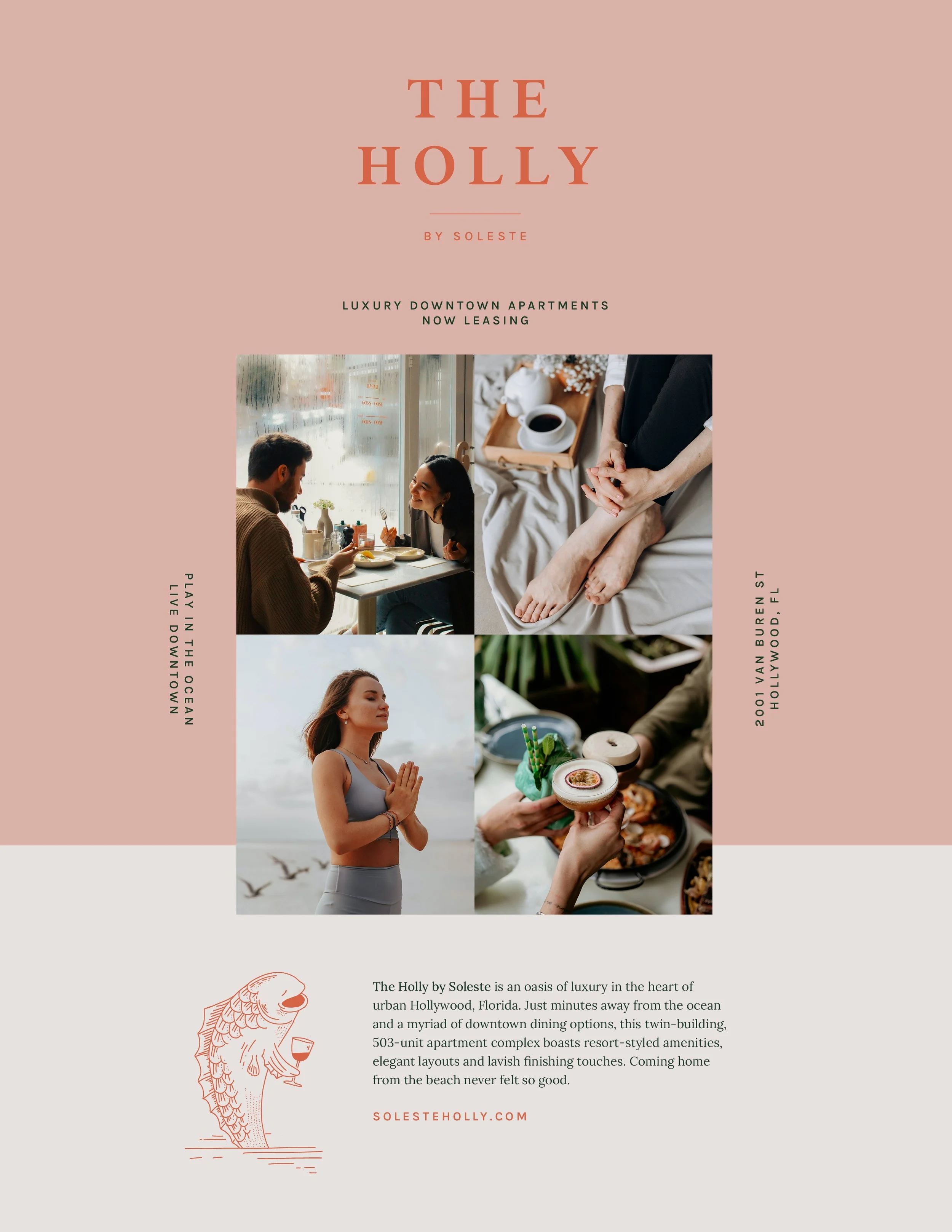
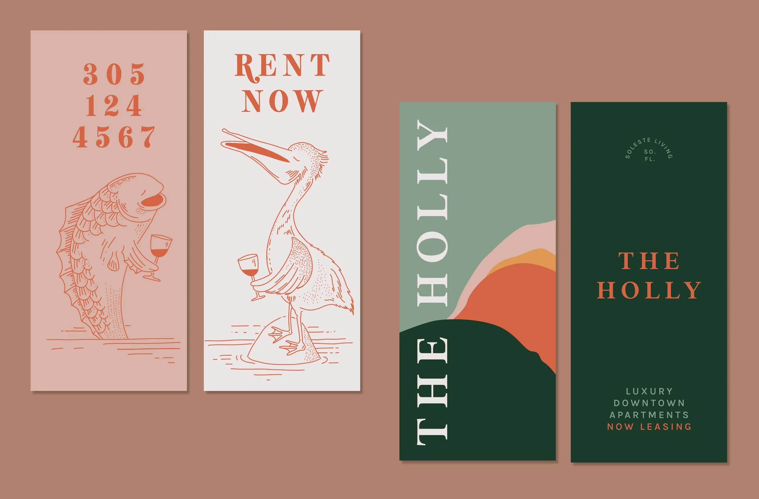
THE HOLLY BY SOLESTE
Signature line: Play in the ocean, live downtown.
Brand motifs: Given its location, a few blocks away from the beach, The Holly targets a younger demographic who want to live closer to the energy and amenities of downtown, but still be close enough to play in the ocean. A lighthearted illustrated scene that we called “Ocean friends” captured this sentiment - “Grab a glass of wine downtown with your mates. Take a walk on the beach. Live the best of both worlds, near the ocean and downtown.”
Side by side, you can see how each property retains its own identity and distinction, but remains a cohesive part of the Soleste family.
You can also check out the work that I did for The Belvedere, another property by Soleste